€11.25
€6.45
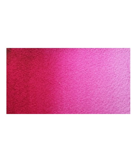
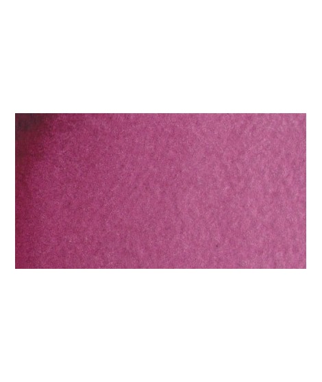
 Isaro Pink – Dynamism and Brightness
PR122 - Transparent - Non-granulating
Isaro Pink is a vibrant and essential shade, perfect for bringing freshness and delicacy to watercolor compositions. This pigment captivates with its transparency and beautiful luminosity, allowing for harmonious gradients and captivating light effects.mixtures and in particular to compose, with the blues, a large number of mauves.
€5.45
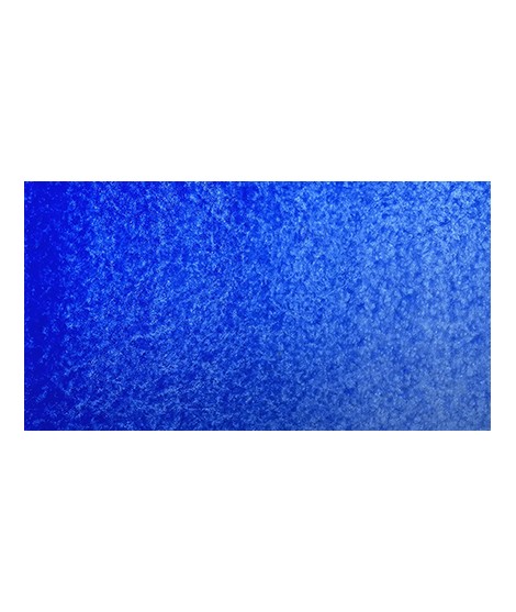
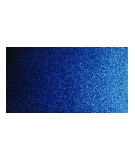
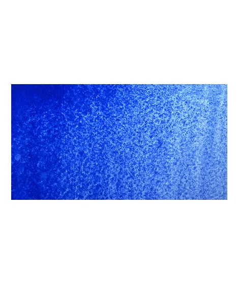
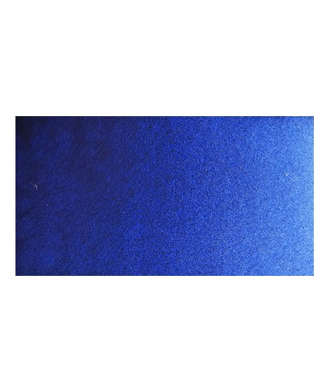
Ultramarine Blue - Between History and Modernity
PB29 - Semi-transparent - Granulating
Ultramarine Blue is a deep, rich hue, valued for its intense vibrancy and its ability to capture light, making it ideal for skies, oceans, and delicate shadows.Very useful for composing magnificent mauves, especially with quinacridones like Isaro pink for example. With black or burnt sienna, it makes it possible to obtain very beautiful Payne grays and with burnt umber to create a beautiful indigo.
€5.45
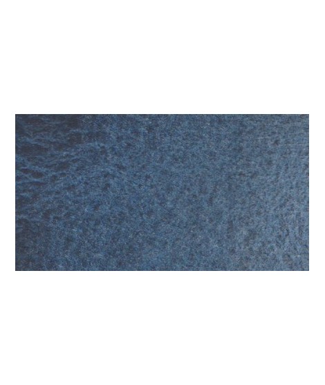
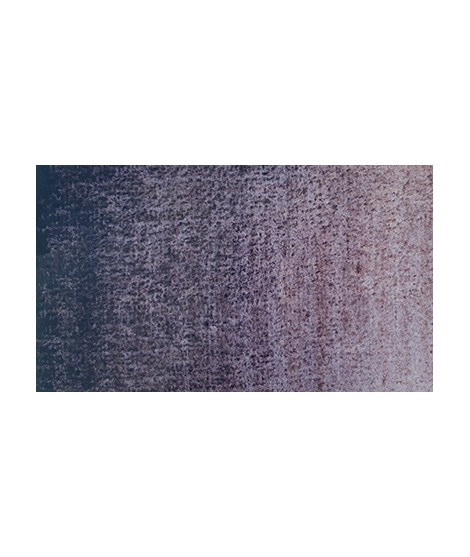
Very nice cold, deep gray, turning bPayne’s Grey - A Textured Grey
PBK11 + PB29 + PB15 - Opaque - Granulating
This hue, due to its harmonious nature and mixing potential, remains a top choice for watercolorists seeking refinement and delicacy in their compositions. It allows for subtle contrasts, making it ideal for working on stormy skies, nocturnal landscapes, and creating atmospheric gradients.lue. Useful as a contrast color.
€6.95
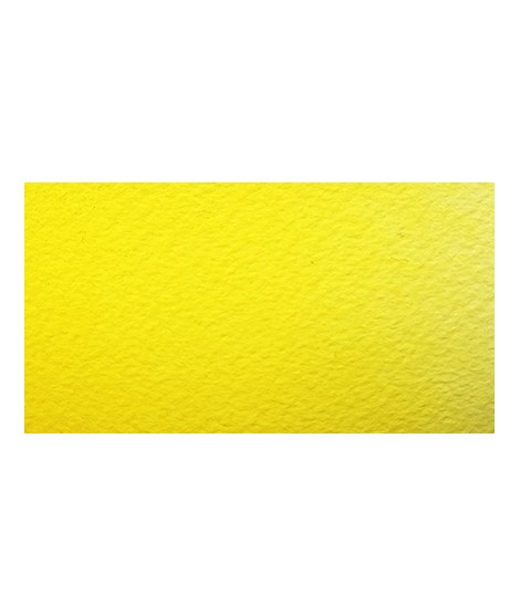
Isaro yellow light -Â Primary Yellow
PY154 - Transparent - Non-granulating
Isaro yellow light is a delicately luminous hue, perfect for capturing the softness of spring light, vibrant flowers, and sunlit skies, all while offering unparalleled transparency and subtlety.
A must-have on your palette. Darker shade than lemon cadmium yellow. Luminous and bright yellow. Useful as primary yellow. It is one of the essential colors on the palette of a watercolorist.

€6.95
Chartreuse Yellow – Natural Greens
PY129 – Transparent – Non-granulating
Chartreuse Yellow is a fascinating color that brings a touch of freshness to any composition. This bright yellow-green, often associated with vegetal and natural hues, is a must-have for capturing the richness of foliage, grasses, or lush green landscapes.ential greenish yellow. It allows a wide range of rich and surprising mixes.
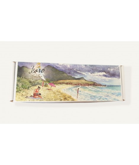
€58.95
The ManùBox # 1 is a selection of 10 Isaro's watercolors.
Tubes 7ML
€7.35
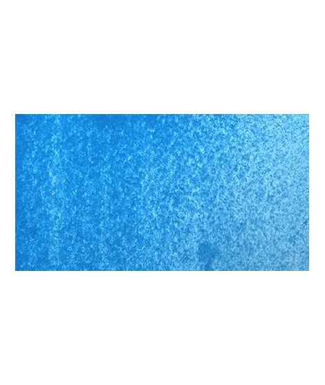
Very beautiful light blue, whiCerulean Blue - The Blue of Skies
PB35 - Semi-transparent - Granulating
Cerulean blue is a fresh and slightly opaque hue, cherished for its soft and natural tones that evoke clear skies and serene seascapes.ch pulls slightly towards green. Particularly suitable for working the sky.
€5.45
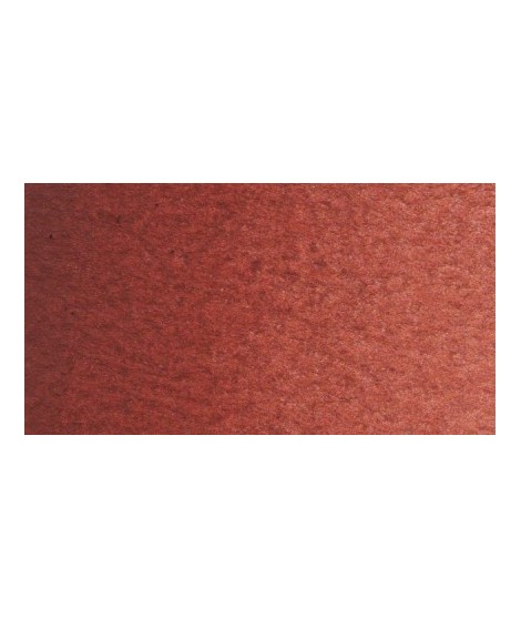
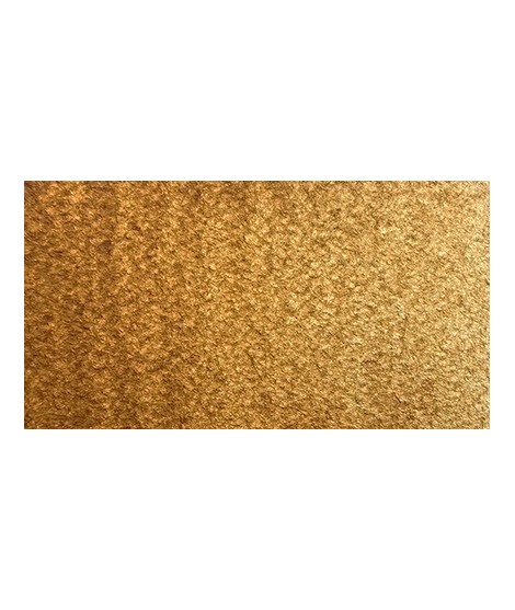
Burnt Sienna in watercolor is a warm, earthy pigment that adds depth, richness, and versatility to any composition, perfect for shadows, landscapes, and natural tones.

€7.35
The Nordman Green – A Unique Green
PG7 + PV16 - Semi-transparent - Granular
Nordman Green is an excellent choice for painting landscapes, forests, and foliage, adding natural richness and extra dimension to vegetal scenes thanks to the textured nuances it creates. It is also ideal for creating cool shadows and subtle shades in nature works or floral compositions. Its deep and balanced tone makes it particularly suited for winter scenes or muted atmospheres, but it can also be used in mixes to create more vibrant greens.y green color.

€6.45
Phthalo Green – A Versatile Green
PG7 – Transparent – Non-granular
Phthalo Green is an essential pigment in watercolor, valued for its vibrant intensity, transparency, and exceptional staining power. This cool green with subtle bluish undertones offers remarkable depth, making it perfect for capturing the richness of lush foliage, tropical landscapes, and emerald waters.ed with phthalo blue, it gives a very nice range of turquoises. With the yellows to obtain a very wide range of greens. With the earths of earthy greens and with the burnt umber a dark green.
€5.45
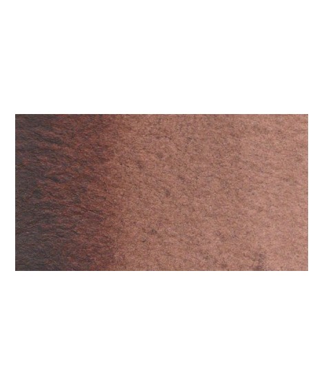
Dark and warm bBurnt Umber Watercolor - An Essential Hue for Your Artistic Palette
Burnt umber offers deep, warm tones, perfect for creating subtle shadows, natural textures, and rich, warm atmospheres.rown. Interesting color for dark your shades.
€3.95
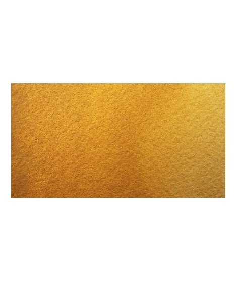
Yellow Ochre - A Trusted Pigment
PY42 - Opaque - Non-Granulating
Yellow ochre, a luminous pigment, brings warmth and softness to compositions while offering excellent lightfastness and exceptional versatility for subtle blends.utiful yellow, earthy and bright. Very useful on the palette.
€3.00
1/2 EMPTY BUCKET TO FILL WITH YOUR TUBE WATERCOLORS
SIZE: 1.6 X 1.4 X 0.9 CM
Sold in lots of: 10, 25, 50
€6.95
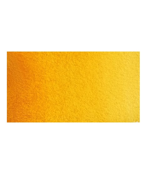
Saffron Yellow – The Golden Glow
PY110 - Transparent - Non-granulating
Saffron Yellow is a bright and warm hue, offering an intense and brilliant golden color, perfect for adding a touch of light and warmth to your artwork. With a beautiful transparency, this yellow allows you to obtain a very beautiful range of greens with Prussian blue and Phthalo blue for example. With yellow phthalo green (PG36) it allows you to easily compose the shades "bladder green" and "Hoocker green"
€6.45
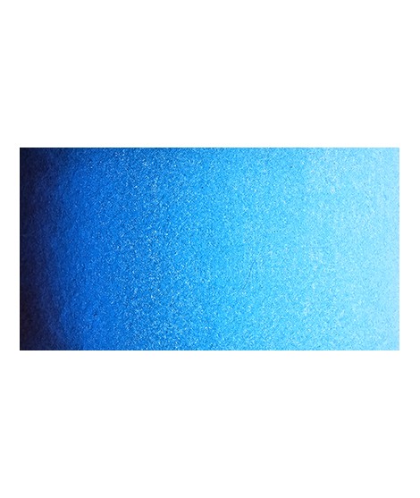
Very bPhthalo Blue - A Luminous Blue
PB15:3 - Transparent - Non-Granulating
Phthalo Blue is particularly prized for seascapes and clear skies, where its transparency and depth truly shine. It can also be used in layering to enrich darkeautiful blue with a shade having an underlying green tone.
With phthalo green it forms very beautiful turquoise. With the yellows of the beautiful greens. With the ocher of the more muted greens and with the pink or the purple Isaro a beautiful range of mauves.
€6.95
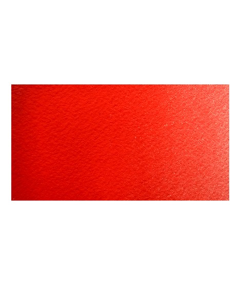
Scarlet Red – An Essential Red
PR255 - Transparent - Non-granulating
Scarlet Red is a vibrant and intense hue, characterized by its richness in reddish and slightly orange tones, perfect for adding warmth and brightness to your watercolor compositions.
€64.50
Assortment "Original" Isaro - 11 isaro's watercolors
To discover the brightness of Isaro watercolors, I offer an assortment of 11 chosen colors.
By mixing you will obtain a palette rich in original nuances.
You will discover unique shades from my range such as boreal blue, ultramarine pink, Isaro orange or even agapanthus blue.
Â

€8.45
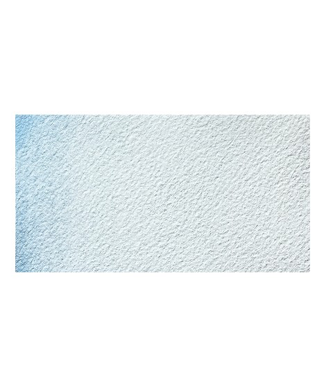
Icy Lake - The Essence of Winter
PBr7 + PB29 + Pearlescent
Icy Lake is a captivating and delicate shade that evokes the tranquility and purity of snow-covered landscapes. This pigment, with its dark blue hue and silver reflections, is perfect for capturing the serenity of frozen waters and winter night skies. Its subtle granulation allows for textured washes and delicate gradients, bringing a calm, wintry atmosphere to your artworks.
€6.95
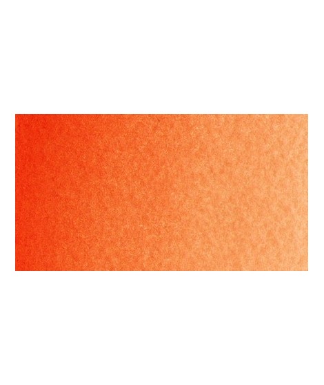
Pyrrole Orange - A Radiant Invitation to Create
P073 - Transparent - Non-granulating
Pyrrole orange is a vibrant and luminous hue, perfect for creating dynamic contrasts and warm mixes, with excellent lightfastness over time.
€5.45
Prussian Blue - The First Modern Synthetic Pigment
PB27 - Transparent - Non-Granulating
Prussian Blue is an essential hue for watercolor artists. Rich in history, intensity, and versatility, it offers endless creative possibilities, whether for landscapes, portraits, or abstract works.
€8.45
Eternal Summit - The Essence of Mountain Landscapes
PW4 + PB36 + Pearlescent - Semi-transparent - Non-granulating
Eternal Summit is a shade that evokes the grandeur of majestic mountains and the serenity of snow-covered landscapes. This light and luminous pigment stands out for its ability to capture light while adding a touch of freshness and calm to your artworks. With its pearlescent finish, Eternal Summit is perfect for depicting immaculate skies as well as mountain landscapes. When mixed, it allows for subtle gradients and unique atmospheric effects. base of this color is a very soft blue. Diluted well, this color gives a bluish white ideal for painting snow for example.
€5.45
Raw Sienna - A Hue from Nature
PBR7 - Semi-transparent - Granulating
Natural Sienna is a warm, earthy watercolor, perfect for creating depth effects, natural tones, washes, and offering remarkable permanence.eautiful earthy yellow.
€6.95
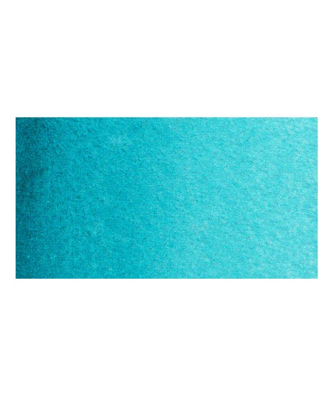
Turquoise Green – Aquatic Escape
PG7 + PG15:1 – Transparent – Non-granular
Turquoise Green is a vibrant and luminous hue, evoking crystal-clear waters and exotic landscapes. Its balance between blue and green makes it a perfect pigment for depicting tropical lagoons, vibrant foliage, or dawn skies with subtle nuances.een, this turquoise is nuanced at will with blue or green.
€6.95
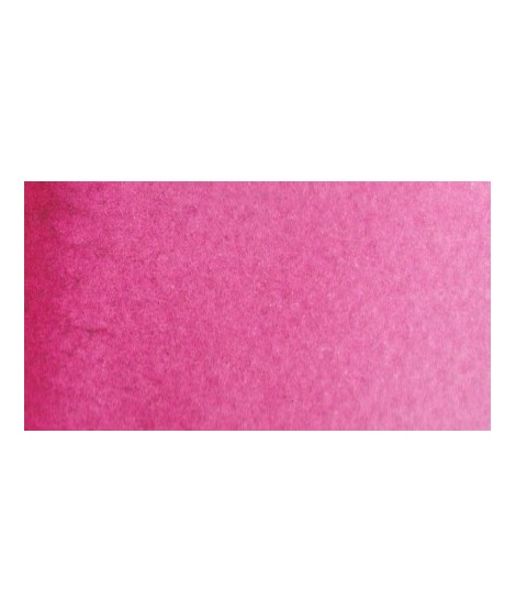
Magenta - A Primary Hue
PV19 - Transparent - Non-granulating
Magenta in watercolor, vibrant and transparent, is an essential color for creating luminous mixes, bright pinks, and deep purples, while offering excellent permanence.lor. It is a bright pink, which forms with the yellows beautiful oranges and with the blue magnificent mauves.
€7.35
Cobalt Blue - An Iconic Blue
PB28 - Semi-transparent - Granulating
Ideal for landscapes, Cobalt Blue excels in skies, calm waters, and distant mountains. Its granulating nature is perfect for textured effects and organic details.e. Bright and close to primary blue. We can define it as the most blue of blues because it does not draw on green (like Prussian blue) or red (like overseas).

€6.45
Isaro green light – A Touch of Freshness
PG36 + PY35 + PY42 – Semi-transparent – Non-granular
Isaro green light is a bright and radiant hue that evokes the freshness of spring and the softness of young foliage. Its vibrant intensity makes it an ideal pigment to bring liveliness to landscape and floral compositions.Â

€6.45
Chrome Oxide Green – A Mineral and Earthy Green
PG17 - Opaque - Non-granulating
Chromium oxide green is a mineral pigment valued for its stability and subtle tone, making it ideal for landscapes and natural subjects. With a deep, slightly neutral green hue, it fits seamlessly into the palettes of watercolor artists seeking balanced and realistic shades.mono pigment.
€6.95
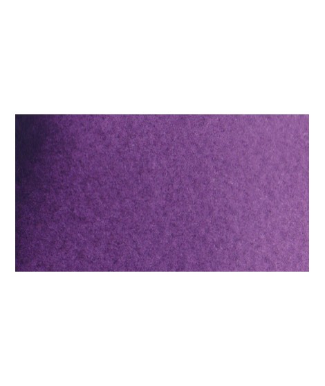
Dark Isaro Mauve - A Remarkable Dioxazine Violet
PV23 - Transparent - Non-granulating
Dark Isaro Mauve is an intense, powerful, and vibrant pigment, offering a rich and deep hue, perfect for creating subtle shadows and a wide range of mauve tones.

€5.45
Indigo Blue - A Historic Blue
PB29 + PBr7 + PB15 - Opaque - Moderately Granulating
With its granulating texture and natural depth, Indigo Blue is perfect for representing dramatic atmospheres, starry skies, or reflections on water. Its ability to layer in fine washes or be used opaquely makes it a favored choice for artists seeking variety in their compositions.
€6.95
Very beautiful light mauve Isaro Mauve - An Intense Purple
PV19 - Transparent - Non-granulating
Isaro Mauve is a versatile pigment that can be used alone or in mixes to add interesting and lasting hues, while offering a rich and luminous palette.mono pigmentary and therefore a beautiful purity of tone. It can be lightened with Isaro pink and darkens with ultramarine blue or phthalo blue for example.
€63.45
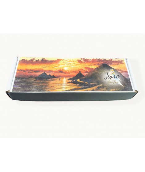
The ManĂąBox # 2 is a selection of 10 Isaro's watercolors
Titanium White
Indian yellow - (Can be replaced by saffron yellow) *
English Red
Cadmium red deep (If you prefer transparent colors you can choose Pyrrole red deep instead) *
Isaro purple deep (You can also choose a phtalo blue if you prefer to widen the range of your primaries) *
Rose Isaro
Indanthrene Blue
Cobalt blue
Satine blue
Turquoise green
Presentation: Box in 100% recycled cardboard - Tube 7ml
* Each artist has his preferences, so you have the possibility of modifying 2 shades of this box so that it corresponds as well as possible to the tutorials that you will follow with ManĂą.
€6.95
Indanthrene Blue - Intense Depth
PB60 - Transparent - Non-Granulating
This blue is perfect for artworks requiring dark and powerful tones, such as seascapes, stormy skies, or expressive portraits. It also excels in layering to create depth and subtle effects.
€8.45
Boreal blue - A Cosmic Blue
PB29 + Pearlescent
Boreal Blue is a captivating shade that evokes the magical light of the auroras borealis. This rich and intense blue, with its subtle and deep nuances, is perfect for artists seeking to create ethereal and mysterious atmospheres in their works. Its dark hue, combined with a slight granulation, allows for light and depth effects in skies, icy landscapes, or nocturnal scenes.Â

€7.35
Rose d’Outremer – Softness Under the Brush
PR259 - Semi-transparent - Granular
The Rose d'Outremer is a very soft and subtly textured hue that captivates with its gentleness. This pigment, a rose with slightly violet undertones, offers a rich chromatic quality, making it ideal for floral compositions.k especially to bring softness to certain floral compositions.