
€8.20
Active filters

€7.60

€7.60
A very discreet and interesting pink especially to bring softness to certain floral compositions.

€8.75
Rose navré et légèrement orange
€8.75

€7.60

€6.55
Magnificent bright color. Indispensable in many mixtures and in particular to compose, with the blues, a large number of mauves.
With the reds it makes it possible to obtain "cherry red" or "raspberry red" tones.
In my opinion, it is one of the very useful colors on a palette.

€8.20
A very discreet and interesting pink especially to bring softness to certain floral compositions.

€8.75
Rose lĂ©gèrement nacrĂ©Â
€5.45
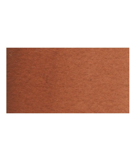
Very beautiful earth turning red. This color is, in my opinion, essential on the palette as it is rich in mixture. With blues, for example, burnt Sienna is a nice range of grays. With the reds, she creates "brick red" colors.

€5.45
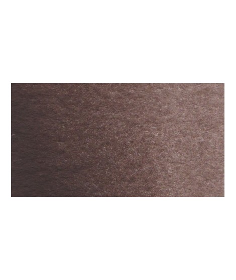
Dark brown tending to mauve. It can also be easily obtained on the palette by mixing smoke black with mauve iron oxide. To work on its shade, you can add mauve iron oxide to it. By combining it with yellow ocher or natural Siena earth you get sepia brown.
€5.45
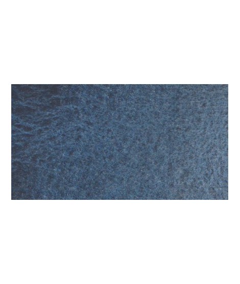
Very nice cold, deep gray, turning blue. Useful as a contrast color.

€7.25
Magnificent red which turns brown. More transparent than burnt Sienna and less grainy, it can perfectly replace it for watercolorists who prefer a more transparent and reddish tone.

€7.25
One of the flagship colors at Isaro. Very popular with watercolorists, it is one of the essentials on a palette.
€5.45
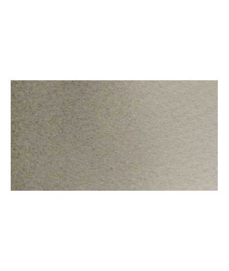
Beautiful subtle very light gray for light shadows and drapes.
€7.25
Very beautiful red, lively and bright with an underlying note colder than Scarlett red.
€7.25
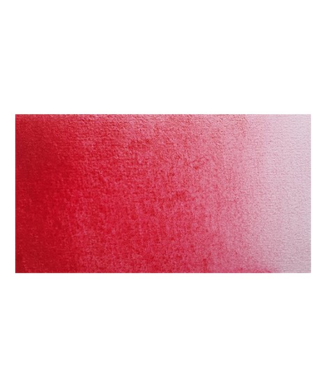
This very beautiful red whose shade can make one think of madder lacquer does not have the lack of stability over time.
With a little burnt umber, it is perfectly darkened and you easily get a crimson alizarin shade.

€8.75
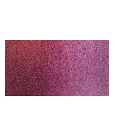
Ametrine is a quartz born from the union of citrine and amethyst which gives it very interesting reflections. I was inspired by the color of this mineral to create this purple which joins "other colors of the 2022 "Happy Precious Year" collection.
This color is grainy and iridescent.

€7.25
Magnificent red which turns brown. More transparent than burnt Sienna and less grainy, it can perfectly replace it for watercolorists who prefer a more transparent and reddish tone.
€4.65
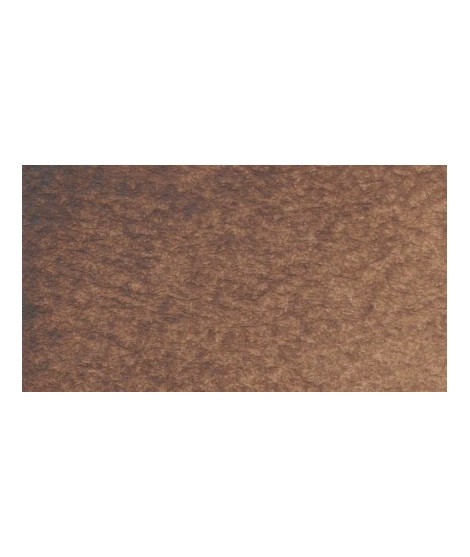
Very beautiful brown, slightly red. For watercolorists looking for uniform washes, March Brown may be preferred over natural soils.
€8.75
Ametrine is a quartz born from the union of citrine and amethyst which gives it very interesting reflections. I was inspired by the color of this mineral to create this purple which joins "other colors of the 2022 "Happy Precious Year" collection.
This color is grainy and iridescent.

€8.20
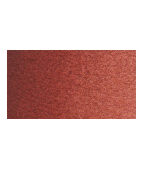
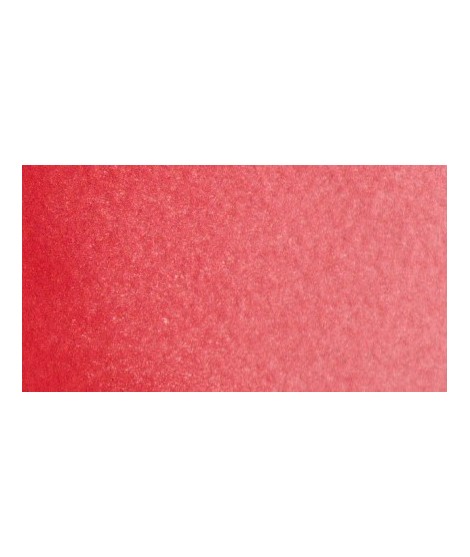
Very beautiful dark red tending to burgundy.

€7.25
This very beautiful red whose shade can make one think of madder lacquer does not have the lack of stability over time.
With a little burnt umber, it is perfectly darkened and you easily get a crimson alizarin shade.

€7.25
Very beautiful red, lively and bright with an underlying note colder than Scarlett red.

€7.25
One of the flagship colors at Isaro. Very popular with watercolorists, it is one of the essentials on a palette.

€5.45
Very nice cold, deep gray, turning blue. Useful as a contrast color.

€7.60
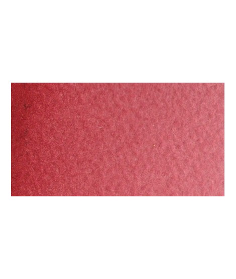
This red has a great purity of tone. It draws very slightly on the yellow.

€6.65
Magnificent bright color. Indispensable in many mixtures and in particular to compose, with the blues, a large number of mauves.
With the reds it makes it possible to obtain "cherry red" or "raspberry red" tones.
In my opinion, it is one of the very useful colors on a palette.

€7.60
Out of stock

€8.75

€8.75
Rose navré et légèrement orange

€7.60

€5.95
Very interesting Color to create "pastel" touch by mixing with other colors.
€5.45
Very beautiful brown with a green shade that characterizes real natural shade earth. I draw attention to the fact that this gray earth is naturally very little coloring.
€5.45
Dark brown tending to mauve. It can also be easily obtained on the palette by mixing smoke black with mauve iron oxide. To work on its shade, you can add mauve iron oxide to it. By combining it with yellow ocher or natural Siena earth you get sepia brown.