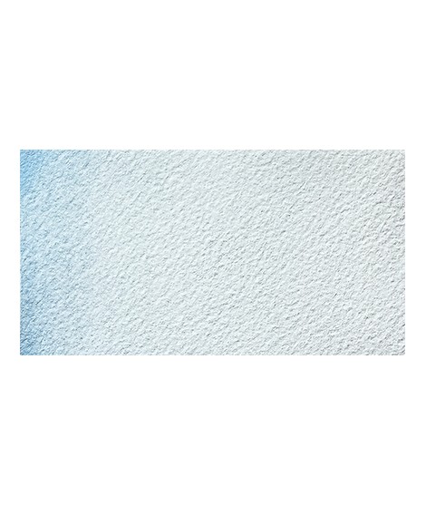
€8.45
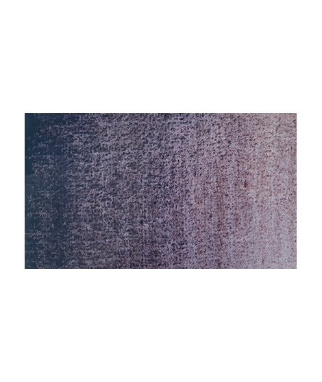
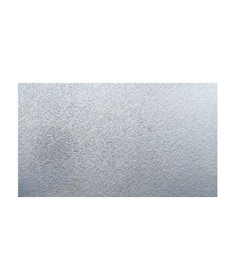
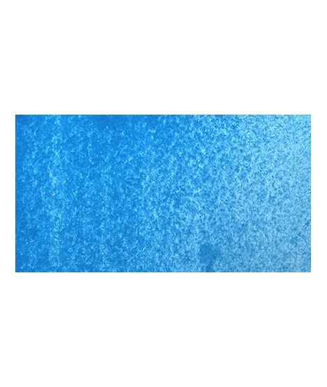
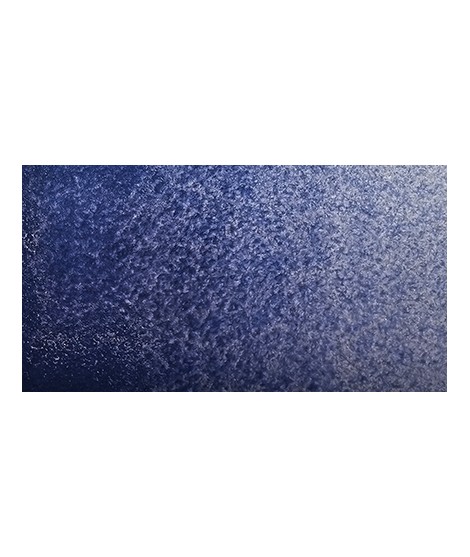
Icy Lake - The Essence of Winter
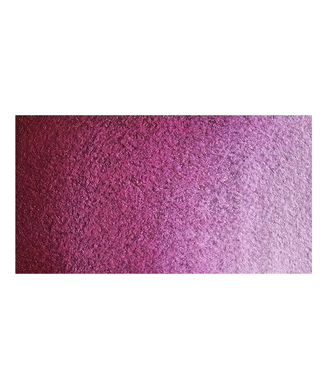
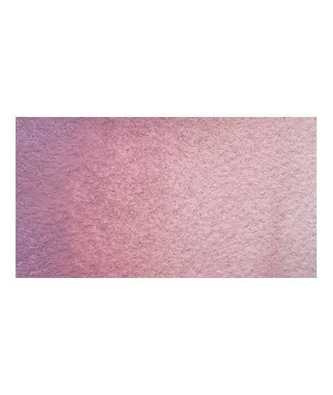
PBr7 + PB29 + Pearlescent
Icy Lake is a captivating and delicate shade that evokes the tranquility and purity of snow-covered landscapes. This pigment, with its dark blue hue and silver reflections, is perfect for capturing the serenity of frozen waters and winter night skies. Its subtle granulation allows for textured washes and delicate gradients, bringing a calm, wintry atmosphere to your artworks.