€3.00
1/2 EMPTY BUCKET TO FILL WITH YOUR TUBE WATERCOLORS
SIZE: 1.6 X 1.4 X 0.9 CM
Sold in lots of: 10, 25, 50
1/2 EMPTY BUCKET TO FILL WITH YOUR TUBE WATERCOLORS
SIZE: 1.6 X 1.4 X 0.9 CM
Sold in lots of: 10, 25, 50
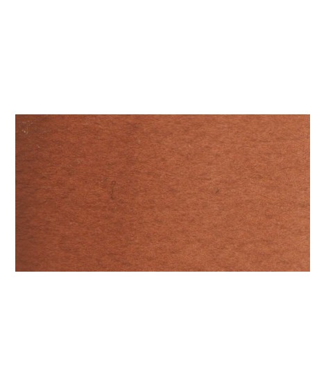
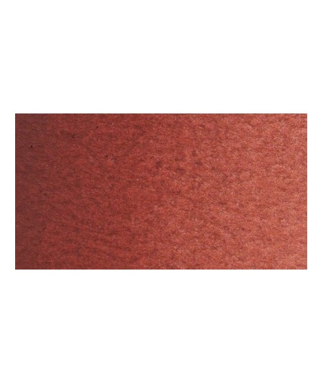
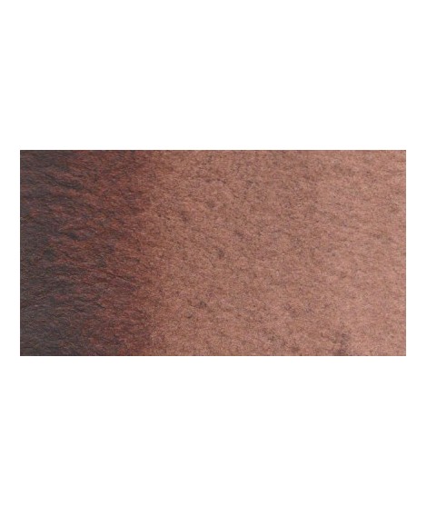
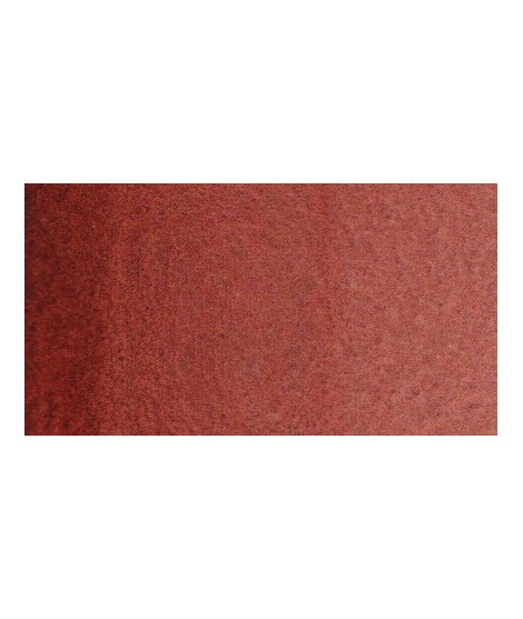
English Red - A Shade of Character - PR101 - OpaqueÂ
English Red is a rich hue perfect for creating deep shadows, realistic portraits, or autumn landscapes. It offers excellent permanence and great versatility in mixing.
Venetian Red is a powerful shade, offering the rich tones of a deep, earthy red.
Inspired by natural pigments used for centuries, this iron oxide is opaque and delivers a deep intensity at full saturation. When diluted, it can be worked transparently, creating beautiful gradients. watercolorists.
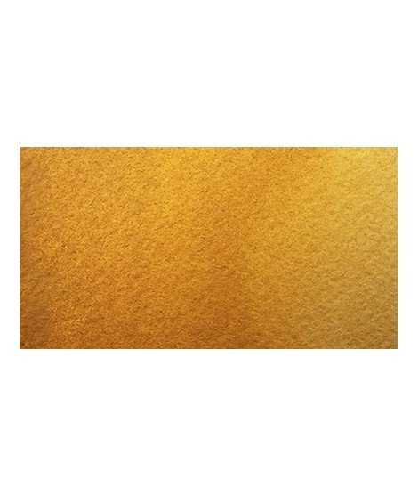
 Mars Brown light - A Versatile Brown
PR101 - Opaque - Non-granulating
Mars Brown Light is a rich, earthy hue, highly valued in painting for its versatility and ability to create natural, deep tones. Derived from iron oxide, this pigment offers a warm color and is extremely stable. For watercolor artists seeking uniform washes, Mars Brown may be preferred over natural earth pigments.Â
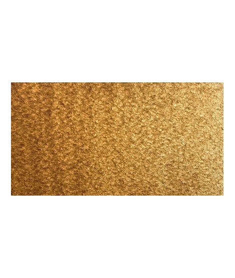
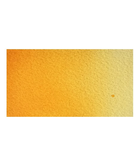
Yellow Ochre - A Trusted Pigment
PY42 - Opaque - Non-Granulating
Yellow ochre, a luminous pigment, brings warmth and softness to compositions while offering excellent lightfastness and exceptional versatility for subtle blends.utiful yellow, earthy and bright. Very useful on the palette.
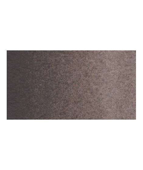
Lamp Black – The Intensity of a Dark Hue
PBK6 – Opaque – Non-granulating
Lamp Black is an intense pigment, providing deep blacks that allow for the creation of subtle shadows and nuanced grays.Â
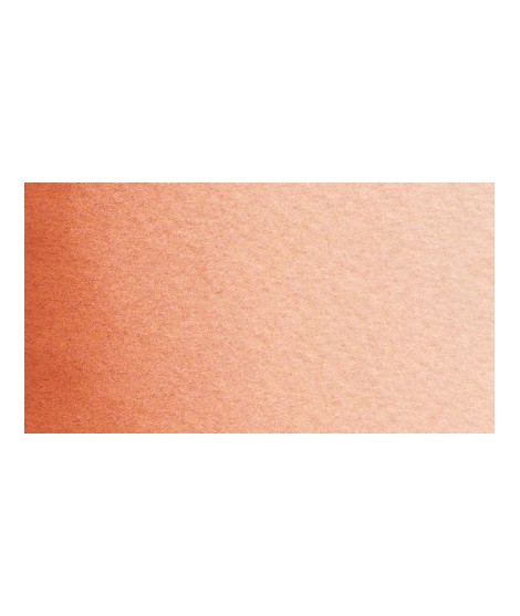
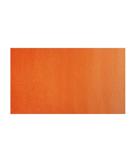
Iron Oxide Orange – A Warm Hue
PR101 - Opaque - Non-granulating
Iron oxide orange is a warm, earthy pigment, providing an intense and vibrant hue, perfect for landscapes, portraits, and subtle mixes, all while ensuring excellent permanence.
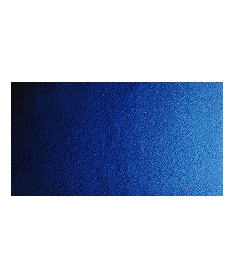
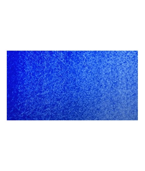
Prussian Blue - The First Modern Synthetic Pigment
PB27 - Transparent - Non-Granulating
Prussian Blue is an essential hue for watercolor artists. Rich in history, intensity, and versatility, it offers endless creative possibilities, whether for landscapes, portraits, or abstract works.
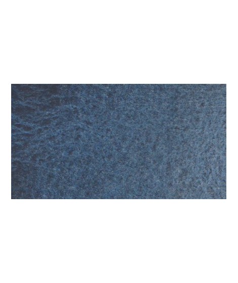
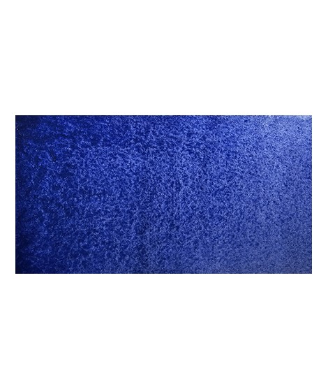
Indigo Blue - A Historic Blue
PB29 + PBr7 + PB15 - Opaque - Moderately Granulating
With its granulating texture and natural depth, Indigo Blue is perfect for representing dramatic atmospheres, starry skies, or reflections on water. Its ability to layer in fine washes or be used opaquely makes it a favored choice for artists seeking variety in their compositions.
Very nice cold, deep gray, turning bPayne’s Grey - A Textured Grey
PBK11 + PB29 + PB15 - Opaque - Granulating
This hue, due to its harmonious nature and mixing potential, remains a top choice for watercolorists seeking refinement and delicacy in their compositions. It allows for subtle contrasts, making it ideal for working on stormy skies, nocturnal landscapes, and creating atmospheric gradients.lue. Useful as a contrast color.
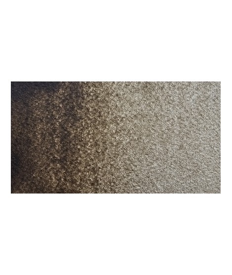
Raw Umber - An Authentic Color
PBr7 - Semi-transparent - Granulating
Raw Umber is ideal for creating soft shadows and earthy tones while adding depth and harmony.with a green shade that characterizes real natural shade earth. I draw attention to the fact that this gray earth is naturally very little coloring.
Burnt Sienna in watercolor is a warm, earthy pigment that adds depth, richness, and versatility to any composition, perfect for shadows, landscapes, and natural tones.
Sepia – The Softness of a Warm Brown
PBK11 + PBK6 + PR101 + PY42 - Opaque - Non-granulating
Sepia, with its warm and deep tones, is ideal for creating shadows or earthy hues, realistic portraits, monochromes, and natural landscapes.tiful very dark brown, almost black. Very useful for contrasts. Can be obtained on the palette by mixing smoke black with mauve iron oxide and ocher or natural Sienna.
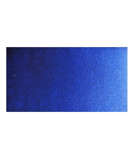
Ultramarine Blue - Between History and Modernity
PB29 - Semi-transparent - Granulating
Ultramarine Blue is a deep, rich hue, valued for its intense vibrancy and its ability to capture light, making it ideal for skies, oceans, and delicate shadows.Very useful for composing magnificent mauves, especially with quinacridones like Isaro pink for example. With black or burnt sienna, it makes it possible to obtain very beautiful Payne grays and with burnt umber to create a beautiful indigo.
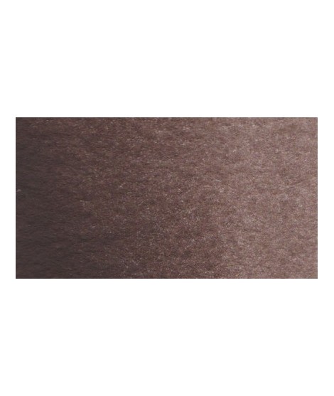
Van Dijck Brown - A Rich Color
PR101 + PBk6 - Opaque - Non-granulating
Van Dijck brown is a rich and deep pigment, perfect for creating subtle shadows and warm atmospheres, while offering great lightfastness and excellent coverage.
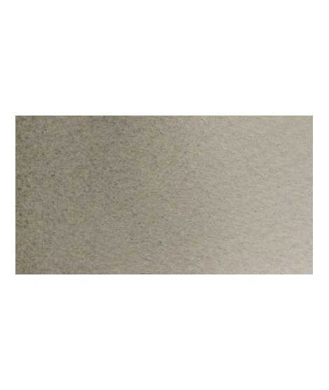
Isaro grey light - A Subtle Softness
PR101 + PG17 - Semi-transparent - Non-granulating
Isaro grey light is a soft and luminous shade, ideal for subtle backgrounds, light shadows, and delicate gradients. With its smooth texture and transparency, it helps create calming atmospheres while adding depth to compositions without weighing them down. Perfect for watercolorists seeking discreet and refined nuances and drapes.
Raw Sienna - A Hue from Nature
PBR7 - Semi-transparent - Granulating
Natural Sienna is a warm, earthy watercolor, perfect for creating depth effects, natural tones, washes, and offering remarkable permanence.eautiful earthy yellow.
Dark and warm bBurnt Umber Watercolor - An Essential Hue for Your Artistic Palette
Burnt umber offers deep, warm tones, perfect for creating subtle shadows, natural textures, and rich, warm atmospheres.rown. Interesting color for dark your shades.
Very interesting Color to create "pastel" touch by mixing with other colors.
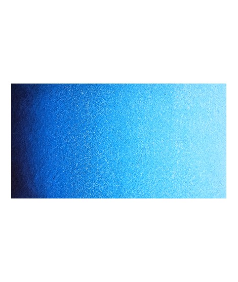
Very bPhthalo Blue - A Luminous Blue
PB15:3 - Transparent - Non-Granulating
Phthalo Blue is particularly prized for seascapes and clear skies, where its transparency and depth truly shine. It can also be used in layering to enrich darkeautiful blue with a shade having an underlying green tone.
With phthalo green it forms very beautiful turquoise. With the yellows of the beautiful greens. With the ocher of the more muted greens and with the pink or the purple Isaro a beautiful range of mauves.
Isaro green light – A Touch of Freshness
PG36 + PY35 + PY42 – Semi-transparent – Non-granular
Isaro green light is a bright and radiant hue that evokes the freshness of spring and the softness of young foliage. Its vibrant intensity makes it an ideal pigment to bring liveliness to landscape and floral compositions.Â
Green useful for landscapes in particular. Maybe nuanced with phthalo green or yellows.
Nickel Yellow – A Luminous Hue
PY53 – Semi-transparent – Non-granulating
Nickel Yellow is a bright and clear yellow. With a soft, slightly greenish tint, this color stands out for its ability to brighten your work.soft, slightly pastel yellow.
Chrome Oxide Green – A Mineral and Earthy Green
PG17 - Opaque - Non-granulating
Chromium oxide green is a mineral pigment valued for its stability and subtle tone, making it ideal for landscapes and natural subjects. With a deep, slightly neutral green hue, it fits seamlessly into the palettes of watercolor artists seeking balanced and realistic shades.mono pigment.
Phthalo Green – A Versatile Green
PG7 – Transparent – Non-granular
Phthalo Green is an essential pigment in watercolor, valued for its vibrant intensity, transparency, and exceptional staining power. This cool green with subtle bluish undertones offers remarkable depth, making it perfect for capturing the richness of lush foliage, tropical landscapes, and emerald waters.ed with phthalo blue, it gives a very nice range of turquoises. With the yellows to obtain a very wide range of greens. With the earths of earthy greens and with the burnt umber a dark green.
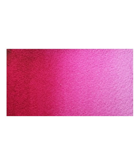
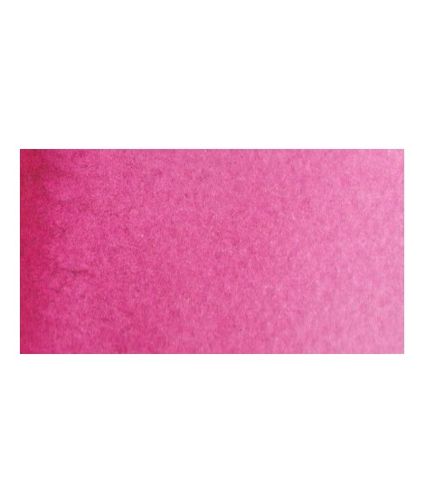
 Isaro Pink – Dynamism and Brightness
PR122 - Transparent - Non-granulating
Isaro Pink is a vibrant and essential shade, perfect for bringing freshness and delicacy to watercolor compositions. This pigment captivates with its transparency and beautiful luminosity, allowing for harmonious gradients and captivating light effects.mixtures and in particular to compose, with the blues, a large number of mauves.
Indanthrene Blue - Intense Depth
PB60 - Transparent - Non-Granulating
This blue is perfect for artworks requiring dark and powerful tones, such as seascapes, stormy skies, or expressive portraits. It also excels in layering to create depth and subtle effects.
Satine Blue - An Original Blend
PB29 + PBr7 + PV16 - Semi-transparent - Granulating
Satine Blue is a refined color that captivates with its softness and subtle glow. Made from carefully selected pigments, this blue harmonizes beautifully with both warm and cool tones. For subtle shades, mix it with Isaro Rose or Magenta to create delicate purples or lavender hues. You can also try combining it with Payne's Grey for nocturnal skies or aquatic shadows.
Magenta - A Primary Hue
PV19 - Transparent - Non-granulating
Magenta in watercolor, vibrant and transparent, is an essential color for creating luminous mixes, bright pinks, and deep purples, while offering excellent permanence.lor. It is a bright pink, which forms with the yellows beautiful oranges and with the blue magnificent mauves.
Chartreuse Yellow – Natural Greens
PY129 – Transparent – Non-granulating
Chartreuse Yellow is a fascinating color that brings a touch of freshness to any composition. This bright yellow-green, often associated with vegetal and natural hues, is a must-have for capturing the richness of foliage, grasses, or lush green landscapes.ential greenish yellow. It allows a wide range of rich and surprising mixes.
Isaro Orange - A Unique Hue
PO61 + PR206 + PBr23 - Transparent - Non-granulating
Made from a blend of multiple pigments, this intense orange is perfect for capturing the warmth of autumn landscapes, sunsets, or flowers. Isaro Orange is transparent, allowing for beautiful fluidity and a sense of lightness, while remaining stable and lightfast.
Indian Yellow - A Historic Hue
PY154 + PO73 - Transparent - Non-granulating
Indian Yellow, with its warm and luminous tone, is a transparent and versatile color, perfect for adding brilliance and depth to your watercolor paintings.arm and bright yellow, very beautiful in wash for example.
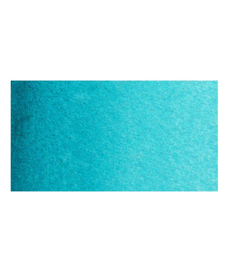
Turquoise Green – Aquatic Escape
PG7 + PG15:1 – Transparent – Non-granular
Turquoise Green is a vibrant and luminous hue, evoking crystal-clear waters and exotic landscapes. Its balance between blue and green makes it a perfect pigment for depicting tropical lagoons, vibrant foliage, or dawn skies with subtle nuances.een, this turquoise is nuanced at will with blue or green.
Perylene Red – A Deep Red-Brown
PR179 - Transparent - Non-granulating
Perylene Red is a deep, transparent, and luminous hue, valued for its exceptional permanence and versatility in creating warm or neutral mixes.
Sap Sap Green – A Classic and Natural Green
PG36 + PY139 - Transparent - Non-granulating
This deep yellow-green, with its luminous transparency, is prized for its ability to create subtle botanical shades. Ideal for delicate foliage, moss, and pastoral landscapes, it blends seamlessly into washes and mixes beautifully with other pigments.