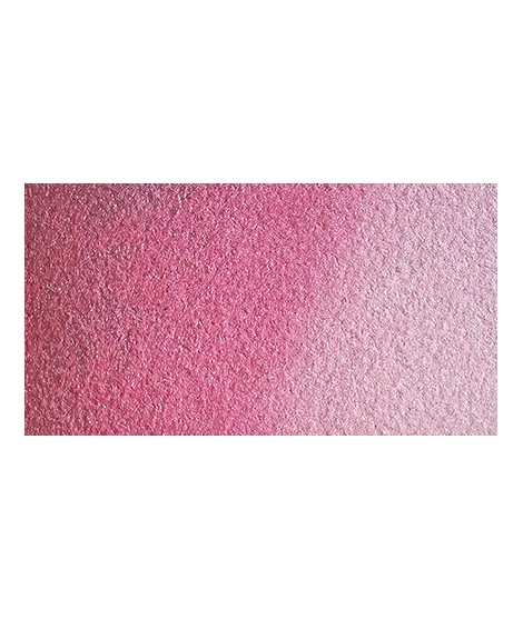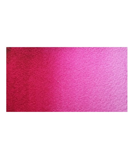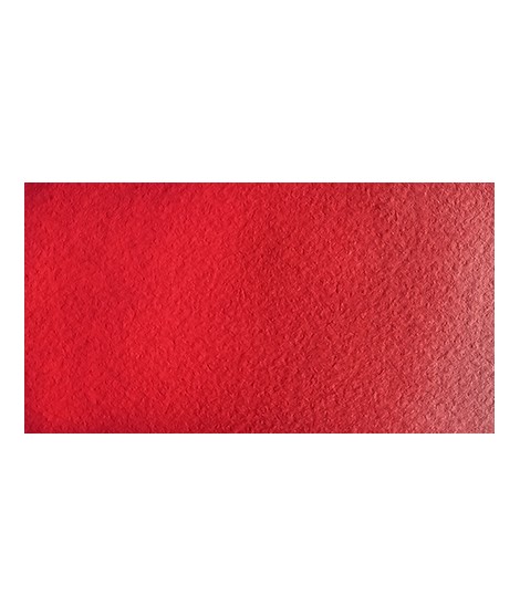
€8.45
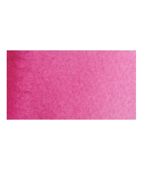
Agate Red - An original red
PR264 + PR122 + Pearlescent - Transparent - Slightly Granular
Agate red offers a rich and pearlescent hue, perfect for festive and original shades.