
€8.45
Active filters

€6.95
Based on blue and phthalo green, this turquoise is nuanced at will with blue or green.
€16.00
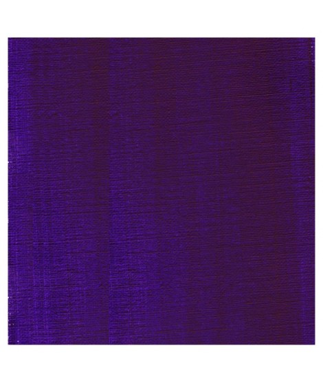
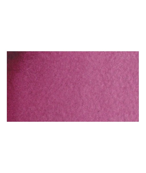
A deep violet with a touch of red
€16.00
It's a good glazing colour with a subtil and interessant blueish shade. Mixed with white, we obtain a rich range of vivid purple. His tint power is very high.

€6.55
Bright and vivid green that can also be created on the palette by mixing using phthalo green PG7 or phthalo green yellow shade PG36; To the latter, lemon cadmium yellow or light cadmium yellow is added or, if it is desired to retain more transparency, light Isaro yellow PY154.

€6.55
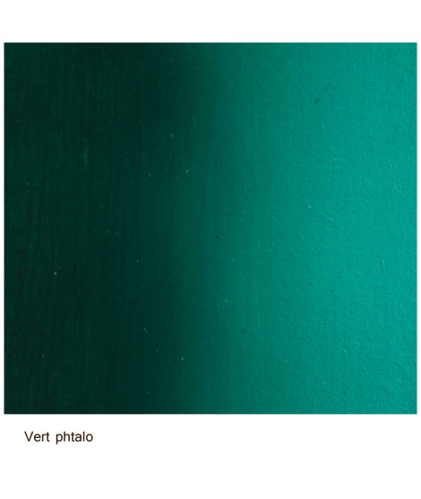
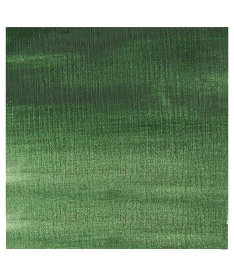
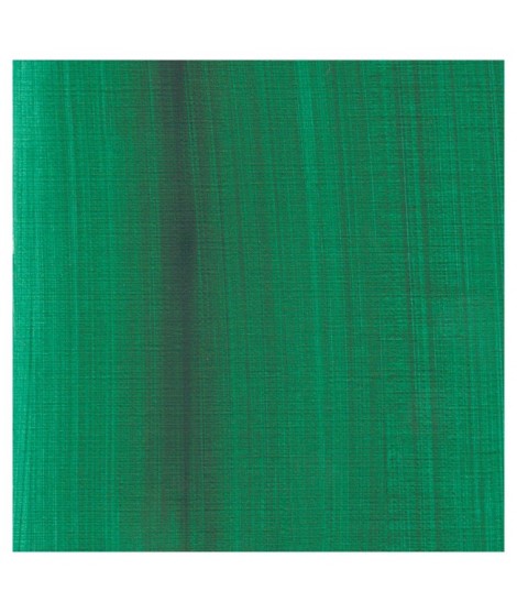
Very beautiful green, turning blue. When mixed with phthalo blue, it gives a very nice range of turquoises. With the yellows to obtain a very wide range of greens. With the earths of earthy greens and with the burnt umber a dark green.
€16.00
This violet is the mixture of three pigments to created a unique shade of violet

€6.55
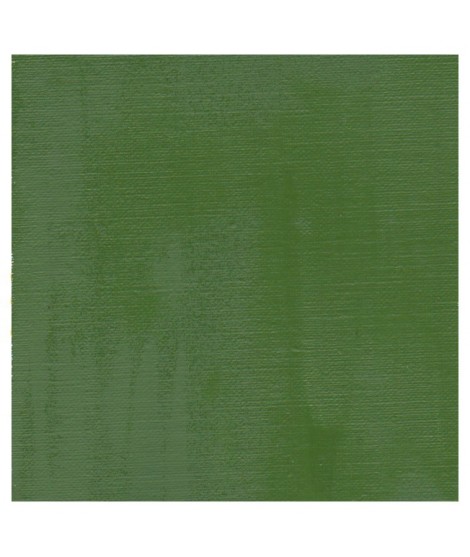
Green useful for landscapes in particular. Maybe nuanced with phthalo green or yellows.

€7.40
Very beautiful green tone less dynamic than phthalo green. The emerald green is bluish.

€6.55
Very beautiful earthy green and mono pigment.

€6.95
Magnificent bright green with an underlying shade of yellow.

€6.95
Vert Sapin
PG36 + PY165

€6.95

€7.40
Singular and grainy green color.
€14.00
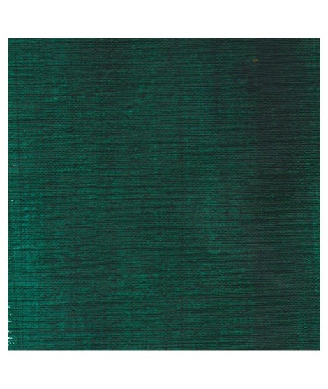
This vivid and strong bluish greens a good staple green to produce a large range of greens.
€5.30
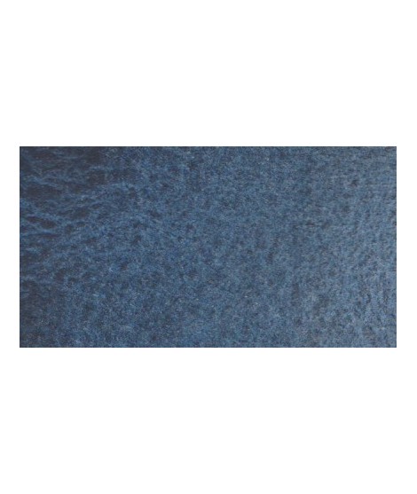
Very nice cold, deep gray, turning blue. Useful as a contrast color.
€22.00
This earthy green is very Opaque.Â
Mixed with yellows or earths (ochre, umber, sienna), it produces a usefull range of greens for the landscapists
€12.00
It's a deep brownish green.
€12.00
It's a beautifull green useful in producing glazes when diluted.
€26.00
This colour is more Transparent and less dull than chromium oxide green. Emerald green produces splendidly luminous green when mixed with cadmium yellow. Landscapists and some portraitists prefer it because his undertone is less vivid than the phtalo green.
€8.00
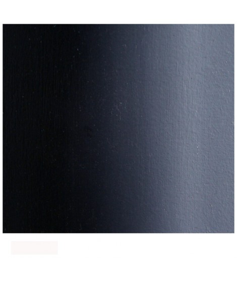
A deep cool blue black.
€5.30
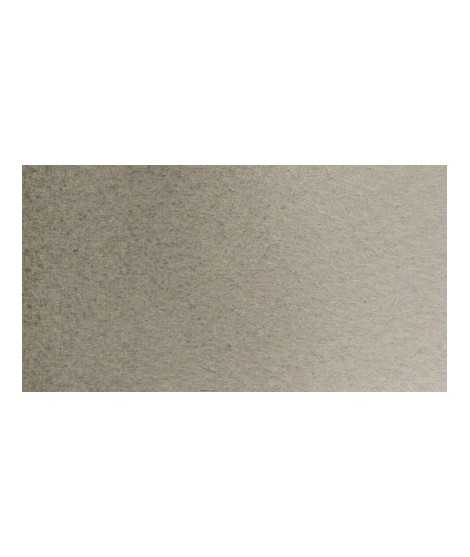
Beautiful subtle very light gray for light shadows and drapes.
€16.00
It's a strong neutral black.
€8.00
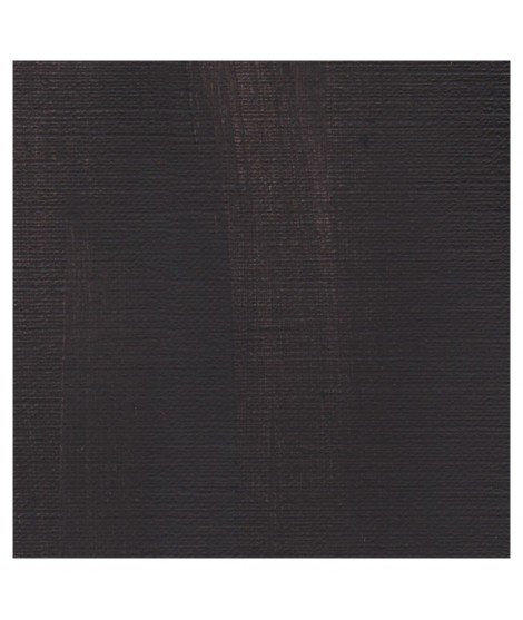
A warm deep black. Mixed with yellow ochre we obtain a warm black and mixed with ultramarine blue it produces a cold black.
€8.45
Ametrine is a quartz born from the union of citrine and amethyst which gives it very interesting reflections. I was inspired by the color of this mineral to create this purple which joins "other colors of the 2022 "Happy Precious Year" collection.
This color is grainy and iridescent.
€6.95
Very beautiful violet with a beautiful purity of tone. It belongs to the overseas family. Its particularity is to naturally granulate.
€6.95
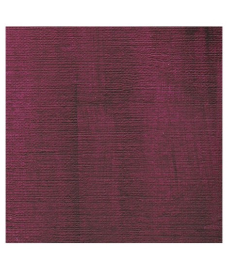
Dark mauve which can be lightened with Isaro pink and nuanced with overseas blue for example.
€6.95
Very beautiful light mauve mono pigmentary and therefore a beautiful purity of tone. It can be lightened with Isaro pink and darkens with ultramarine blue or phthalo blue for example.
€6.95
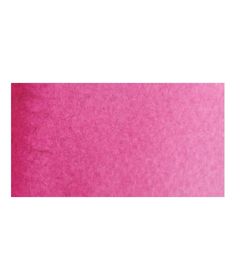
This color can be used as the primary color. It is a bright pink, which forms with the yellows beautiful oranges and with the blue magnificent mauves.
€6.95
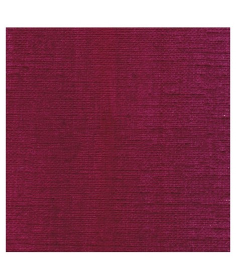
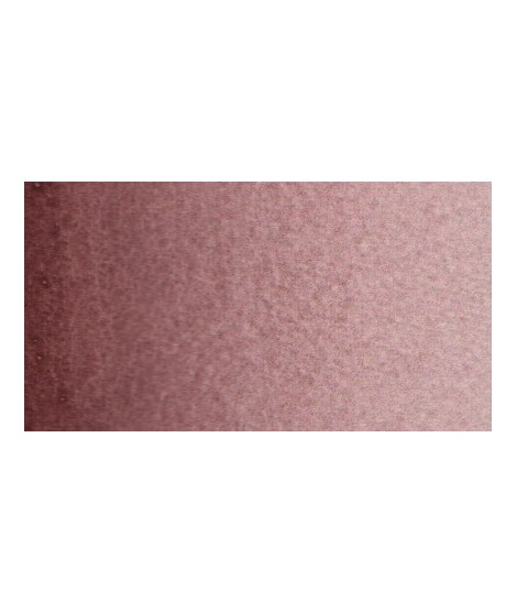
Your dark purple tending to brown. Pure it is of an interesting tone. It also comes in composite colors like sepia brown or Van Dijck brown.

€5.30
This black can be useful for certain mixtures. For example, by combining it with ultramarine blue to obtain Payne gray or mauve iron oxide or Venice red to obtain Van Dijck brown, if we add a little ocher we obtain the sepia color.