
€7.40
Active filters
€12.00
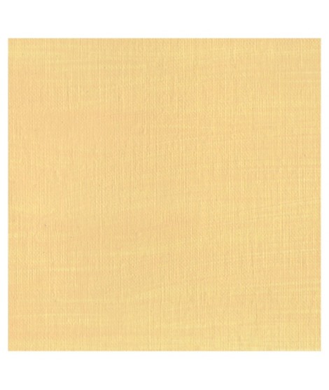
Pinkish yellow, very close to Naples yellow.Â
Perfect for skin tones.
€24.00
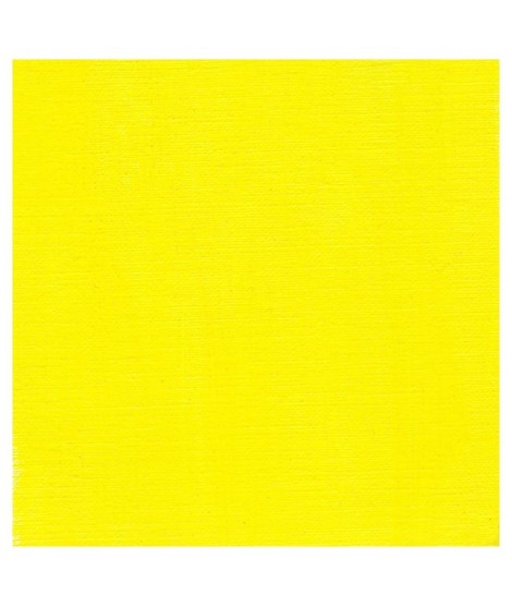
This bright, highly luminous yellow is an ultra-pure colour with a touch of green. This cadmium yellow lemon is a yellow much akin to primary yellow.Â

€7.40
A very discreet and interesting pink especially to bring softness to certain floral compositions.
€16.00
This is a luminous transparent yellow with the same hue of the cadmium yellow light. Mixed with phtalo green,phtalo blue or indantrene blue, we obtain a interesant range of Transparent green. Mixed with titanium white the result is a very luminous and Opaque light yellow.

€8.45
Rose navré et légèrement orange
€24.00
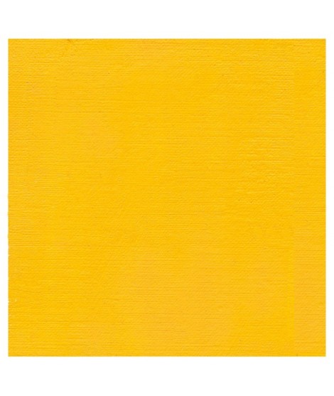
A bright, very luminous yellow with an ultra-pure colour.
A warm yellow wich is very precious to produce warm mixes of all kinds
€8.45
€16.00
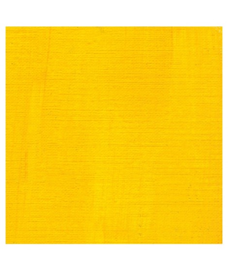
It's a good glazing colour with a beautifull orangey yellow hue.

€7.40
€24.00
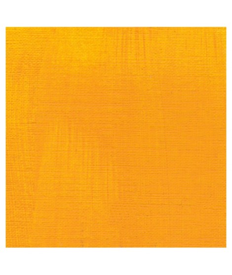
This is a rich orangey yellow. It's the warmest yellow cadmium. This yellow is , such as all cadmium, bright, very luminous and an ultra-pure colour.

€7.40

€6.55
Magnificent bright color. Indispensable in many mixtures and in particular to compose, with the blues, a large number of mauves.
With the reds it makes it possible to obtain "cherry red" or "raspberry red" tones.
In my opinion, it is one of the very useful colors on a palette.
€16.00
A beautifull and luminous red. More pinkish than the red cadmium light

€7.40
A very discreet and interesting pink especially to bring softness to certain floral compositions.

€8.45
Rose lĂ©gèrement nacrĂ©Â
€26.00
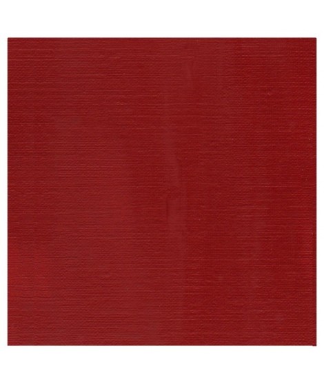
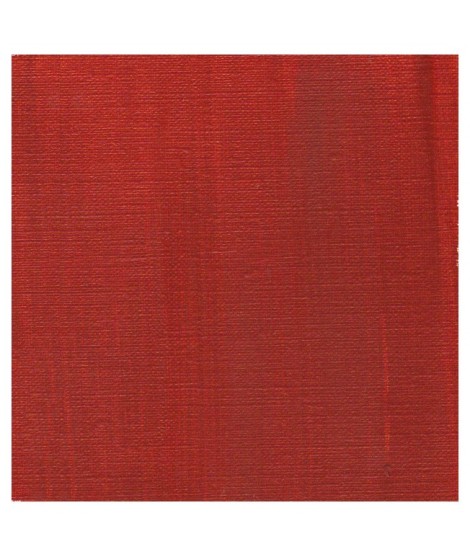
This pure and luminous bright red has a high tint power.
Cadmium red is obtained by replacing a tiny percentage of sulphur with selenium when combined with cadmium. This red has a very pure hue. So, mixed with white his undertone is red and not pink such as with organic reds.
€16.00
€26.00
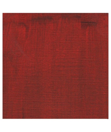
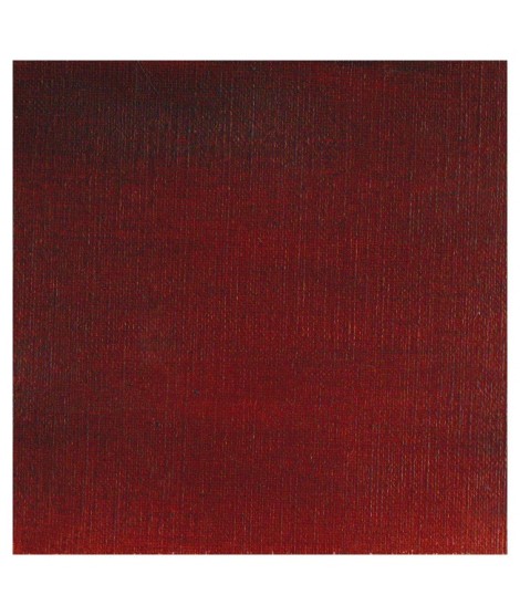
The deepest of the Isaro's cadmium range. This red have a slight hint of violet in its undertone
€16.00
A dark red brown, very beautifull for glazings.
€12.00
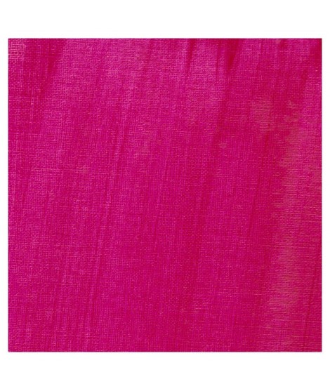
This cool pink with a bluish undertone is very useful. Mixed with the blues, this quinacridone rose produces a rich range of violet. So Isaro pink is perfect to paint flowers. It's also a good glazing colour.Â
€8.00
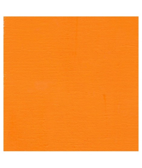
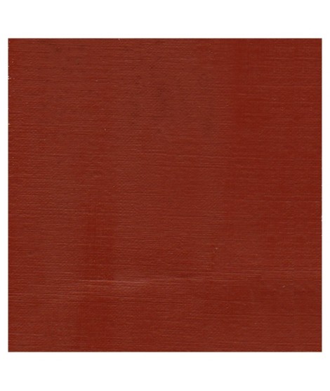
A rich and earthy burnt orange
€8.00
A rich and earthy burnt orange.
€16.00
This Transparent iron oxyde with a orangey undertone is excellent for producing luminous and warm glazes.
€16.00
It's a strong neutral black.
€8.00
A warm deep black. Mixed with yellow ochre we obtain a warm black and mixed with ultramarine blue it produces a cold black.

€6.95
Magnificent red which turns brown. More transparent than burnt Sienna and less grainy, it can perfectly replace it for watercolorists who prefer a more transparent and reddish tone.
€8.45
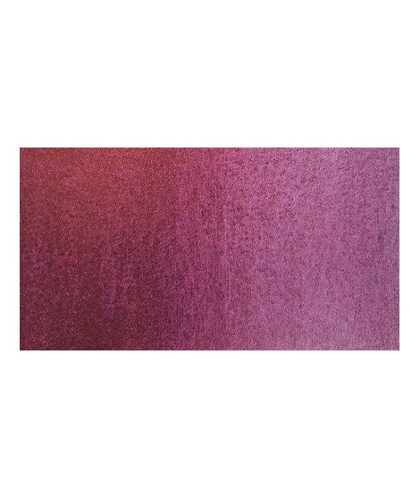
Ametrine is a quartz born from the union of citrine and amethyst which gives it very interesting reflections. I was inspired by the color of this mineral to create this purple which joins "other colors of the 2022 "Happy Precious Year" collection.
This color is grainy and iridescent.

€7.40
Very beautiful dark red tending to burgundy.
€6.95
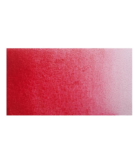
This very beautiful red whose shade can make one think of madder lacquer does not have the lack of stability over time.
With a little burnt umber, it is perfectly darkened and you easily get a crimson alizarin shade.

€6.95
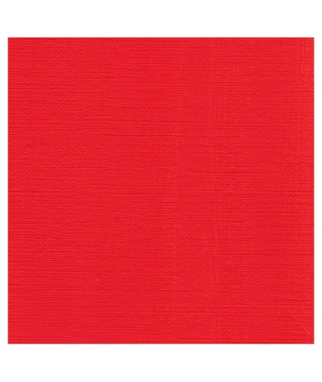
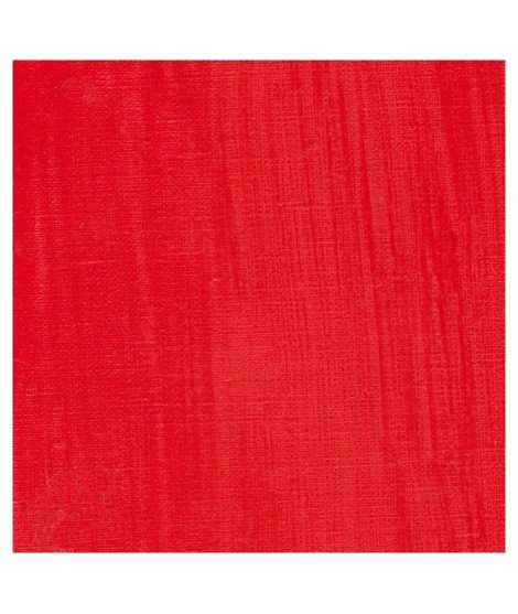
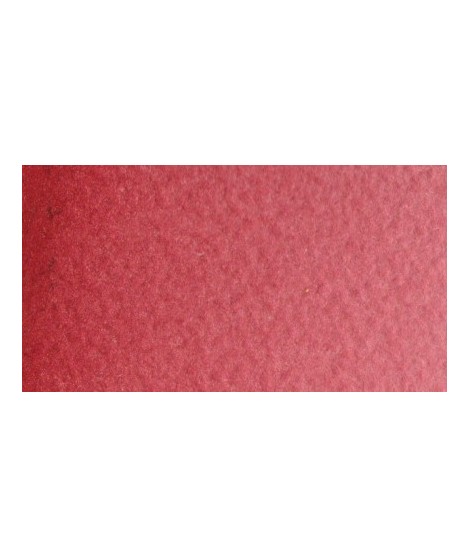
Very beautiful red, lively and bright with an underlying note colder than Scarlett red.

€6.95
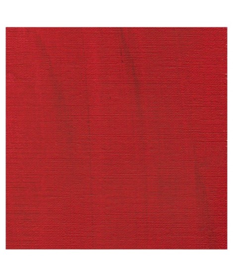
One of the flagship colors at Isaro. Very popular with watercolorists, it is one of the essentials on a palette.

€7.40
This red has a great purity of tone. It draws very slightly on the yellow.

€6.95
Warm and bright yellow, very beautiful in wash for example.

€6.95
You can add light Isaro yellow to a range of Indian yellow.