
€7.40
Active filters

€7.40
A very discreet and interesting pink especially to bring softness to certain floral compositions.

€8.45
Rose navré et légèrement orange
€8.45

€7.40

€7.40

€6.55
Magnificent bright color. Indispensable in many mixtures and in particular to compose, with the blues, a large number of mauves.
With the reds it makes it possible to obtain "cherry red" or "raspberry red" tones.
In my opinion, it is one of the very useful colors on a palette.
€16.00
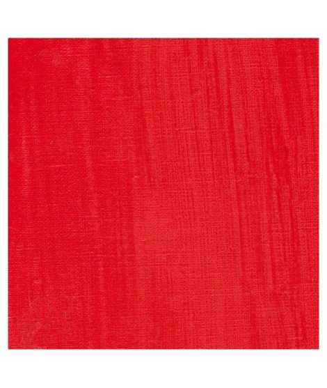
A beautifull and luminous red. More pinkish than the red cadmium light

€7.40
A very discreet and interesting pink especially to bring softness to certain floral compositions.

€8.45
Rose lĂ©gèrement nacrĂ©Â
€26.00
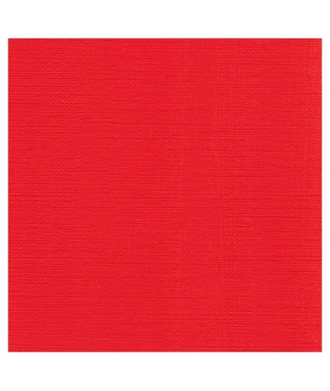
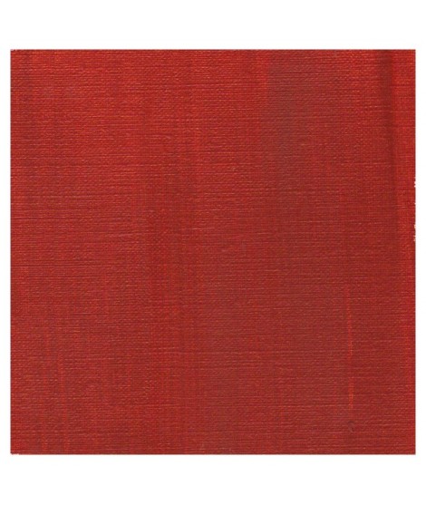
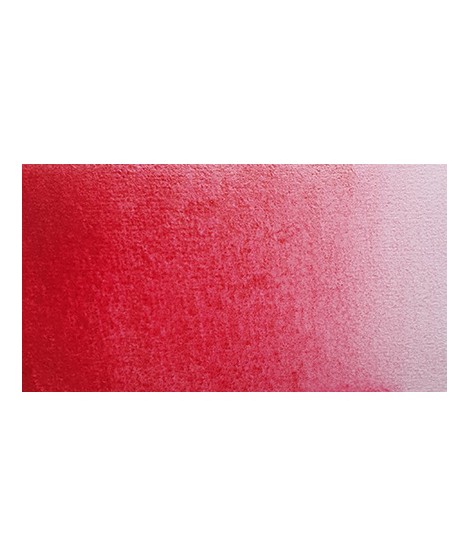
This pure and luminous bright red has a high tint power.
Cadmium red is obtained by replacing a tiny percentage of sulphur with selenium when combined with cadmium. This red has a very pure hue. So, mixed with white his undertone is red and not pink such as with organic reds.

€8.45
Golden color, to be used for certain highlights.
€16.00
€26.00
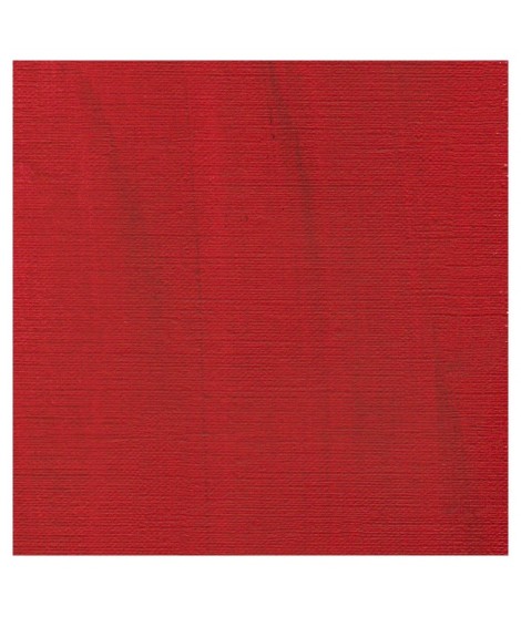
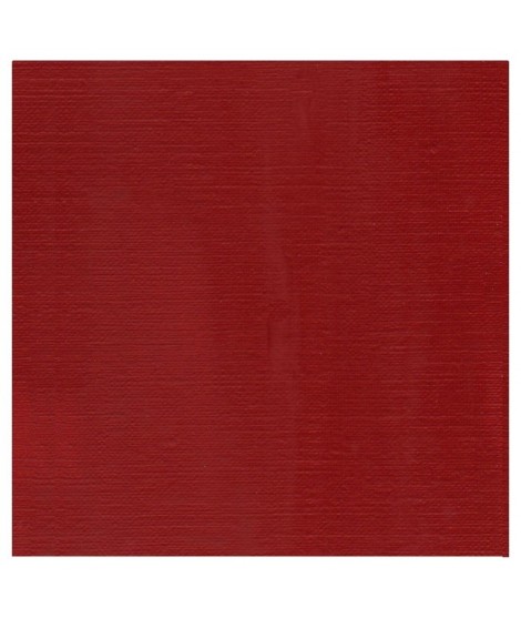
The deepest of the Isaro's cadmium range. This red have a slight hint of violet in its undertone

€8.45
Turquoise légèrement irisé
€16.00
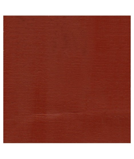
A dark red brown, very beautifull for glazings.
€12.00
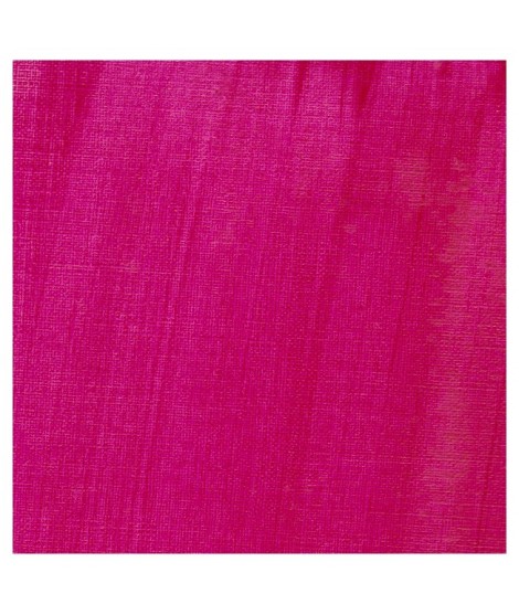
This cool pink with a bluish undertone is very useful. Mixed with the blues, this quinacridone rose produces a rich range of violet. So Isaro pink is perfect to paint flowers. It's also a good glazing colour.Â
€8.00
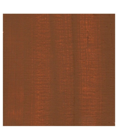
A rich and earthy burnt orange
€8.00
A rich and earthy burnt orange.
€8.00
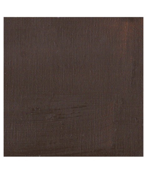
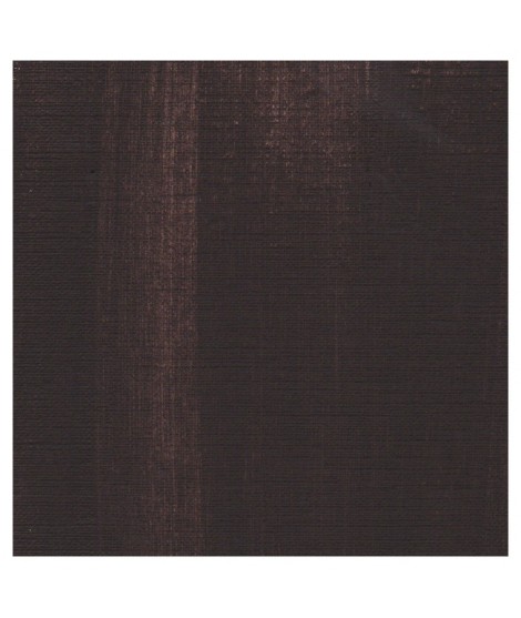
This deep and intense reddish brown has a high drying power. So, is excellent for making preliminary sketches with a very diluated first coat.
€8.00
This yellowish-brown is darker than yellow ochre but has the same undertone. This natural earth produces outstanding transparency effect.
€8.00
This natural iron oxide is a fine rather cold brown with a greenish undertone.
€8.00
This deep and intense reddish brown has a high drying power. So, is excellent for making preliminary sketches with a very diluated first coat.

€8.45
The flagship color in metallic colors. Very appreciated by watercolorists looking for fantasy.
€16.00
This Transparent iron oxyde with a orangey undertone is excellent for producing luminous and warm glazes.
€8.00
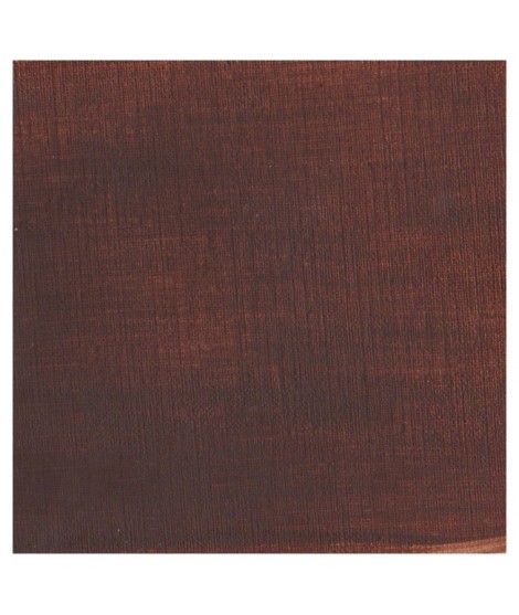
A reddish brown more Opaque and intense than the burnt umber
€8.00
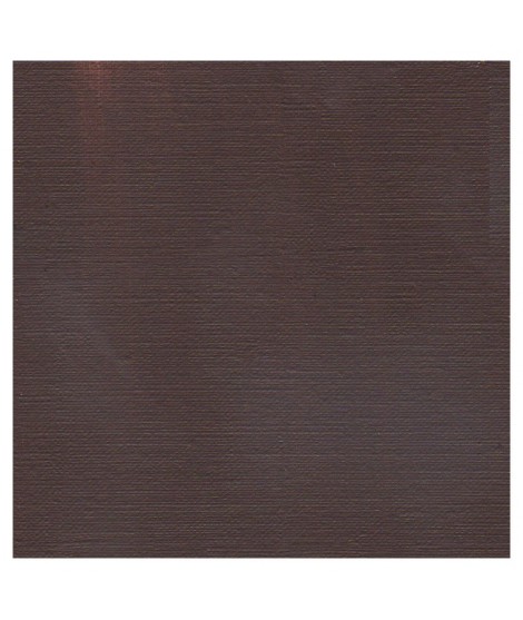
A intense cold brown with a violet shade.
€8.00
A beautifull warm brown with a yellowish undertone

€8.45
The base of this color is a very soft blue. Diluted well, this color gives a bluish white ideal for painting snow for example.

€8.45
The base of this color is a silver gray.
The addition of a silver pearlescent pigment strengthens the silvery note of the shade and brings to mind a pewter gray.

€6.95
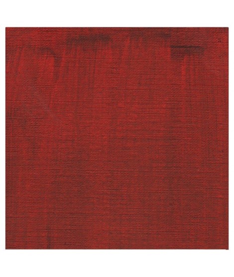
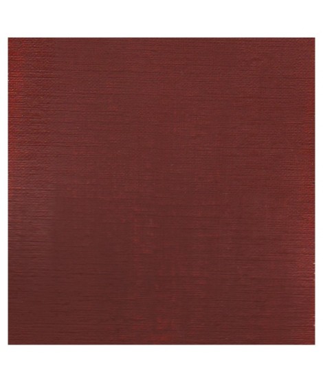
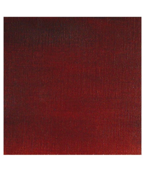
Magnificent red which turns brown. More transparent than burnt Sienna and less grainy, it can perfectly replace it for watercolorists who prefer a more transparent and reddish tone.

€8.45
It is a metallic color. This tone is singular, with a mauve shade dotted with copper highlights.
€3.95
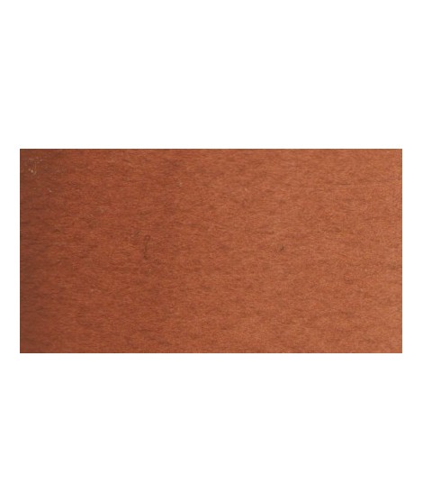
Very beautiful brown, slightly red. For watercolorists looking for uniform washes, March Brown may be preferred over natural soils.

€7.40
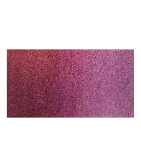
This red is part of the range of metallic colors. Like all the metallic colors that I have created, its nuance is singular.
€8.45
Ametrine is a quartz born from the union of citrine and amethyst which gives it very interesting reflections. I was inspired by the color of this mineral to create this purple which joins "other colors of the 2022 "Happy Precious Year" collection.
This color is grainy and iridescent.