
€7.40
Active filters

€7.40
A very discreet and interesting pink especially to bring softness to certain floral compositions.

€8.45
Rose navré et légèrement orange
€8.45

€7.40

€7.40

€6.55
Magnificent bright color. Indispensable in many mixtures and in particular to compose, with the blues, a large number of mauves.
With the reds it makes it possible to obtain "cherry red" or "raspberry red" tones.
In my opinion, it is one of the very useful colors on a palette.
€16.00
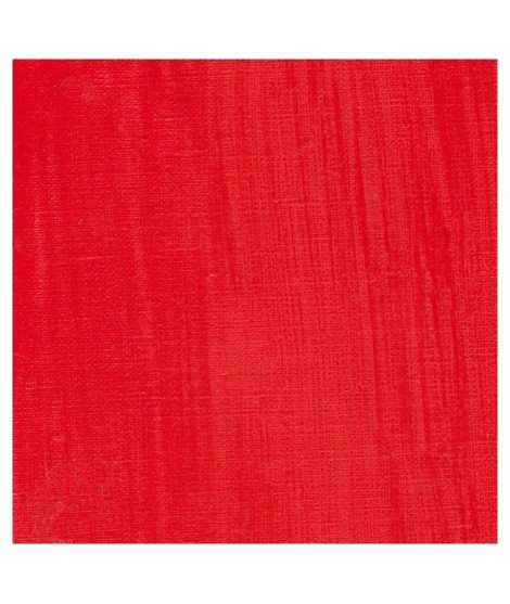
A beautifull and luminous red. More pinkish than the red cadmium light

€7.40
A very discreet and interesting pink especially to bring softness to certain floral compositions.
€26.00
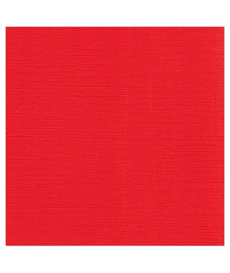
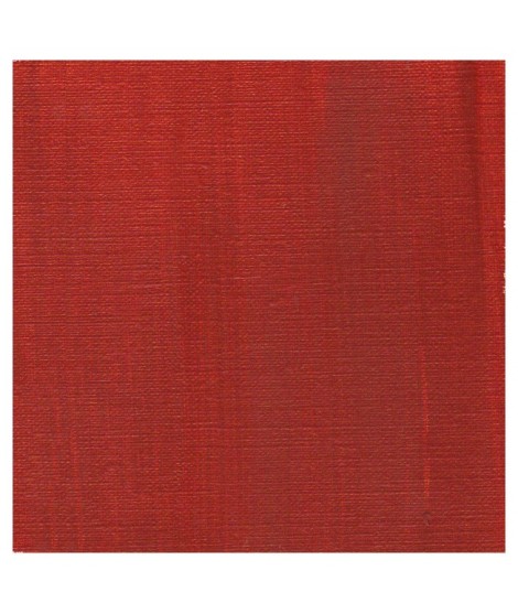
This pure and luminous bright red has a high tint power.
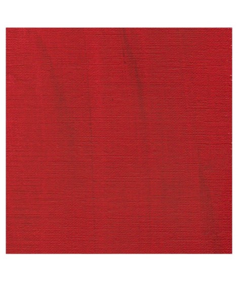
Cadmium red is obtained by replacing a tiny percentage of sulphur with selenium when combined with cadmium. This red has a very pure hue. So, mixed with white his undertone is red and not pink such as with organic reds.

€8.45
Rose lĂ©gèrement nacrĂ©Â
€16.00

€8.45
Golden color, to be used for certain highlights.
€26.00
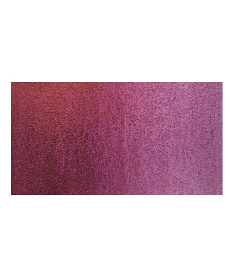
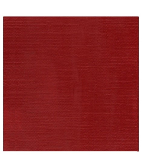
The deepest of the Isaro's cadmium range. This red have a slight hint of violet in its undertone
€16.00
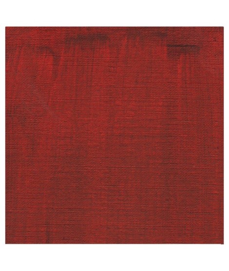
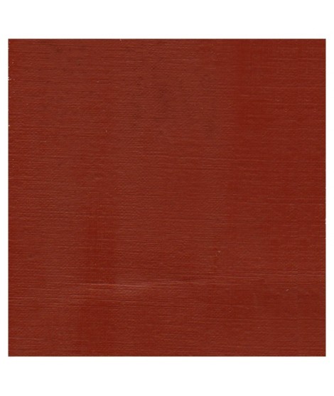
A dark red brown, very beautifull for glazings.

€8.45
Turquoise légèrement irisé

€8.45
€12.00
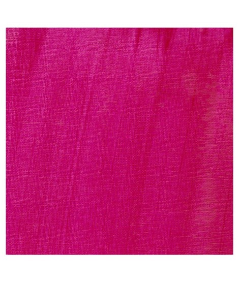
This cool pink with a bluish undertone is very useful. Mixed with the blues, this quinacridone rose produces a rich range of violet. So Isaro pink is perfect to paint flowers. It's also a good glazing colour.Â

€6.95
Based on blue and phthalo green, this turquoise is nuanced at will with blue or green.

€6.55
Bright and vivid green that can also be created on the palette by mixing using phthalo green PG7 or phthalo green yellow shade PG36; To the latter, lemon cadmium yellow or light cadmium yellow is added or, if it is desired to retain more transparency, light Isaro yellow PY154.

€6.55
Very beautiful green, turning blue. When mixed with phthalo blue, it gives a very nice range of turquoises. With the yellows to obtain a very wide range of greens. With the earths of earthy greens and with the burnt umber a dark green.

€6.55
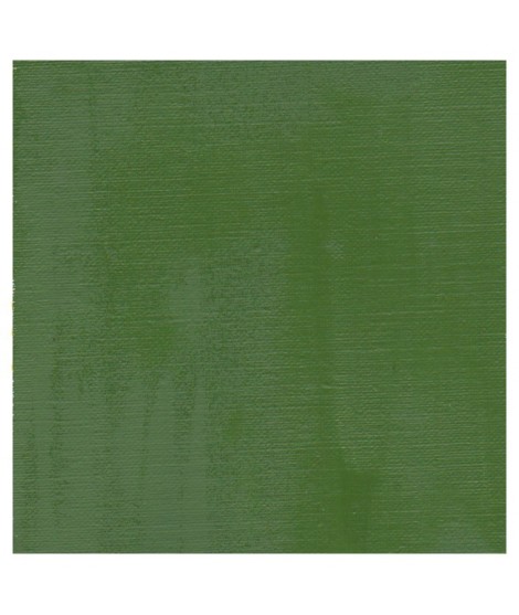
Green useful for landscapes in particular. Maybe nuanced with phthalo green or yellows.

€7.40
Very beautiful green tone less dynamic than phthalo green. The emerald green is bluish.

€6.55
Very beautiful earthy green and mono pigment.

€6.95
Magnificent bright green with an underlying shade of yellow.

€6.95
Vert Sapin
PG36 + PY165

€6.95

€7.40
Singular and grainy green color.
€8.00
A rich and earthy burnt orange
€8.00
A rich and earthy burnt orange.
€14.00
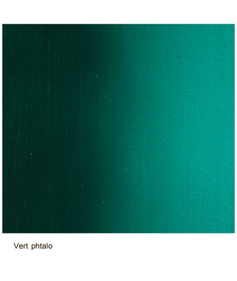
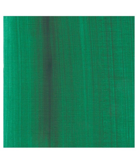
This vivid and strong bluish greens a good staple green to produce a large range of greens.
€22.00
This earthy green is very Opaque.Â
Mixed with yellows or earths (ochre, umber, sienna), it produces a usefull range of greens for the landscapists
€12.00
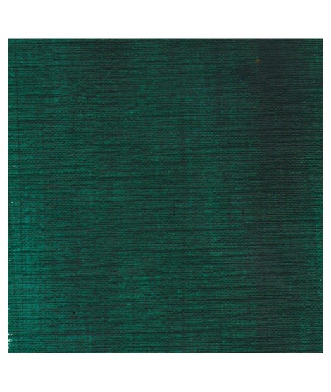
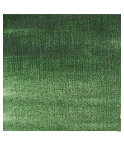
It's a deep brownish green.
€12.00
It's a beautifull green useful in producing glazes when diluted.
€26.00
This colour is more Transparent and less dull than chromium oxide green. Emerald green produces splendidly luminous green when mixed with cadmium yellow. Landscapists and some portraitists prefer it because his undertone is less vivid than the phtalo green.