
€7.40
Active filters

€7.40
A very discreet and interesting pink especially to bring softness to certain floral compositions.

€8.45
Rose navré et légèrement orange
€8.45

€7.40

€7.40

€6.55
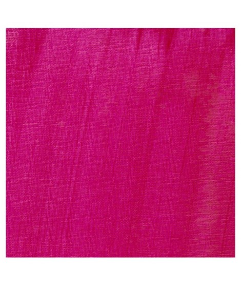
Magnificent bright color. Indispensable in many mixtures and in particular to compose, with the blues, a large number of mauves.
With the reds it makes it possible to obtain "cherry red" or "raspberry red" tones.
In my opinion, it is one of the very useful colors on a palette.

€7.40
A very discreet and interesting pink especially to bring softness to certain floral compositions.

€8.45
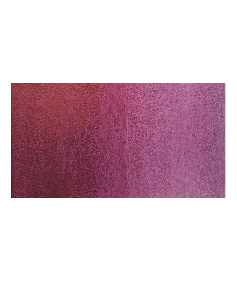
Rose lĂ©gèrement nacrĂ©Â

€8.45
Golden color, to be used for certain highlights.

€8.45
Turquoise légèrement irisé
€12.00
This cool pink with a bluish undertone is very useful. Mixed with the blues, this quinacridone rose produces a rich range of violet. So Isaro pink is perfect to paint flowers. It's also a good glazing colour.Â

€8.45
The flagship color in metallic colors. Very appreciated by watercolorists looking for fantasy.

€8.45
The base of this color is a very soft blue. Diluted well, this color gives a bluish white ideal for painting snow for example.

€8.45
The base of this color is a silver gray.
The addition of a silver pearlescent pigment strengthens the silvery note of the shade and brings to mind a pewter gray.
€16.00
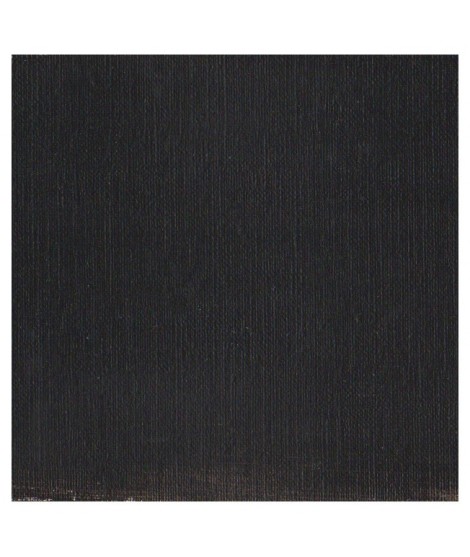
It's a strong neutral black.
€8.00
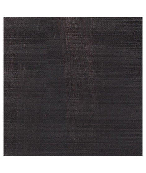
A warm deep black. Mixed with yellow ochre we obtain a warm black and mixed with ultramarine blue it produces a cold black.

€8.45
It is a metallic color. This tone is singular, with a mauve shade dotted with copper highlights.

€7.40
This red is part of the range of metallic colors. Like all the metallic colors that I have created, its nuance is singular.

€8.45
This color is one of the metallic colors that I created to give a little fantasy to the palette of artists who want it.

€5.30
This black can be useful for certain mixtures. For example, by combining it with ultramarine blue to obtain Payne gray or mauve iron oxide or Venice red to obtain Van Dijck brown, if we add a little ocher we obtain the sepia color.