€26.00
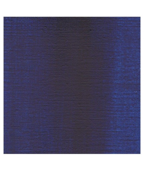
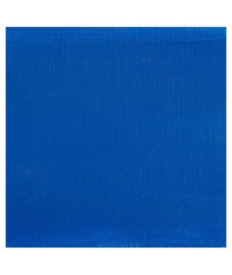
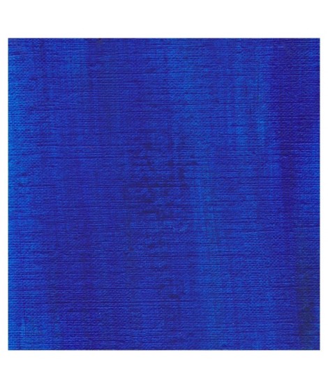
The bluest of the blues. This blue becomes even brighter when mixed with whites. Very useful for mixing.
Active filters
The bluest of the blues. This blue becomes even brighter when mixed with whites. Very useful for mixing.
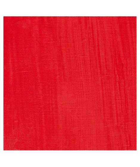
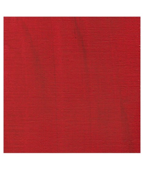
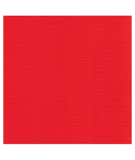
This pure and luminous bright red has a high tint power.
Cadmium red is obtained by replacing a tiny percentage of sulphur with selenium when combined with cadmium. This red has a very pure hue. So, mixed with white his undertone is red and not pink such as with organic reds.
The deepest of the Isaro's cadmium range. This red have a slight hint of violet in its undertone
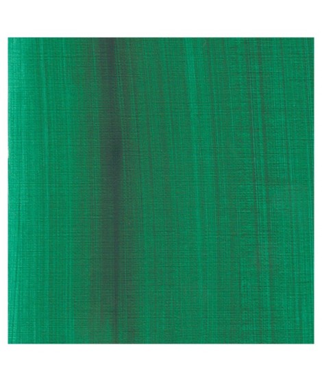
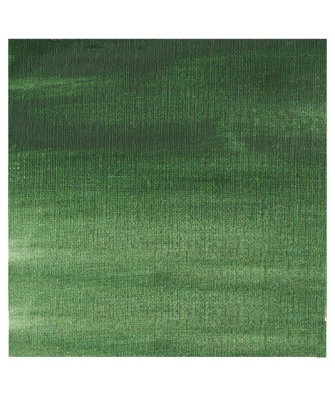
This colour is more Transparent and less dull than chromium oxide green. Emerald green produces splendidly luminous green when mixed with cadmium yellow. Landscapists and some portraitists prefer it because his undertone is less vivid than the phtalo green.
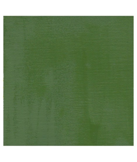
This earthy green is very Opaque.Â
Mixed with yellows or earths (ochre, umber, sienna), it produces a usefull range of greens for the landscapists
A deep and intense blue with a touch of red.
This Transparent iron oxyde with a orangey undertone is excellent for producing luminous and warm glazes.
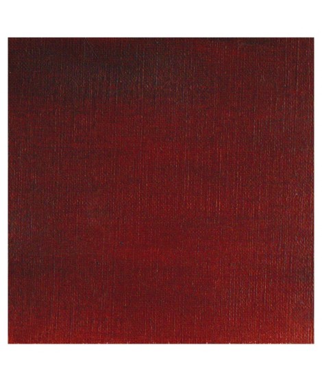
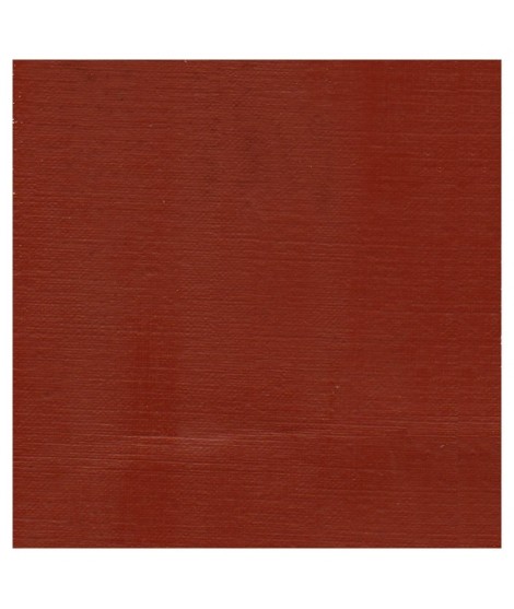
A dark red brown, very beautifull for glazings.
A beautifull and luminous red. More pinkish than the red cadmium light
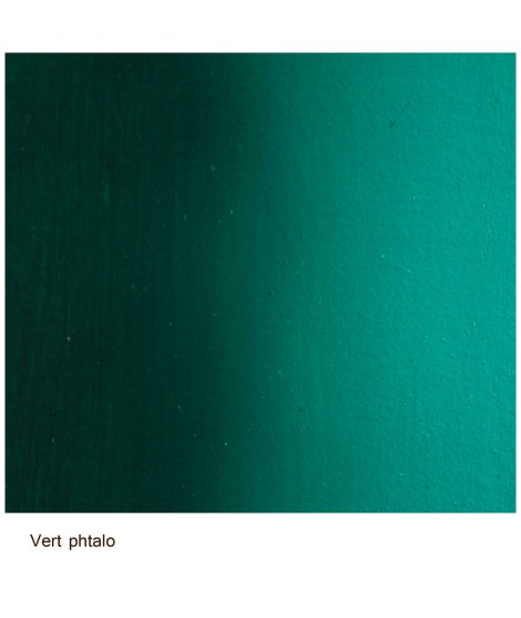
This vivid and strong bluish greens a good staple green to produce a large range of greens.
A beautifull an luminous blue.
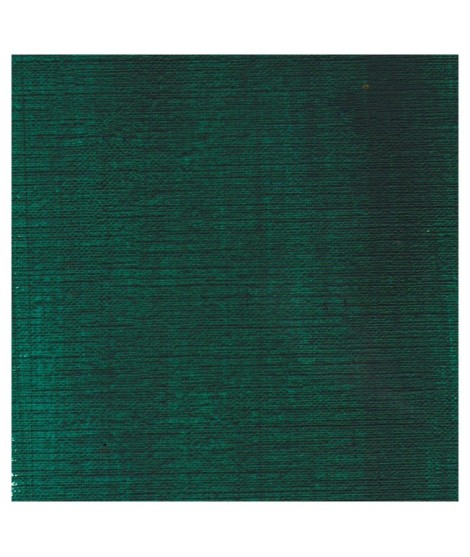
It's a deep brownish green.
It's a beautifull green useful in producing glazes when diluted.
A strong blue. Mixed with the phtalo green, it produces a luminous range of turquoise.
I was inspired by the surprising reflections of a semi-precious stone: apatite.
This blue is grainy and iridescent. It is part of the 2022 Happy Precious Year collection.
Ametrine is a quartz born from the union of citrine and amethyst which gives it very interesting reflections. I was inspired by the color of this mineral to create this purple which joins "other colors of the 2022 "Happy Precious Year" collection.
This color is grainy and iridescent.
I was inspired by the surprising reflections of a semi-precious stone: apatite.
This blue is grainy and iridescent. It is part of the 2022 Happy Precious Year collection.
Un bleu à la teinte unique et légèrement iridescent. Il ravira les aquarellistes qui apprécient les effets et la granulation.
A rich and earthy burnt orange.
A splendid blue with a rich purple blue undertone.
This blue is a mixture of 3 pigments. Very useful for painting marine
A rich and earthy burnt orange
This splendid greenish blue is used to create very beautiful range of greens.
This blue is very drier-reactive, accelerating the drying power of the colours with which it is mixed. Tint power is extremely strong.
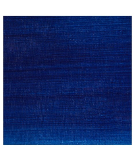
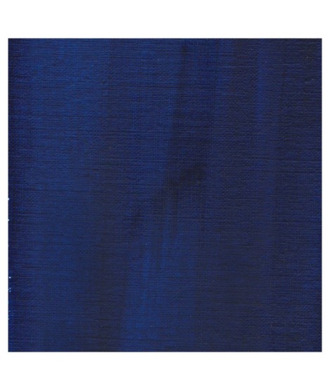
Real cobalt blue with a great purity of tone. Bright and close to primary blue. We can define it as the most blue of blues because it does not draw on green (like Prussian blue) or red (like overseas).
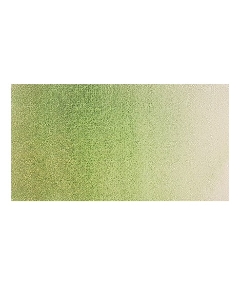
Singular and grainy green color.
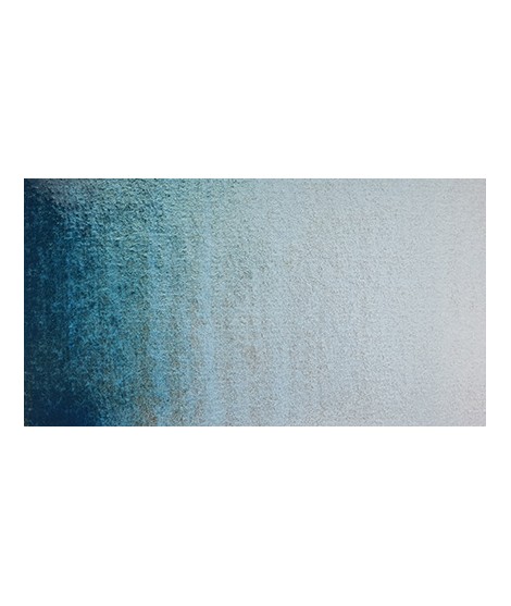
Very beautiful light blue, which pulls slightly towards green. Particularly suitable for working the sky.
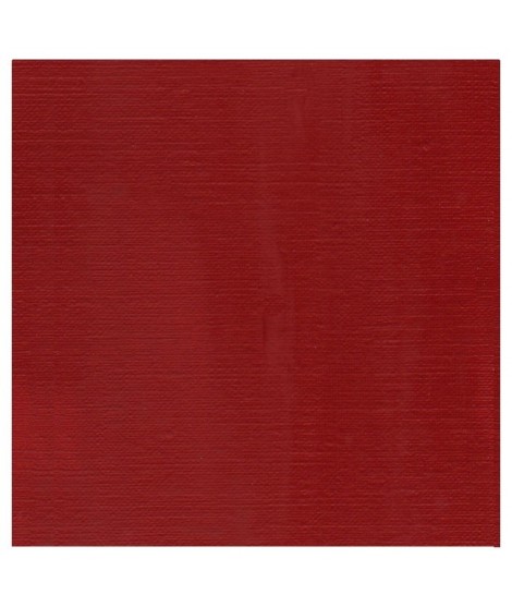
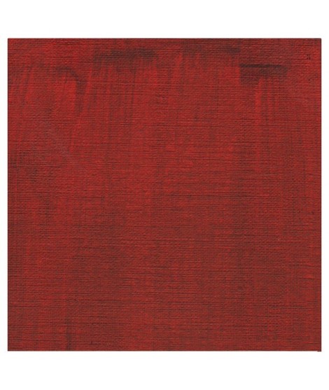
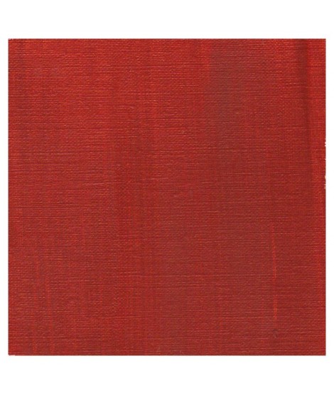
Very beautiful dark red tending to burgundy.
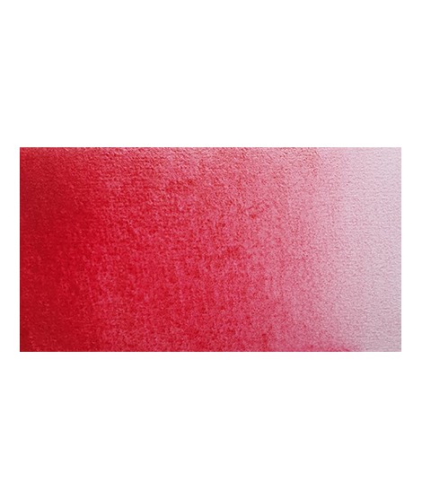
This red has a great purity of tone. It draws very slightly on the yellow.
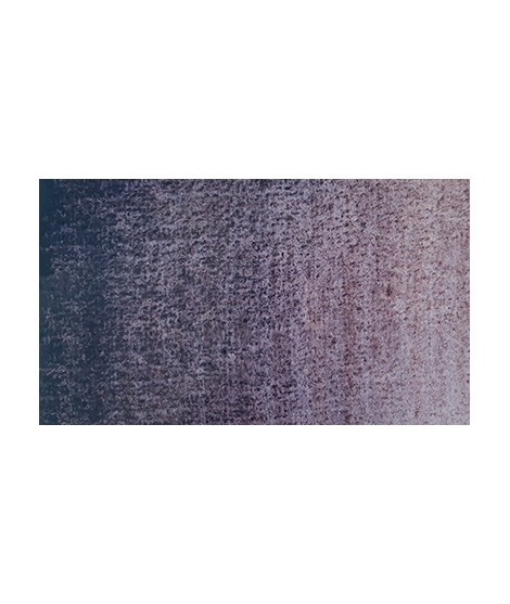
Gorgeous unique shade of gray blue.
Very beautiful green tone less dynamic than phthalo green. The emerald green is bluish.
This very beautiful red whose shade can make one think of madder lacquer does not have the lack of stability over time.
With a little burnt umber, it is perfectly darkened and you easily get a crimson alizarin shade.
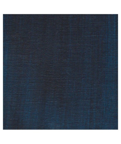
It is a dark blue, which corresponds to a dark reddish blue. It is ideal for nuancing cool colors like violets and blues by giving them more depth. Also useful for forming greens, especially with chartreuse yellow.