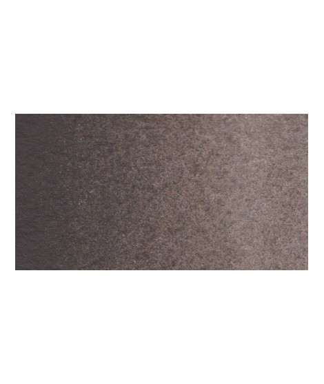
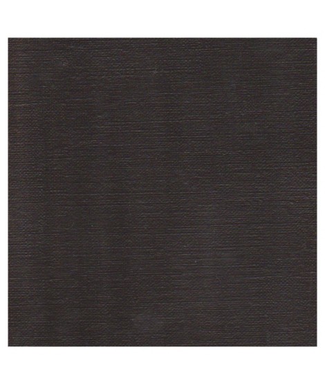
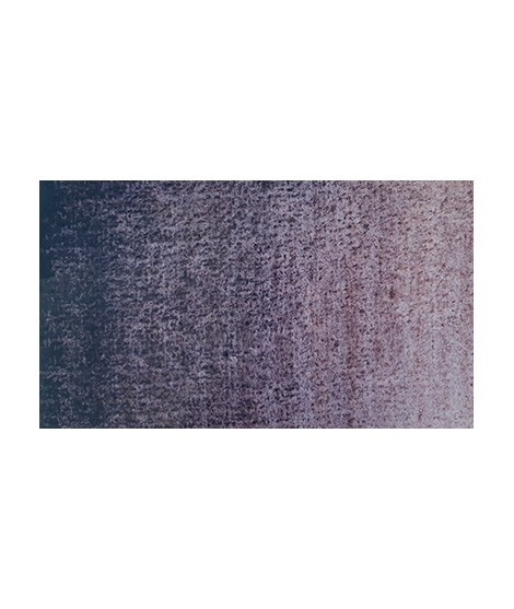
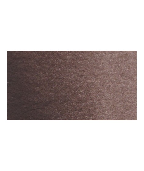
Dark brown tending to mauve. It can also be easily obtained on the palette by mixing smoke black with mauve iron oxide. To work on its shade, you can add mauve iron oxide to it. By combining it with yellow ocher or natural Siena earth you get sepia brown.
Active filters
- Mono-pigmented:: yes
Beautiful subtle very light gray for light shadows and drapes.
Very nice cold, deep gray, turning blue. Useful as a contrast color.
Very beautiful very dark brown, almost black. Very useful for contrasts. Can be obtained on the palette by mixing smoke black with mauve iron oxide and ocher or natural Sienna.
Green useful for landscapes in particular. Maybe nuanced with phthalo green or yellows.
Bright and vivid green that can also be created on the palette by mixing using phthalo green PG7 or phthalo green yellow shade PG36; To the latter, lemon cadmium yellow or light cadmium yellow is added or, if it is desired to retain more transparency, light Isaro yellow PY154.
Rose navré et légèrement orange
Rose légèrement nacréÂ
Vert Sapin
PG36 + PY165
You can add light Isaro yellow to a range of Indian yellow.
Warm and bright yellow, very beautiful in wash for example.
Based on blue and phthalo green, this turquoise is nuanced at will with blue or green.
This red is part of the range of metallic colors. Like all the metallic colors that I have created, its nuance is singular.
Singular and grainy green color.
A very discreet and interesting pink especially to bring softness to certain floral compositions.
Gorgeous unique shade of gray blue.
This blue is a mixture of 3 pigments. Very useful for painting marine
A beautifull warm brown with a yellowish undertone
A deep cool blue black.
Turquoise légèrement irisé
Un bleu à la teinte unique et légèrement iridescent. Il ravira les aquarellistes qui apprécient les effets et la granulation.
Rose nacré clair.
Un rose très clair et légèrement nacré
This color is one of the metallic colors that I created to give a little fantasy to the palette of artists who want it.
The flagship color in metallic colors. Very appreciated by watercolorists looking for fantasy.
I was inspired by the surprising reflections of a semi-precious stone: apatite.
This blue is grainy and iridescent. It is part of the 2022 Happy Precious Year collection.
I was inspired by the surprising reflections of a semi-precious stone: apatite.
This blue is grainy and iridescent. It is part of the 2022 Happy Precious Year collection.
It is a metallic color. This tone is singular, with a mauve shade dotted with copper highlights.
The base of this color is a silver gray.
The addition of a silver pearlescent pigment strengthens the silvery note of the shade and brings to mind a pewter gray.