€3.95
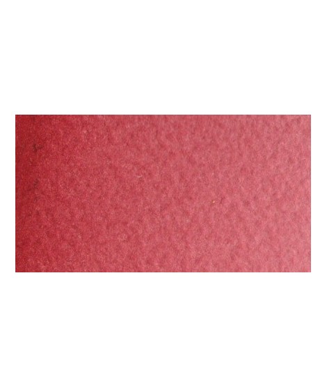
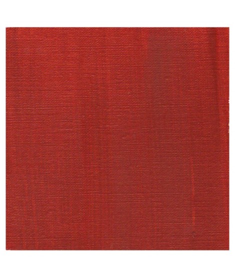
Very good brick red tone, with an underlying pink shade. Despite its relative opacity, this well-mastered color is appreciated by watercolorists.
Active filters
Very good brick red tone, with an underlying pink shade. Despite its relative opacity, this well-mastered color is appreciated by watercolorists.
Very beautiful brick red, with an underlying shade of orange-yellow.
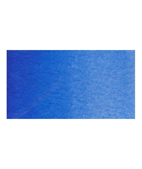
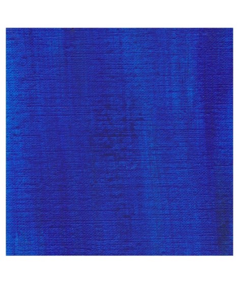
Magnificent blue with an underlying shade of mauve. Very useful for composing magnificent mauves, especially with quinacridones like Isaro pink for example.
With black or burnt sienna, it makes it possible to obtain very beautiful Payne grays and with burnt umber to create a beautiful indigo.
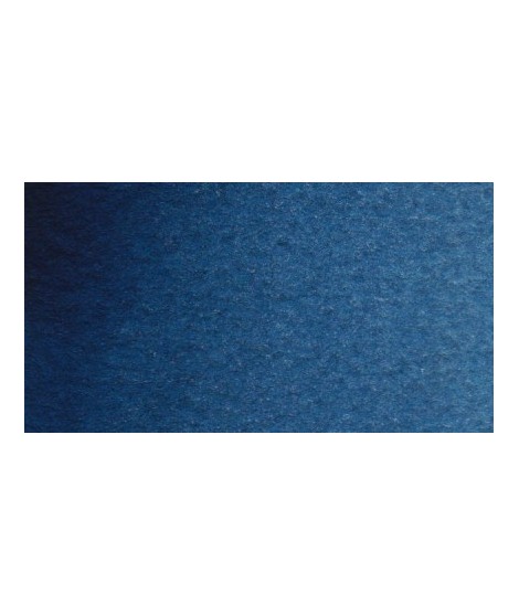
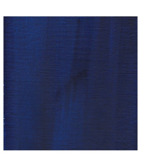
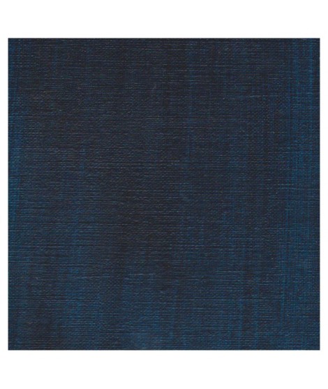
Close shade of natural indigo.
Dark blue with an underlying green hue. This blue is very useful for creating greens, it is actually the blue of greens.
Very beautiful earthy green and mono pigment.
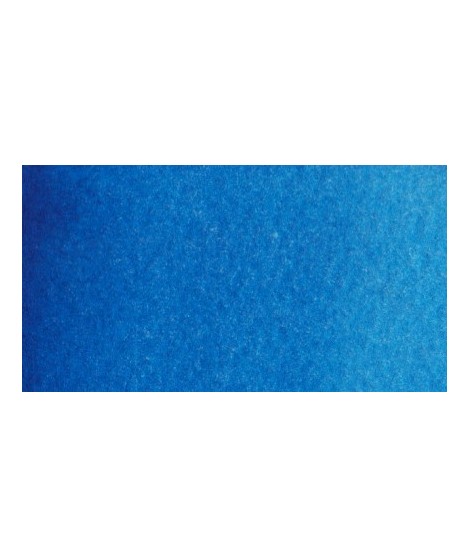
Very beautiful blue with a shade having an underlying green tone. Very bright and frank.
With phthalo green it forms very beautiful turquoise. With the yellows of the beautiful greens. With the ocher of the more muted greens and with the pink or the purple Isaro a beautiful range of mauves.
Green useful for landscapes in particular. Maybe nuanced with phthalo green or yellows.
Bright and vivid green that can also be created on the palette by mixing using phthalo green PG7 or phthalo green yellow shade PG36; To the latter, lemon cadmium yellow or light cadmium yellow is added or, if it is desired to retain more transparency, light Isaro yellow PY154.
Very beautiful green, turning blue. When mixed with phthalo blue, it gives a very nice range of turquoises. With the yellows to obtain a very wide range of greens. With the earths of earthy greens and with the burnt umber a dark green.
Vert Sapin
PG36 + PY165
Magnificent red which turns brown. More transparent than burnt Sienna and less grainy, it can perfectly replace it for watercolorists who prefer a more transparent and reddish tone.
This very beautiful red whose shade can make one think of madder lacquer does not have the lack of stability over time.
With a little burnt umber, it is perfectly darkened and you easily get a crimson alizarin shade.
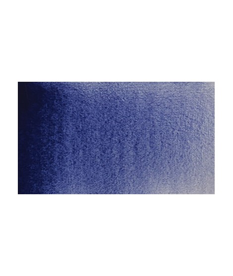
It is a dark blue, which corresponds to a dark reddish blue. It is ideal for nuancing cool colors like violets and blues by giving them more depth. Also useful for forming greens, especially with chartreuse yellow.
One of the flagship colors at Isaro. Very popular with watercolorists, it is one of the essentials on a palette.
Based on blue and phthalo green, this turquoise is nuanced at will with blue or green.
Magnificent bright green with an underlying shade of yellow.
Very beautiful red, lively and bright with an underlying note colder than Scarlett red.
Very beautiful green tone less dynamic than phthalo green. The emerald green is bluish.
Real cobalt blue with a great purity of tone. Bright and close to primary blue. We can define it as the most blue of blues because it does not draw on green (like Prussian blue) or red (like overseas).
Singular and grainy green color.
Very beautiful light blue, which pulls slightly towards green. Particularly suitable for working the sky.
Very beautiful dark red tending to burgundy.
This red has a great purity of tone. It draws very slightly on the yellow.
Gorgeous unique shade of gray blue.
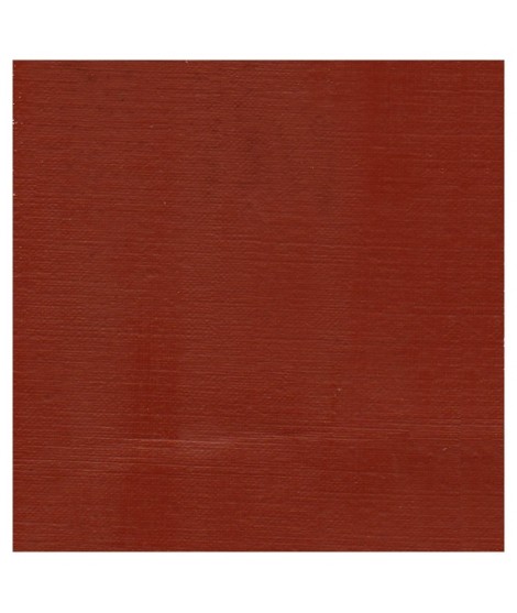
A rich and earthy burnt orange
This splendid greenish blue is used to create very beautiful range of greens.
This blue is very drier-reactive, accelerating the drying power of the colours with which it is mixed. Tint power is extremely strong.
A rich and earthy burnt orange.
A splendid blue with a rich purple blue undertone.
This blue is a mixture of 3 pigments. Very useful for painting marine