€3.95
Very beautiful yellow, earthy and bright. Very useful on the palette.
Active filters
Very beautiful yellow, earthy and bright. Very useful on the palette.
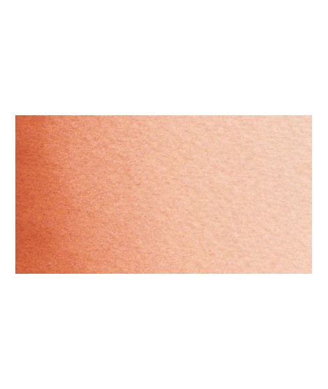
Very good brick red tone, with an underlying pink shade. Despite its relative opacity, this well-mastered color is appreciated by watercolorists.
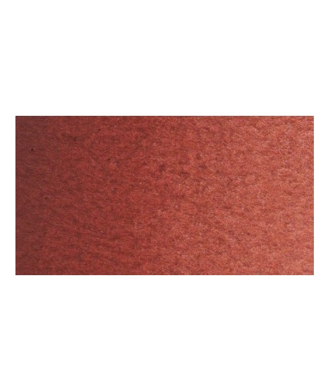
Very beautiful brick red, with an underlying shade of orange-yellow.
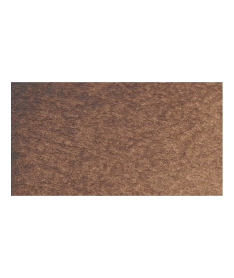
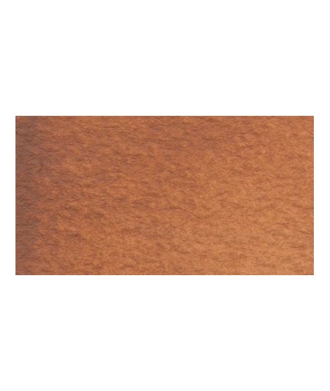
Very beautiful brown, slightly red. For watercolorists looking for uniform washes, March Brown may be preferred over natural soils.
Very nice cold, deep gray, turning blue. Useful as a contrast color.
This black can be useful for certain mixtures. For example, by combining it with ultramarine blue to obtain Payne gray or mauve iron oxide or Venice red to obtain Van Dijck brown, if we add a little ocher we obtain the sepia color.
Very beautiful brown with a green shade that characterizes real natural shade earth. I draw attention to the fact that this gray earth is naturally very little coloring.
Very interesting Color to create "pastel" touch by mixing with other colors.
Close shade of natural indigo.
Magnificent blue with an underlying shade of mauve. Very useful for composing magnificent mauves, especially with quinacridones like Isaro pink for example.
With black or burnt sienna, it makes it possible to obtain very beautiful Payne grays and with burnt umber to create a beautiful indigo.
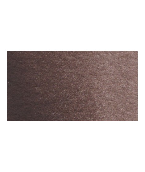
Dark and warm brown. Interesting color for dark your shades.
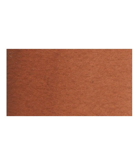
Very beautiful earth turning red. This color is, in my opinion, essential on the palette as it is rich in mixture. With blues, for example, burnt Sienna is a nice range of grays. With the reds, she creates "brick red" colors.
Beautiful earthy yellow.
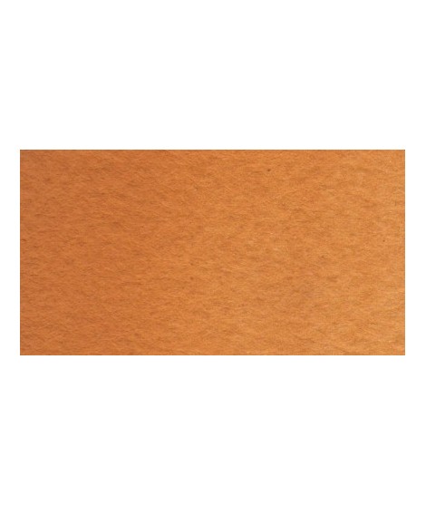
Earthy orange but nevertheless bright.
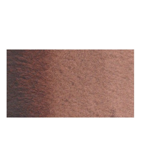
Dark brown tending to mauve. It can also be easily obtained on the palette by mixing smoke black with mauve iron oxide. To work on its shade, you can add mauve iron oxide to it. By combining it with yellow ocher or natural Siena earth you get sepia brown.
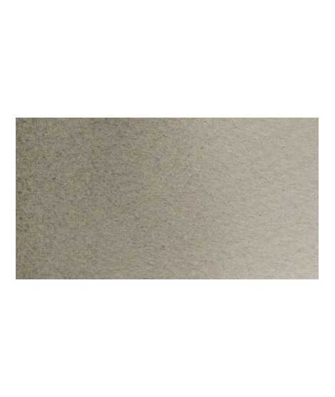
Beautiful subtle very light gray for light shadows and drapes.
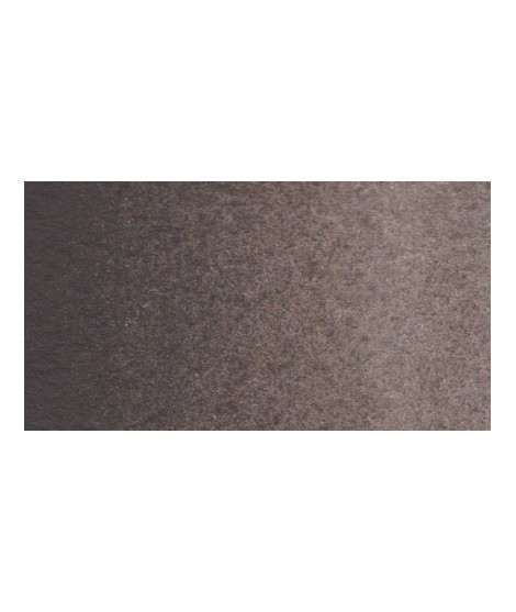
Very beautiful very dark brown, almost black. Very useful for contrasts. Can be obtained on the palette by mixing smoke black with mauve iron oxide and ocher or natural Sienna.
A very discreet and interesting pink especially to bring softness to certain floral compositions.
A very soft, slightly pastel yellow.
Green useful for landscapes in particular. Maybe nuanced with phthalo green or yellows.
Bright and vivid green that can also be created on the palette by mixing using phthalo green PG7 or phthalo green yellow shade PG36; To the latter, lemon cadmium yellow or light cadmium yellow is added or, if it is desired to retain more transparency, light Isaro yellow PY154.
Very beautiful earthy green and mono pigment.
Your dark purple tending to brown. Pure it is of an interesting tone. It also comes in composite colors like sepia brown or Van Dijck brown.
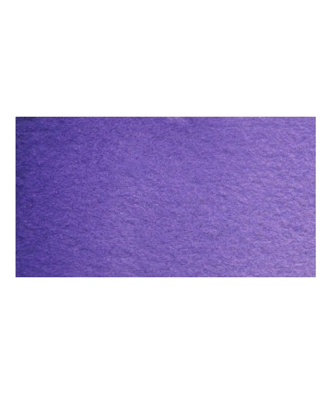
Very beautiful violet with a beautiful purity of tone. It belongs to the overseas family. Its particularity is to naturally granulate.
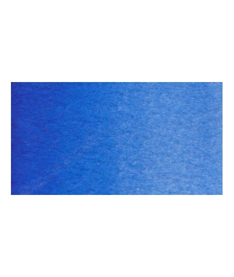
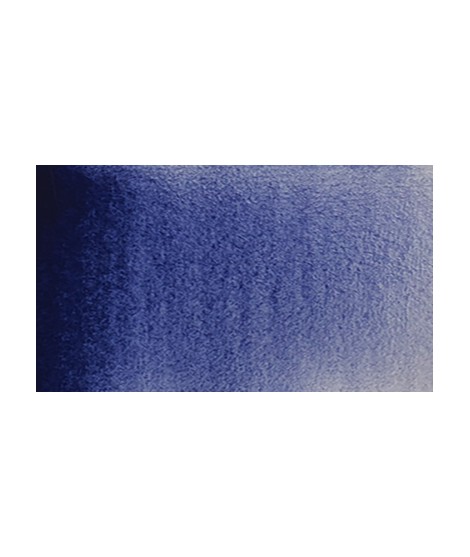
Real cobalt blue with a great purity of tone. Bright and close to primary blue. We can define it as the most blue of blues because it does not draw on green (like Prussian blue) or red (like overseas).
Very beautiful green tone less dynamic than phthalo green. The emerald green is bluish.
A very discreet and interesting pink especially to bring softness to certain floral compositions.
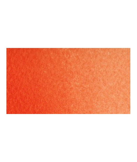
Bright orange. This color is monopigmentary which gives it a very beautiful purity of tone. Due to its greater transparency, pyrrole orange may be preferred.
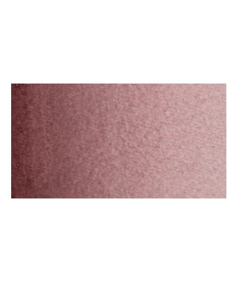
Very beautiful dark red tending to burgundy.
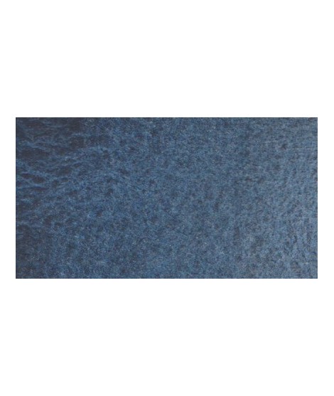
Gorgeous unique shade of gray blue.
This red has a great purity of tone. It draws very slightly on the yellow.