Burnt Sienna in watercolor is a warm, earthy pigment that adds depth, richness, and versatility to any composition, perfect for shadows, landscapes, and natural tones.
Active filters
Dark and warm bBurnt Umber Watercolor - An Essential Hue for Your Artistic Palette
Burnt umber offers deep, warm tones, perfect for creating subtle shadows, natural textures, and rich, warm atmospheres.rown. Interesting color for dark your shades.
Rose d’Outremer – Softness Under the Brush
PR259 - Semi-transparent - Granular
The Rose d'Outremer is a very soft and subtly textured hue that captivates with its gentleness. This pigment, a rose with slightly violet undertones, offers a rich chromatic quality, making it ideal for floral compositions.k especially to bring softness to certain floral compositions.
Powder Pink – Softness and Elegance
PR122 + PW6:1 – Opaque – Non-granulating
Powder Pink is a delicate and refined shade, perfect for adding a touch of softness and subtlety to watercolor compositions. Inspired by the pastel hues of flower petals or the velvety feel of antique fabric, this slightly muted pink is ideal for romantic atmospheres and gentle light effects.
Van Dijck Brown - A Rich Color
PR101 + PBk6 - Opaque - Non-granulating
Van Dijck brown is a rich and deep pigment, perfect for creating subtle shadows and warm atmospheres, while offering great lightfastness and excellent coverage.
Raw Umber - An Authentic Color
PBr7 - Semi-transparent - Granulating
Raw Umber is ideal for creating soft shadows and earthy tones while adding depth and harmony.with a green shade that characterizes real natural shade earth. I draw attention to the fact that this gray earth is naturally very little coloring.
Sepia – The Softness of a Warm Brown
PBK11 + PBK6 + PR101 + PY42 - Opaque - Non-granulating
Sepia, with its warm and deep tones, is ideal for creating shadows or earthy hues, realistic portraits, monochromes, and natural landscapes.tiful very dark brown, almost black. Very useful for contrasts. Can be obtained on the palette by mixing smoke black with mauve iron oxide and ocher or natural Sienna.
 Mars Brown light - A Versatile Brown
PR101 - Opaque - Non-granulating
Mars Brown Light is a rich, earthy hue, highly valued in painting for its versatility and ability to create natural, deep tones. Derived from iron oxide, this pigment offers a warm color and is extremely stable. For watercolor artists seeking uniform washes, Mars Brown may be preferred over natural earth pigments.Â
Beverly Pink – An Exceptional Pearlescent Pink
PR122 + Pearlescent – Semi-transparent – Non-granulating
Beverly rose is a luminous and refined shade that combines the delicacy of pink with a subtle pearlescent glow. Its transparent texture and slight iridescence make it an ideal choice for adding softness and brilliance to floral compositions, twilight skies, or pearly effects in portraits.
Coral Rose – The Harmony of Floral Compositions
PW6 + P073 + PV19 – Opaque – Non-granulating
Coral Rose is a vibrant and warm shade that lies between pink and orange, evoking the glow of sunsets and the delicacy of tropical flowers. This luminous pigment brings a touch of freshness and energy to artworks while remaining soft and harmonious.ry discreet and interesting pink especially to bring softness to certain floral compositions.
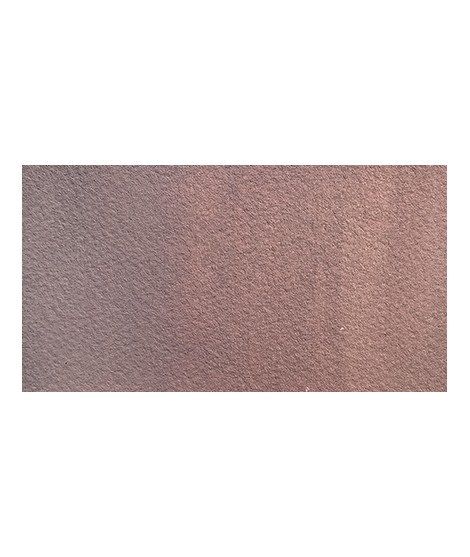
Powdery Beige – The Elegance of Softness
PW6 + PR122 + PY42 – Opaque – Non-granulating
Powdery Beige is a delicate and subtle shade, perfect for adding softness and luminosity to watercolor works. Crafted from a refined blend of pigments, it offers a warm, slightly rosy hue, making it ideal for skin tones.
In watercolor, this shade is particularly valuable for portrait painting, allowing for smooth and refined skin tone transitions. Combined with a touch of Burnt Sienna or Isaro Rose, it enhances complexions with natural depth and delicacy.
Shaded Beige – For Softly Shadowing Light Skin Tones
PW6 + PY42 + PR264 + PBk31 – Opaque – Non-granulating
Shaded Beige is a soft and nuanced color, striking a perfect balance between warmth and neutrality. Composed of earthy pigments, it offers great versatility in watercolor, especially for painting skin tones and delicate shadows.
Pinkish Beige – Subtlety and Radiance of Skin
PW6 + PR264 + PY42 – Opaque – Non-granulating
Pinkish beige is a delicate and subtle hue that combines the warmth of beige with a hint of pink, offering a soft and natural color. Ideal for skin tones in watercolor, it allows for finely rendered variations, from fair complexions to deeper shadows, by blending it with other pigments.