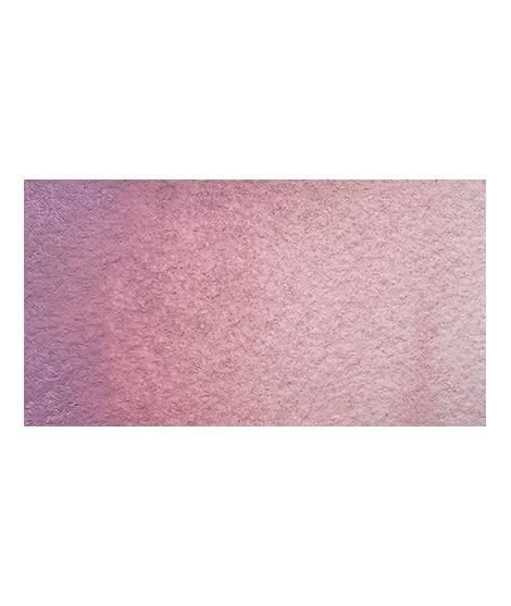
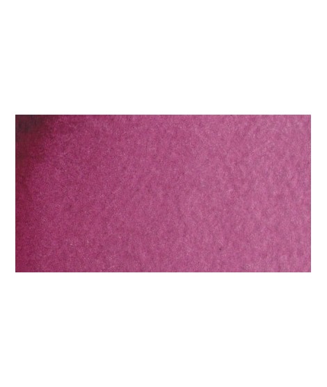
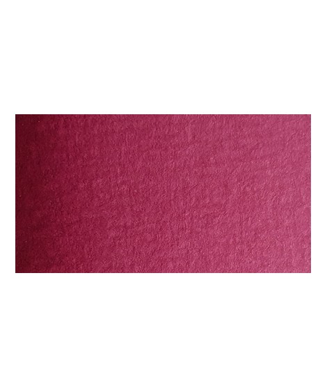
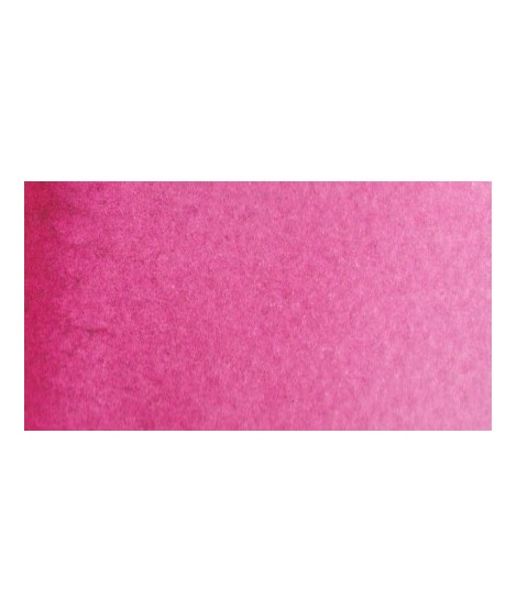
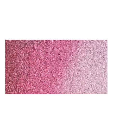
Golden color, to be used for certain highlights.
Active filters
Rose légèrement nacréÂ
The base of this color is a silver gray.
The addition of a silver pearlescent pigment strengthens the silvery note of the shade and brings to mind a pewter gray.
This color is one of the metallic colors that I created to give a little fantasy to the palette of artists who want it.
Turquoise légèrement irisé
Rose navré et légèrement orange
The base of this color is a very soft blue. Diluted well, this color gives a bluish white ideal for painting snow for example.
It is a metallic color. This tone is singular, with a mauve shade dotted with copper highlights.
Magnificent bright green with an underlying shade of yellow.
You can add light Isaro yellow to a range of Indian yellow.
Bright yellow with great purity of tone.
This red is part of the range of metallic colors. Like all the metallic colors that I have created, its nuance is singular.
A very discreet and interesting pink especially to bring softness to certain floral compositions.
Magnificent yellow-orange very bright and a beautiful purity of tone.
Its more marked opacity than organic yellows (Isaro Yellow light, dark and Indian) can hold back its use, however well mastered it is quite magnificent. It is undeniably one of the colors in my range that appeals to the majority of watercolorists.
Very beautiful green tone less dynamic than phthalo green. The emerald green is bluish.
Magnificent pale yellow with underlying shade of green, very bright and bright yellow.
A very essential greenish yellow. It allows a wide range of rich and surprising mixes.
Based on blue and phthalo green, this turquoise is nuanced at will with blue or green.
Your dark purple tending to brown. Pure it is of an interesting tone. It also comes in composite colors like sepia brown or Van Dijck brown.
Vert Sapin
PG36 + PY165
Very beautiful light mauve mono pigmentary and therefore a beautiful purity of tone. It can be lightened with Isaro pink and darkens with ultramarine blue or phthalo blue for example.
Dark mauve which can be lightened with Isaro pink and nuanced with overseas blue for example.
Warm yellow with a shade close to dark cadmium yellow. With a beautiful transparency, this yellow allows you to obtain a very beautiful range of greens with Prussian blue and Phthalo blue for example. With yellow phthalo green (PG36) it allows you to easily compose the shades "bladder green" and "Hoocker green"
Pale yellow with a slightly darker shade than lemon cadmium yellow. Luminous and bright yellow. Useful as primary yellow. It is one of the essential colors on the palette of a watercolorist.
This color can be used as the primary color. It is a bright pink, which forms with the yellows beautiful oranges and with the blue magnificent mauves.
Warm and bright yellow, very beautiful in wash for example.
Magnificent bright color. Indispensable in many mixtures and in particular to compose, with the blues, a large number of mauves.
With the reds it makes it possible to obtain "cherry red" or "raspberry red" tones.
In my opinion, it is one of the very useful colors on a palette.
Bright and vivid green that can also be created on the palette by mixing using phthalo green PG7 or phthalo green yellow shade PG36; To the latter, lemon cadmium yellow or light cadmium yellow is added or, if it is desired to retain more transparency, light Isaro yellow PY154.
Green useful for landscapes in particular. Maybe nuanced with phthalo green or yellows.