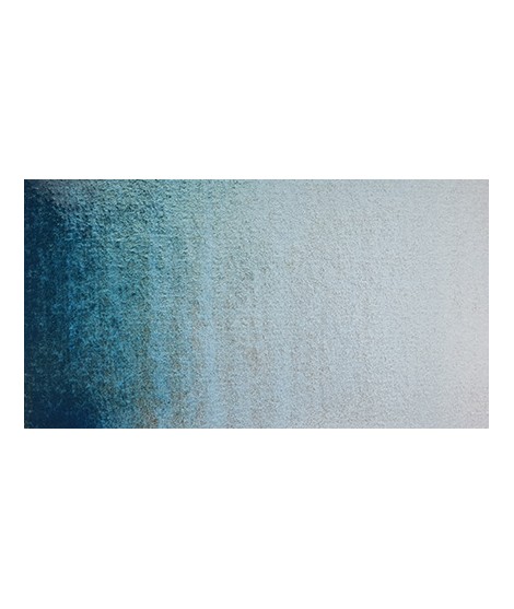
I was inspired by the surprising reflections of a semi-precious stone: apatite.
This blue is grainy and iridescent. It is part of the 2022 Happy Precious Year collection.
Active filters
I was inspired by the surprising reflections of a semi-precious stone: apatite.
This blue is grainy and iridescent. It is part of the 2022 Happy Precious Year collection.
Ametrine is a quartz born from the union of citrine and amethyst which gives it very interesting reflections. I was inspired by the color of this mineral to create this purple which joins "other colors of the 2022 "Happy Precious Year" collection.
This color is grainy and iridescent.
Ametrine is a quartz born from the union of citrine and amethyst which gives it very interesting reflections. I was inspired by the color of this mineral to create this purple which joins "other colors of the 2022 "Happy Precious Year" collection.
This color is grainy and iridescent.
I was inspired by the surprising reflections of a semi-precious stone: apatite.
This blue is grainy and iridescent. It is part of the 2022 Happy Precious Year collection.
Rose navré et légèrement orange
Un bleu à la teinte unique et légèrement iridescent. Il ravira les aquarellistes qui apprécient les effets et la granulation.
Rose légèrement nacréÂ
Bright yellow with great purity of tone.
Very beautiful light blue, which pulls slightly towards green. Particularly suitable for working the sky.
Real cobalt blue with a great purity of tone. Bright and close to primary blue. We can define it as the most blue of blues because it does not draw on green (like Prussian blue) or red (like overseas).
Gorgeous unique shade of gray blue.
Very beautiful dark red tending to burgundy.
A very discreet and interesting pink especially to bring softness to certain floral compositions.
This red has a great purity of tone. It draws very slightly on the yellow.
A very discreet and interesting pink especially to bring softness to certain floral compositions.
Magnificent yellow-orange very bright and a beautiful purity of tone.
Its more marked opacity than organic yellows (Isaro Yellow light, dark and Indian) can hold back its use, however well mastered it is quite magnificent. It is undeniably one of the colors in my range that appeals to the majority of watercolorists.
Magnificent pale yellow with underlying shade of green, very bright and bright yellow.
Very beautiful violet with a beautiful purity of tone. It belongs to the overseas family. Its particularity is to naturally granulate.
Dark mauve which can be lightened with Isaro pink and nuanced with overseas blue for example.
Warm and bright yellow, very beautiful in wash for example.
It is a dark blue, which corresponds to a dark reddish blue. It is ideal for nuancing cool colors like violets and blues by giving them more depth. Also useful for forming greens, especially with chartreuse yellow.
Your dark purple tending to brown. Pure it is of an interesting tone. It also comes in composite colors like sepia brown or Van Dijck brown.
Pale yellow with a slightly darker shade than lemon cadmium yellow. Luminous and bright yellow. Useful as primary yellow. It is one of the essential colors on the palette of a watercolorist.
A very essential greenish yellow. It allows a wide range of rich and surprising mixes.
You can add light Isaro yellow to a range of Indian yellow.
One of the flagship colors at Isaro. Very popular with watercolorists, it is one of the essentials on a palette.
Magnificent red which turns brown. More transparent than burnt Sienna and less grainy, it can perfectly replace it for watercolorists who prefer a more transparent and reddish tone.