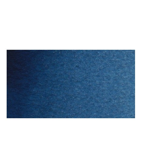
It is a dark blue, which corresponds to a dark reddish blue. It is ideal for nuancing cool colors like violets and blues by giving them more depth. Also useful for forming greens, especially with chartreuse yellow.
Active filters
Your dark purple tending to brown. Pure it is of an interesting tone. It also comes in composite colors like sepia brown or Van Dijck brown.
Pale yellow with a slightly darker shade than lemon cadmium yellow. Luminous and bright yellow. Useful as primary yellow. It is one of the essential colors on the palette of a watercolorist.
A very essential greenish yellow. It allows a wide range of rich and surprising mixes.
A very soft, slightly pastel yellow.
Very beautiful blue with a shade having an underlying green tone. Very bright and frank.
With phthalo green it forms very beautiful turquoise. With the yellows of the beautiful greens. With the ocher of the more muted greens and with the pink or the purple Isaro a beautiful range of mauves.
Magnificent bright color. Indispensable in many mixtures and in particular to compose, with the blues, a large number of mauves.
With the reds it makes it possible to obtain "cherry red" or "raspberry red" tones.
In my opinion, it is one of the very useful colors on a palette.
Dark blue with an underlying green hue. This blue is very useful for creating greens, it is actually the blue of greens.
Magnificent blue with an underlying shade of mauve. Very useful for composing magnificent mauves, especially with quinacridones like Isaro pink for example.
With black or burnt sienna, it makes it possible to obtain very beautiful Payne grays and with burnt umber to create a beautiful indigo.
Close shade of natural indigo.
Very good brick red tone, with an underlying pink shade. Despite its relative opacity, this well-mastered color is appreciated by watercolorists.
Very beautiful brick red, with an underlying shade of orange-yellow.
Very beautiful yellow, earthy and bright. Very useful on the palette.