€8.45
This color is one of the metallic colors that I created to give a little fantasy to the palette of artists who want it.
Active filters
This color is one of the metallic colors that I created to give a little fantasy to the palette of artists who want it.
The base of this color is a very soft blue. Diluted well, this color gives a bluish white ideal for painting snow for example.
The flagship color in metallic colors. Very appreciated by watercolorists looking for fantasy.
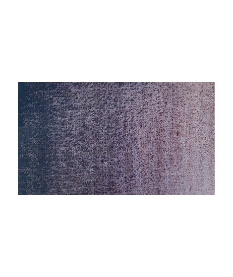
It is a metallic color. This tone is singular, with a mauve shade dotted with copper highlights.
The base of this color is a silver gray.
The addition of a silver pearlescent pigment strengthens the silvery note of the shade and brings to mind a pewter gray.
Un bleu à la teinte unique et légèrement iridescent. Il ravira les aquarellistes qui apprécient les effets et la granulation.
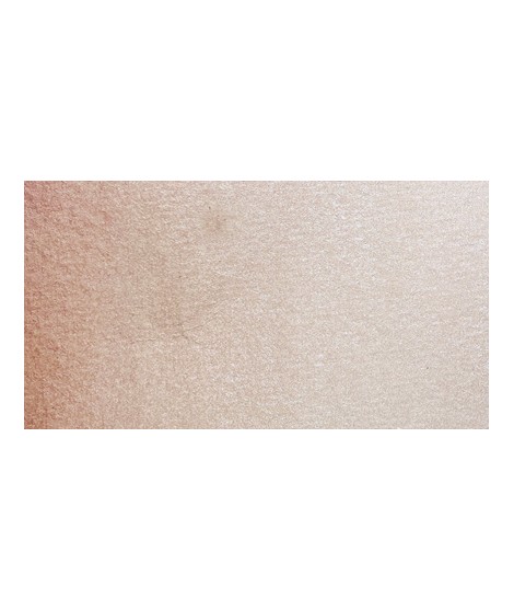
Rose nacré clair.
Un rose très clair et légèrement nacré
Rose lĂ©gèrement nacrĂ©Â
Rose navré et légèrement orange
Very beautiful dark red tending to burgundy.
This red has a great purity of tone. It draws very slightly on the yellow.
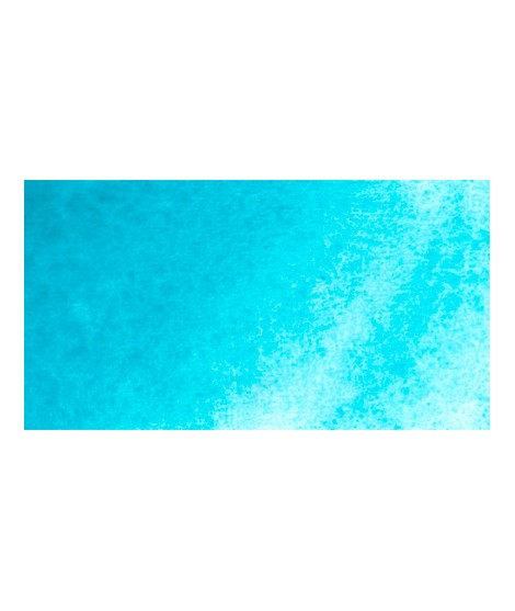
Very beautiful light blue, which pulls slightly towards green. Particularly suitable for working the sky.
This red is part of the range of metallic colors. Like all the metallic colors that I have created, its nuance is singular.
A very discreet and interesting pink especially to bring softness to certain floral compositions.
Bright yellow with great purity of tone.
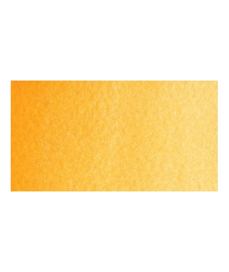
Magnificent yellow-orange very bright and a beautiful purity of tone.
Its more marked opacity than organic yellows (Isaro Yellow light, dark and Indian) can hold back its use, however well mastered it is quite magnificent. It is undeniably one of the colors in my range that appeals to the majority of watercolorists.
A very discreet and interesting pink especially to bring softness to certain floral compositions.
Magnificent pale yellow with underlying shade of green, very bright and bright yellow.
Very beautiful green tone less dynamic than phthalo green. The emerald green is bluish.
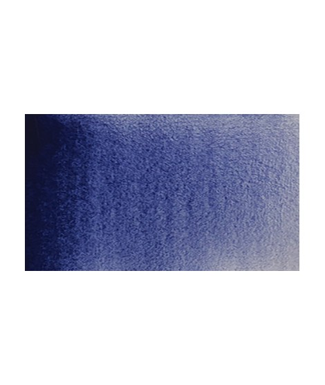
Real cobalt blue with a great purity of tone. Bright and close to primary blue. We can define it as the most blue of blues because it does not draw on green (like Prussian blue) or red (like overseas).
Singular and grainy green color.
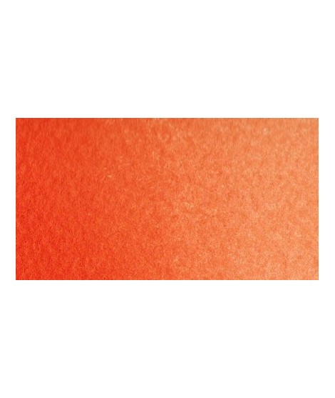
Bright orange. This color is monopigmentary which gives it a very beautiful purity of tone. Due to its greater transparency, pyrrole orange may be preferred.
Gorgeous unique shade of gray blue.
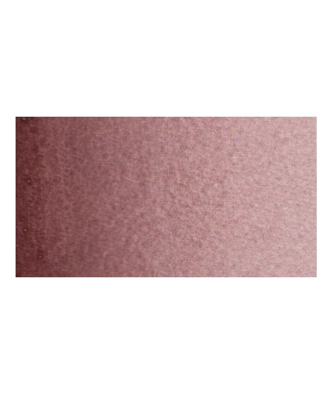
Your dark purple tending to brown. Pure it is of an interesting tone. It also comes in composite colors like sepia brown or Van Dijck brown.
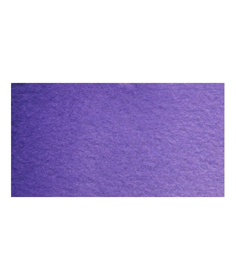
Very beautiful violet with a beautiful purity of tone. It belongs to the overseas family. Its particularity is to naturally granulate.
Bright and vivid green that can also be created on the palette by mixing using phthalo green PG7 or phthalo green yellow shade PG36; To the latter, lemon cadmium yellow or light cadmium yellow is added or, if it is desired to retain more transparency, light Isaro yellow PY154.
Very beautiful earthy green and mono pigment.
A very soft, slightly pastel yellow.