€6.95
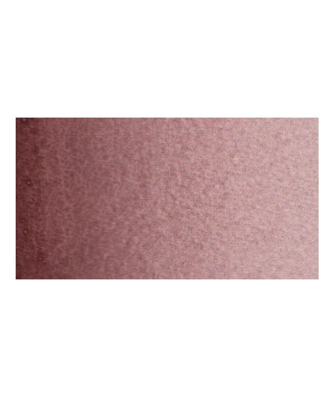
Iron Oxide purple - A Lesser-Known Mineral Hue
PR101 - Opaque - Non-Granulating
Iron Oxide purple is an earthy violet shade with dark undertones.
This versatile pigment is well-suited to both abstract compositions and naturalistic scenes.