€3.95
Very beautiful yellow, earthy and bright. Very useful on the palette.
Active filters
Very beautiful yellow, earthy and bright. Very useful on the palette.
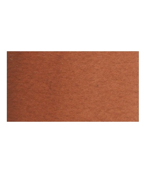
Very beautiful brown, slightly red. For watercolorists looking for uniform washes, March Brown may be preferred over natural soils.
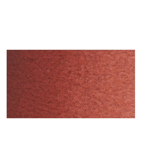
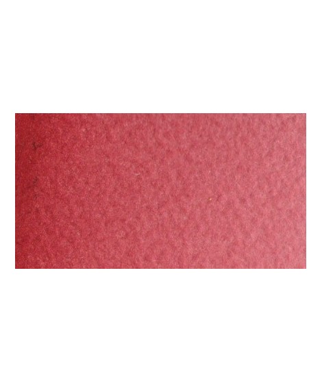
Very good brick red tone, with an underlying pink shade. Despite its relative opacity, this well-mastered color is appreciated by watercolorists.
Very beautiful brick red, with an underlying shade of orange-yellow.
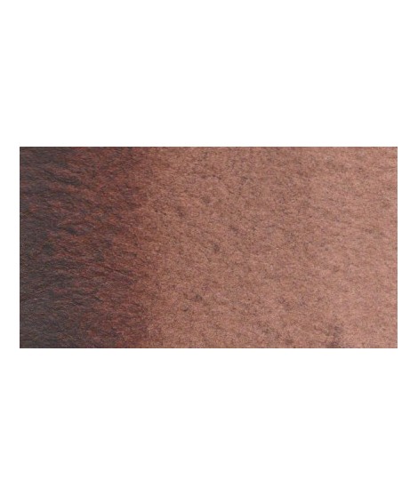
Dark and warm brown. Interesting color for dark your shades.
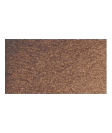
Very beautiful brown with a green shade that characterizes real natural shade earth. I draw attention to the fact that this gray earth is naturally very little coloring.
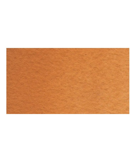
Very beautiful earth turning red. This color is, in my opinion, essential on the palette as it is rich in mixture. With blues, for example, burnt Sienna is a nice range of grays. With the reds, she creates "brick red" colors.
A very discreet and interesting pink especially to bring softness to certain floral compositions.
Magnificent bright color. Indispensable in many mixtures and in particular to compose, with the blues, a large number of mauves.
With the reds it makes it possible to obtain "cherry red" or "raspberry red" tones.
In my opinion, it is one of the very useful colors on a palette.
Rose navré et légèrement orange
Rose lĂ©gèrement nacrĂ©Â
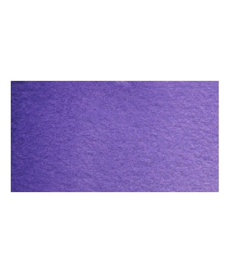
Very beautiful light mauve mono pigmentary and therefore a beautiful purity of tone. It can be lightened with Isaro pink and darkens with ultramarine blue or phthalo blue for example.
Magnificent red which turns brown. More transparent than burnt Sienna and less grainy, it can perfectly replace it for watercolorists who prefer a more transparent and reddish tone.
Dark mauve which can be lightened with Isaro pink and nuanced with overseas blue for example.
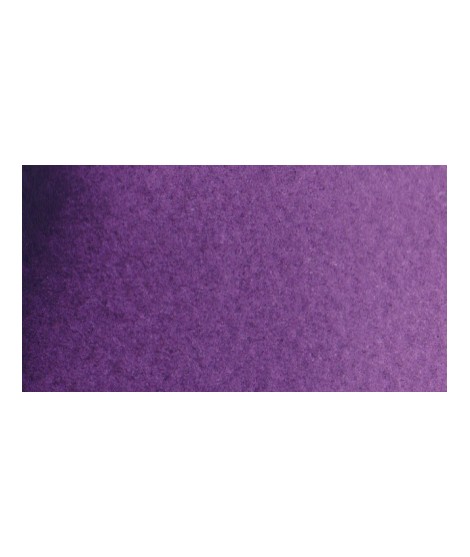
Very beautiful violet with a beautiful purity of tone. It belongs to the overseas family. Its particularity is to naturally granulate.
This very beautiful red whose shade can make one think of madder lacquer does not have the lack of stability over time.
With a little burnt umber, it is perfectly darkened and you easily get a crimson alizarin shade.
Pale yellow with a slightly darker shade than lemon cadmium yellow. Luminous and bright yellow. Useful as primary yellow. It is one of the essential colors on the palette of a watercolorist.
Warm and bright yellow, very beautiful in wash for example.
Warm yellow with a shade close to dark cadmium yellow. With a beautiful transparency, this yellow allows you to obtain a very beautiful range of greens with Prussian blue and Phthalo blue for example. With yellow phthalo green (PG36) it allows you to easily compose the shades "bladder green" and "Hoocker green"
You can add light Isaro yellow to a range of Indian yellow.
A very essential greenish yellow. It allows a wide range of rich and surprising mixes.
One of the flagship colors at Isaro. Very popular with watercolorists, it is one of the essentials on a palette.
Very beautiful red, lively and bright with an underlying note colder than Scarlett red.
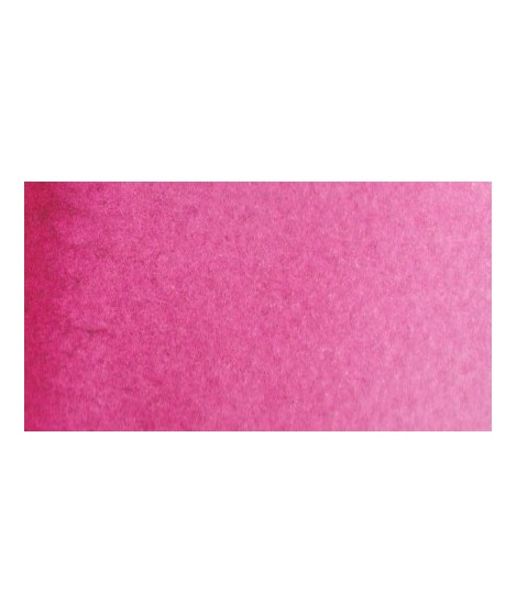
This color can be used as the primary color. It is a bright pink, which forms with the yellows beautiful oranges and with the blue magnificent mauves.
Magnificent pale yellow with underlying shade of green, very bright and bright yellow.
A very discreet and interesting pink especially to bring softness to certain floral compositions.
Bright yellow with great purity of tone.
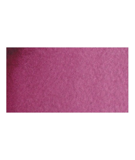
Very beautiful dark red tending to burgundy.
This red has a great purity of tone. It draws very slightly on the yellow.
This red is part of the range of metallic colors. Like all the metallic colors that I have created, its nuance is singular.
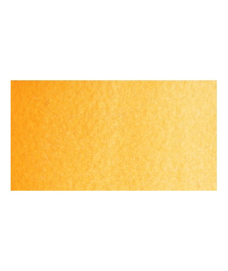
Magnificent yellow-orange very bright and a beautiful purity of tone.
Its more marked opacity than organic yellows (Isaro Yellow light, dark and Indian) can hold back its use, however well mastered it is quite magnificent. It is undeniably one of the colors in my range that appeals to the majority of watercolorists.