€3.95
Very beautiful yellow, earthy and bright. Very useful on the palette.
Active filters
Very beautiful yellow, earthy and bright. Very useful on the palette.
Very beautiful brown, slightly red. For watercolorists looking for uniform washes, March Brown may be preferred over natural soils.
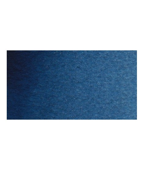
Dark blue with an underlying green hue. This blue is very useful for creating greens, it is actually the blue of greens.
Magnificent blue with an underlying shade of mauve. Very useful for composing magnificent mauves, especially with quinacridones like Isaro pink for example.
With black or burnt sienna, it makes it possible to obtain very beautiful Payne grays and with burnt umber to create a beautiful indigo.
Very beautiful brown with a green shade that characterizes real natural shade earth. I draw attention to the fact that this gray earth is naturally very little coloring.
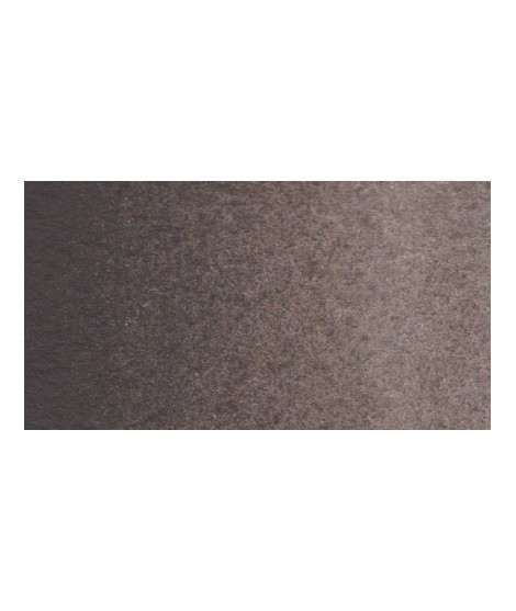
This black can be useful for certain mixtures. For example, by combining it with ultramarine blue to obtain Payne gray or mauve iron oxide or Venice red to obtain Van Dijck brown, if we add a little ocher we obtain the sepia color.
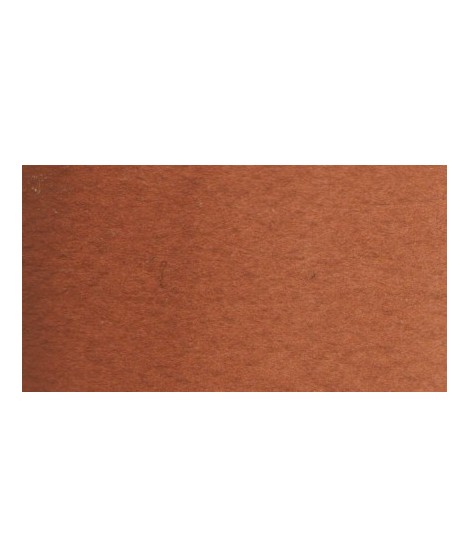
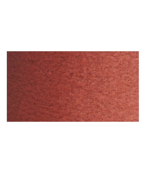
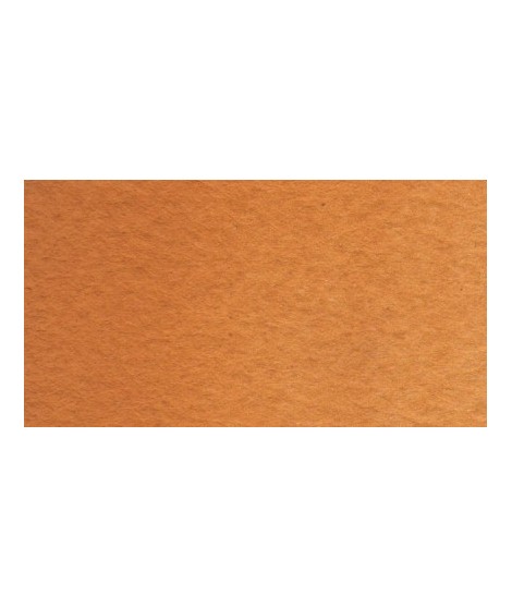
Very beautiful earth turning red. This color is, in my opinion, essential on the palette as it is rich in mixture. With blues, for example, burnt Sienna is a nice range of grays. With the reds, she creates "brick red" colors.
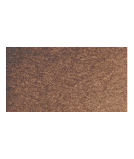
Dark and warm brown. Interesting color for dark your shades.
Close shade of natural indigo.
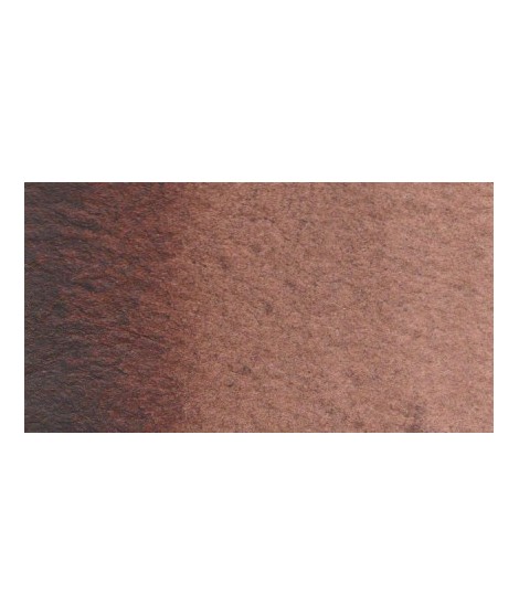
Very beautiful very dark brown, almost black. Very useful for contrasts. Can be obtained on the palette by mixing smoke black with mauve iron oxide and ocher or natural Sienna.
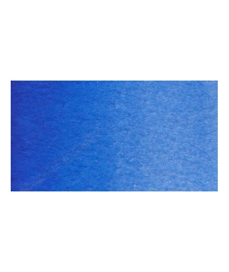
Very beautiful blue with a shade having an underlying green tone. Very bright and frank.
With phthalo green it forms very beautiful turquoise. With the yellows of the beautiful greens. With the ocher of the more muted greens and with the pink or the purple Isaro a beautiful range of mauves.
A very soft, slightly pastel yellow.
A very essential greenish yellow. It allows a wide range of rich and surprising mixes.
It is a dark blue, which corresponds to a dark reddish blue. It is ideal for nuancing cool colors like violets and blues by giving them more depth. Also useful for forming greens, especially with chartreuse yellow.
Pale yellow with a slightly darker shade than lemon cadmium yellow. Luminous and bright yellow. Useful as primary yellow. It is one of the essential colors on the palette of a watercolorist.
You can add light Isaro yellow to a range of Indian yellow.
Warm and bright yellow, very beautiful in wash for example.
Warm yellow with a shade close to dark cadmium yellow. With a beautiful transparency, this yellow allows you to obtain a very beautiful range of greens with Prussian blue and Phthalo blue for example. With yellow phthalo green (PG36) it allows you to easily compose the shades "bladder green" and "Hoocker green"
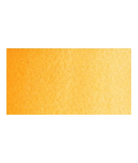
Magnificent yellow-orange very bright and a beautiful purity of tone.
Its more marked opacity than organic yellows (Isaro Yellow light, dark and Indian) can hold back its use, however well mastered it is quite magnificent. It is undeniably one of the colors in my range that appeals to the majority of watercolorists.
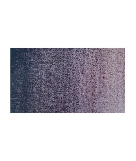
Gorgeous unique shade of gray blue.
Magnificent pale yellow with underlying shade of green, very bright and bright yellow.
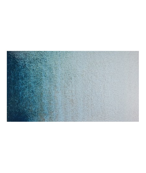
Very beautiful light blue, which pulls slightly towards green. Particularly suitable for working the sky.
This red is part of the range of metallic colors. Like all the metallic colors that I have created, its nuance is singular.
Bright yellow with great purity of tone.
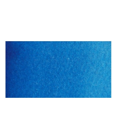
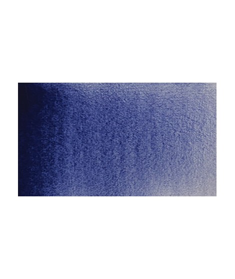
Real cobalt blue with a great purity of tone. Bright and close to primary blue. We can define it as the most blue of blues because it does not draw on green (like Prussian blue) or red (like overseas).
Turquoise légèrement irisé
Golden color, to be used for certain highlights.
Un bleu à la teinte unique et légèrement iridescent. Il ravira les aquarellistes qui apprécient les effets et la granulation.
This color is one of the metallic colors that I created to give a little fantasy to the palette of artists who want it.
It is a metallic color. This tone is singular, with a mauve shade dotted with copper highlights.
I was inspired by the surprising reflections of a semi-precious stone: apatite.
This blue is grainy and iridescent. It is part of the 2022 Happy Precious Year collection.