€5.30
Very interesting Color to create "pastel" touch by mixing with other colors.
Active filters
Very interesting Color to create "pastel" touch by mixing with other colors.
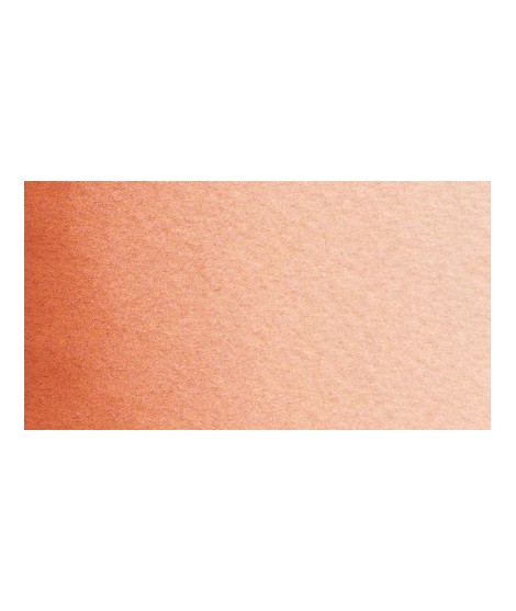
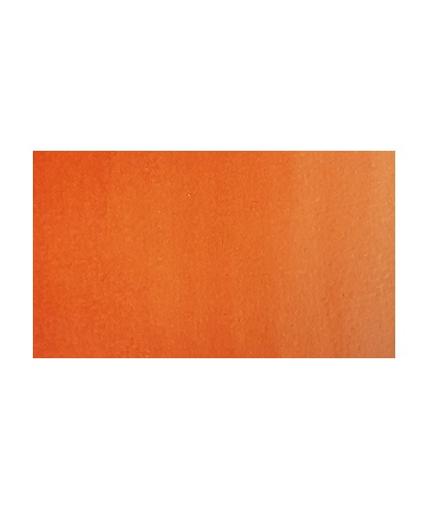
Earthy orange but nevertheless bright.
Very beautiful green, turning blue. When mixed with phthalo blue, it gives a very nice range of turquoises. With the yellows to obtain a very wide range of greens. With the earths of earthy greens and with the burnt umber a dark green.
Very beautiful earthy green and mono pigment.
Green useful for landscapes in particular. Maybe nuanced with phthalo green or yellows.
Bright and vivid green that can also be created on the palette by mixing using phthalo green PG7 or phthalo green yellow shade PG36; To the latter, lemon cadmium yellow or light cadmium yellow is added or, if it is desired to retain more transparency, light Isaro yellow PY154.
Vert Sapin
PG36 + PY165
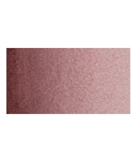
Your dark purple tending to brown. Pure it is of an interesting tone. It also comes in composite colors like sepia brown or Van Dijck brown.
Magnificent bright green with an underlying shade of yellow.
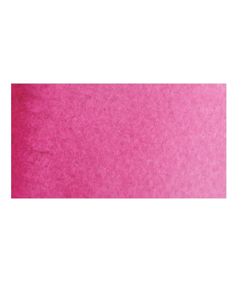
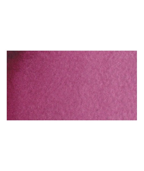
This color can be used as the primary color. It is a bright pink, which forms with the yellows beautiful oranges and with the blue magnificent mauves.
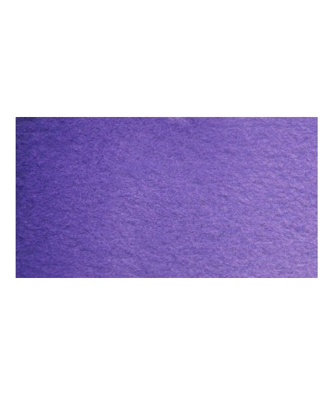
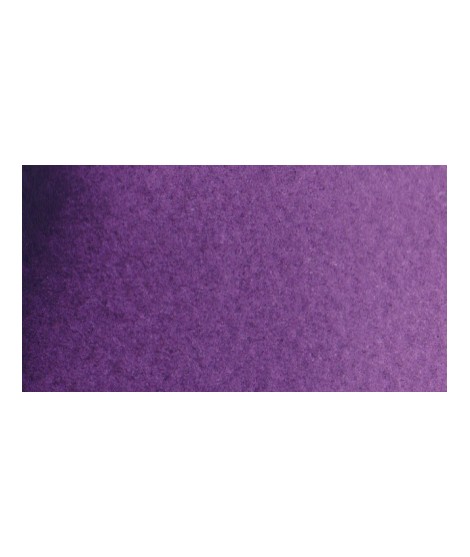
Very beautiful violet with a beautiful purity of tone. It belongs to the overseas family. Its particularity is to naturally granulate.
Based on blue and phthalo green, this turquoise is nuanced at will with blue or green.
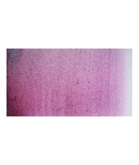
Very beautiful light mauve mono pigmentary and therefore a beautiful purity of tone. It can be lightened with Isaro pink and darkens with ultramarine blue or phthalo blue for example.
Dark mauve which can be lightened with Isaro pink and nuanced with overseas blue for example.
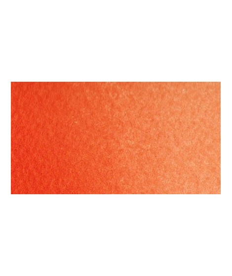
Mono pigment orange which therefore does not result from a mixture of yellow and red which gives it a more excellent purity of tone.
Very beautiful green tone less dynamic than phthalo green. The emerald green is bluish.
Singular and grainy green color.
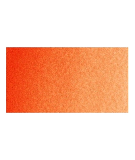
Bright orange. This color is monopigmentary which gives it a very beautiful purity of tone. Due to its greater transparency, pyrrole orange may be preferred.
This red is part of the range of metallic colors. Like all the metallic colors that I have created, its nuance is singular.
Turquoise légèrement irisé
Golden color, to be used for certain highlights.
The flagship color in metallic colors. Very appreciated by watercolorists looking for fantasy.
It is a metallic color. This tone is singular, with a mauve shade dotted with copper highlights.
Ametrine is a quartz born from the union of citrine and amethyst which gives it very interesting reflections. I was inspired by the color of this mineral to create this purple which joins "other colors of the 2022 "Happy Precious Year" collection.
This color is grainy and iridescent.
The base of this color is a silver gray.
The addition of a silver pearlescent pigment strengthens the silvery note of the shade and brings to mind a pewter gray.
This color is one of the metallic colors that I created to give a little fantasy to the palette of artists who want it.
The base of this color is a very soft blue. Diluted well, this color gives a bluish white ideal for painting snow for example.