€6.95
You can add light Isaro yellow to a range of Indian yellow.
Active filters
You can add light Isaro yellow to a range of Indian yellow.
It is a dark blue, which corresponds to a dark reddish blue. It is ideal for nuancing cool colors like violets and blues by giving them more depth. Also useful for forming greens, especially with chartreuse yellow.
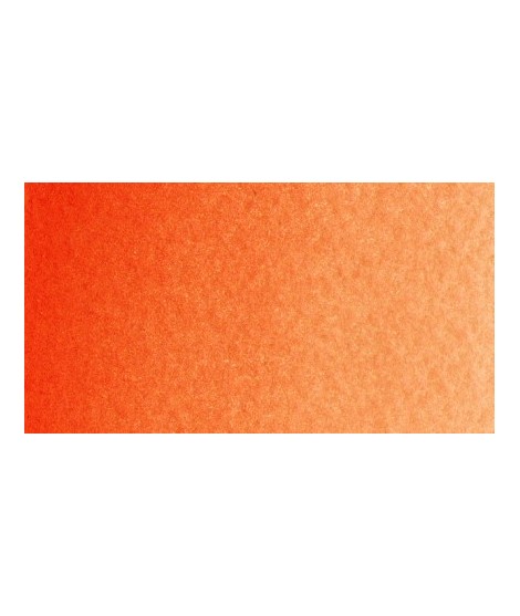
Mono pigment orange which therefore does not result from a mixture of yellow and red which gives it a more excellent purity of tone.
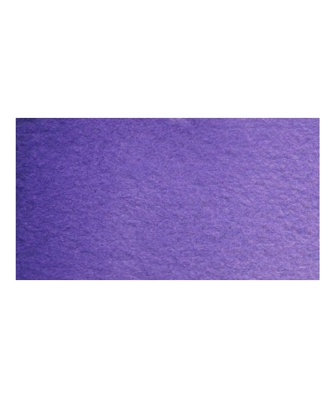
Very beautiful violet with a beautiful purity of tone. It belongs to the overseas family. Its particularity is to naturally granulate.
This red is a very dark red. I find it magnificent in mixture with chartreuse yellow in particular because it forms magnificent autumn tones.
I find that its nuance makes one think of the "old crimson alizarines" of which it does not have the lack of stability.
Warm and bright yellow, very beautiful in wash for example.
One of the flagship colors at Isaro. Very popular with watercolorists, it is one of the essentials on a palette.
Based on blue and phthalo green, this turquoise is nuanced at will with blue or green.
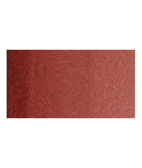
Magnificent red which turns brown. More transparent than burnt Sienna and less grainy, it can perfectly replace it for watercolorists who prefer a more transparent and reddish tone.
Bright yellow with great purity of tone.
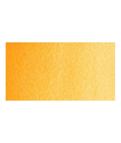
Magnificent yellow-orange very bright and a beautiful purity of tone.
Its more marked opacity than organic yellows (Isaro Yellow light, dark and Indian) can hold back its use, however well mastered it is quite magnificent. It is undeniably one of the colors in my range that appeals to the majority of watercolorists.
Magnificent pale yellow with underlying shade of green, very bright and bright yellow.
Very beautiful light blue, which pulls slightly towards green. Particularly suitable for working the sky.
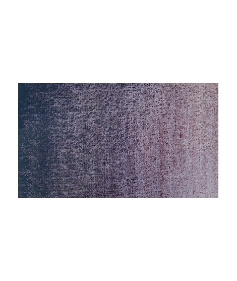
Gorgeous unique shade of gray blue.
Real cobalt blue with a great purity of tone. Bright and close to primary blue. We can define it as the most blue of blues because it does not draw on green (like Prussian blue) or red (like overseas).
Singular and grainy green color.
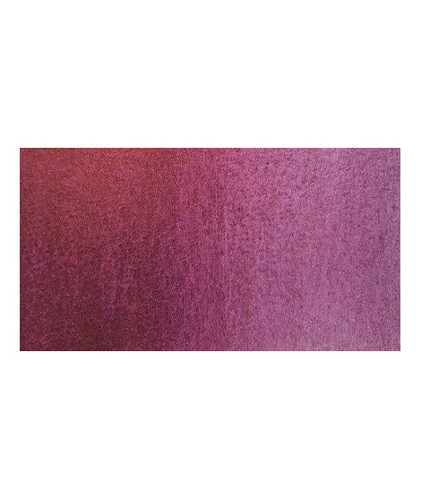
This red is part of the range of metallic colors. Like all the metallic colors that I have created, its nuance is singular.
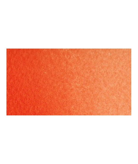
Bright orange. This color is monopigmentary which gives it a very beautiful purity of tone. Due to its greater transparency, pyrrole orange may be preferred.
Very beautiful dark red tending to burgundy.
A very discreet and interesting pink especially to bring softness to certain floral compositions.
This red has a great purity of tone. It draws very slightly on the yellow.
Un bleu à la teinte unique et légèrement iridescent. Il ravira les aquarellistes qui apprécient les effets et la granulation.
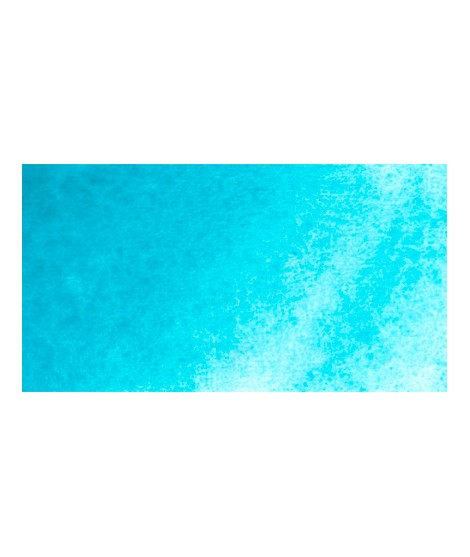
Turquoise légèrement irisé
Golden color, to be used for certain highlights.
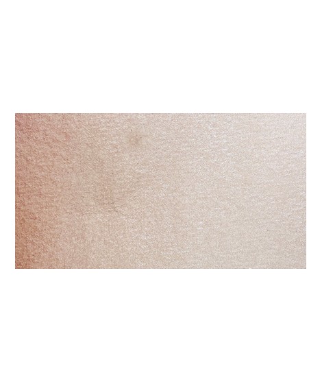
Rose nacré clair.
Un rose très clair et légèrement nacré