€3.95
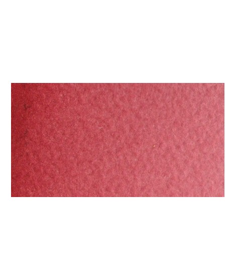
Very good brick red tone, with an underlying pink shade. Despite its relative opacity, this well-mastered color is appreciated by watercolorists.
Active filters
Very good brick red tone, with an underlying pink shade. Despite its relative opacity, this well-mastered color is appreciated by watercolorists.
Turquoise légèrement irisé
One of the flagship colors at Isaro. Very popular with watercolorists, it is one of the essentials on a palette.
This very beautiful red whose shade can make one think of madder lacquer does not have the lack of stability over time.
With a little burnt umber, it is perfectly darkened and you easily get a crimson alizarin shade.
Magnificent red which turns brown. More transparent than burnt Sienna and less grainy, it can perfectly replace it for watercolorists who prefer a more transparent and reddish tone.
This black can be useful for certain mixtures. For example, by combining it with ultramarine blue to obtain Payne gray or mauve iron oxide or Venice red to obtain Van Dijck brown, if we add a little ocher we obtain the sepia color.
Very beautiful red, lively and bright with an underlying note colder than Scarlett red.
Golden color, to be used for certain highlights.
Very beautiful brick red, with an underlying shade of orange-yellow.
This red has a great purity of tone. It draws very slightly on the yellow.
Very beautiful dark red tending to burgundy.