€6.95
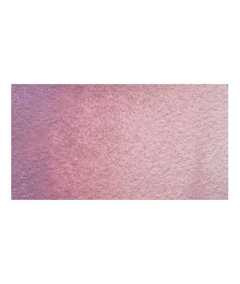
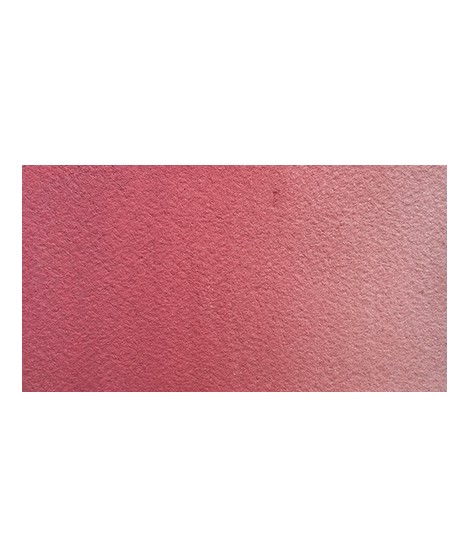
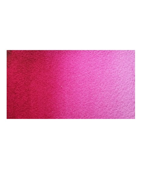
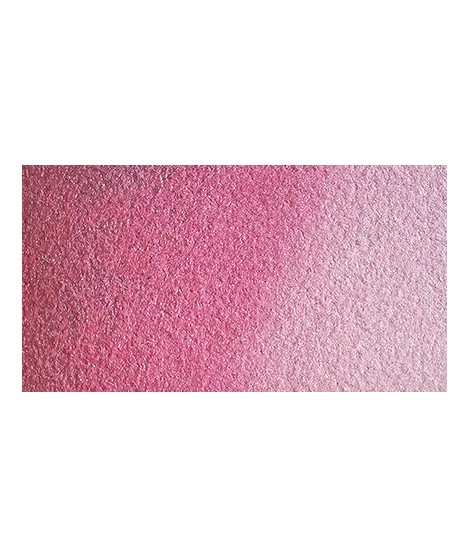
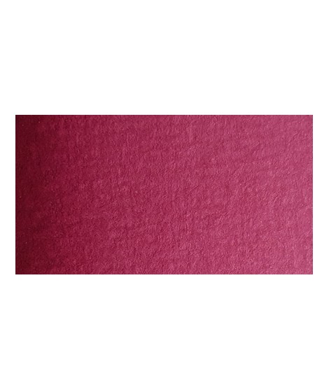
Quinacridone Carmine - A Radiant Pink
PR202 - Transparent - Non-granulating
Quinacridone carmine provides a deep, rich hue that is both luminous and transparent, perfect for creating intense effects and subtle nuances in watercolor works.