€3.95
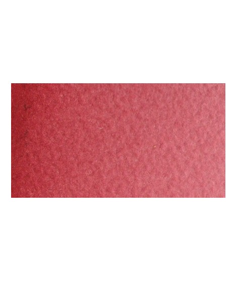
Very good brick red tone, with an underlying pink shade. Despite its relative opacity, this well-mastered color is appreciated by watercolorists.
Active filters
Very good brick red tone, with an underlying pink shade. Despite its relative opacity, this well-mastered color is appreciated by watercolorists.
Turquoise légèrement irisé
The base of this color is a silver gray.
The addition of a silver pearlescent pigment strengthens the silvery note of the shade and brings to mind a pewter gray.
This color is one of the metallic colors that I created to give a little fantasy to the palette of artists who want it.
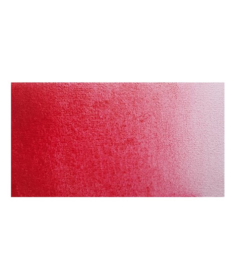
One of the flagship colors at Isaro. Very popular with watercolorists, it is one of the essentials on a palette.
This very beautiful red whose shade can make one think of madder lacquer does not have the lack of stability over time.
With a little burnt umber, it is perfectly darkened and you easily get a crimson alizarin shade.
Magnificent red which turns brown. More transparent than burnt Sienna and less grainy, it can perfectly replace it for watercolorists who prefer a more transparent and reddish tone.
Very beautiful red, lively and bright with an underlying note colder than Scarlett red.
It is a metallic color. This tone is singular, with a mauve shade dotted with copper highlights.
Golden color, to be used for certain highlights.
The base of this color is a very soft blue. Diluted well, this color gives a bluish white ideal for painting snow for example.
Very beautiful brick red, with an underlying shade of orange-yellow.
This red is part of the range of metallic colors. Like all the metallic colors that I have created, its nuance is singular.
This red has a great purity of tone. It draws very slightly on the yellow.
Very beautiful dark red tending to burgundy.
Ametrine is a quartz born from the union of citrine and amethyst which gives it very interesting reflections. I was inspired by the color of this mineral to create this purple which joins "other colors of the 2022 "Happy Precious Year" collection.
This color is grainy and iridescent.