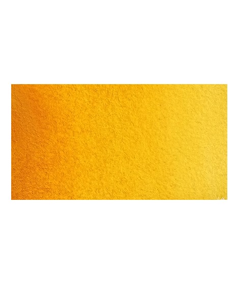
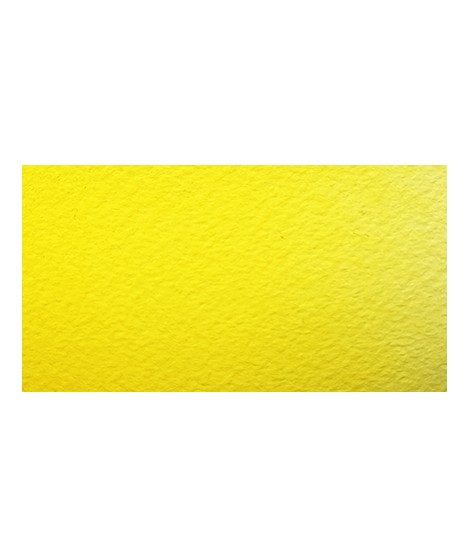
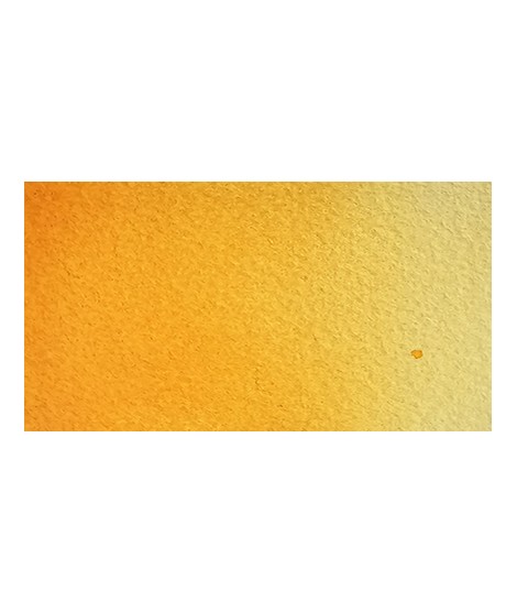
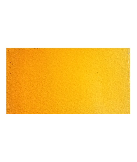
Very beautiful yellow, earthy and bright. Very useful on the palette.
Active filters
Based on blue and phthalo green, this turquoise is nuanced at will with blue or green.
Turquoise légèrement irisé
The base of this color is a silver gray.
The addition of a silver pearlescent pigment strengthens the silvery note of the shade and brings to mind a pewter gray.
This color is one of the metallic colors that I created to give a little fantasy to the palette of artists who want it.
Very beautiful very dark brown, almost black. Very useful for contrasts. Can be obtained on the palette by mixing smoke black with mauve iron oxide and ocher or natural Sienna.
Vert Sapin
PG36 + PY165
Warm yellow with a shade close to dark cadmium yellow. With a beautiful transparency, this yellow allows you to obtain a very beautiful range of greens with Prussian blue and Phthalo blue for example. With yellow phthalo green (PG36) it allows you to easily compose the shades "bladder green" and "Hoocker green"
Dark blue with an underlying green hue. This blue is very useful for creating greens, it is actually the blue of greens.
Magnificent bright green with an underlying shade of yellow.
Very beautiful green, turning blue. When mixed with phthalo blue, it gives a very nice range of turquoises. With the yellows to obtain a very wide range of greens. With the earths of earthy greens and with the burnt umber a dark green.
Very beautiful blue with a shade having an underlying green tone. Very bright and frank.
With phthalo green it forms very beautiful turquoise. With the yellows of the beautiful greens. With the ocher of the more muted greens and with the pink or the purple Isaro a beautiful range of mauves.
I was inspired by the surprising reflections of a semi-precious stone: apatite.
This blue is grainy and iridescent. It is part of the 2022 Happy Precious Year collection.
Green useful for landscapes in particular. Maybe nuanced with phthalo green or yellows.
A very soft, slightly pastel yellow.
Very beautiful brown, slightly red. For watercolorists looking for uniform washes, March Brown may be preferred over natural soils.
Pale yellow with a slightly darker shade than lemon cadmium yellow. Luminous and bright yellow. Useful as primary yellow. It is one of the essential colors on the palette of a watercolorist.
You can add light Isaro yellow to a range of Indian yellow.
Beautiful subtle very light gray for light shadows and drapes.
Bright and vivid green that can also be created on the palette by mixing using phthalo green PG7 or phthalo green yellow shade PG36; To the latter, lemon cadmium yellow or light cadmium yellow is added or, if it is desired to retain more transparency, light Isaro yellow PY154.
Close shade of natural indigo.
Warm and bright yellow, very beautiful in wash for example.
It is a dark blue, which corresponds to a dark reddish blue. It is ideal for nuancing cool colors like violets and blues by giving them more depth. Also useful for forming greens, especially with chartreuse yellow.
It is a metallic color. This tone is singular, with a mauve shade dotted with copper highlights.
Golden color, to be used for certain highlights.
The base of this color is a very soft blue. Diluted well, this color gives a bluish white ideal for painting snow for example.
Very beautiful green tone less dynamic than phthalo green. The emerald green is bluish.
This red is part of the range of metallic colors. Like all the metallic colors that I have created, its nuance is singular.
Very beautiful earthy green and mono pigment.
A very essential greenish yellow. It allows a wide range of rich and surprising mixes.
Bright yellow with great purity of tone.
Magnificent pale yellow with underlying shade of green, very bright and bright yellow.