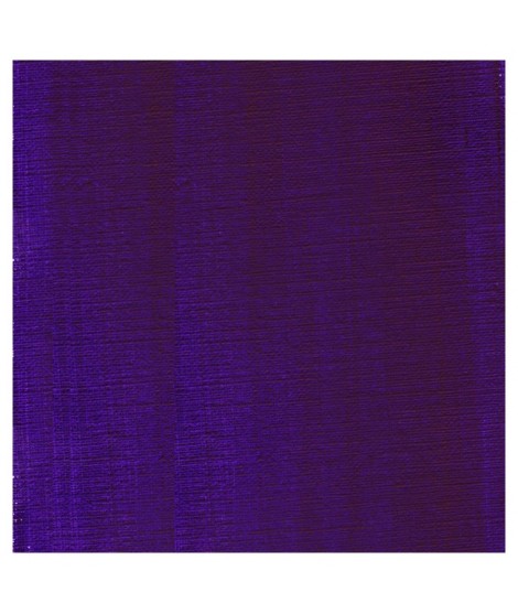
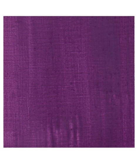
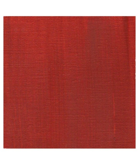
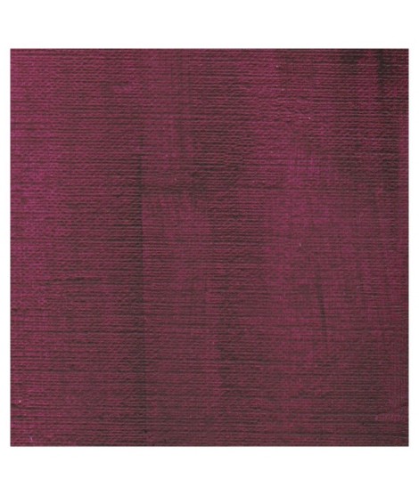
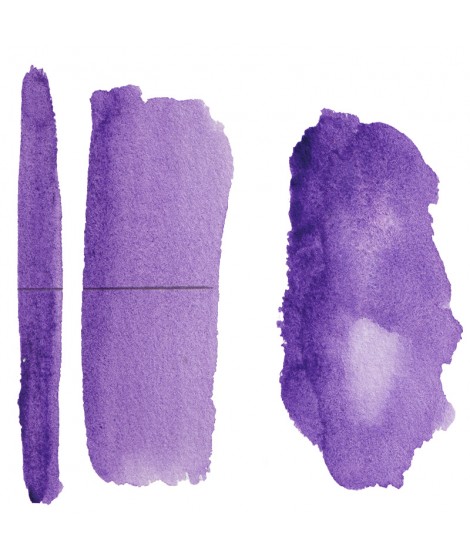
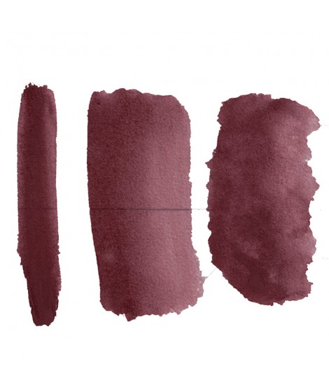
Scarlett Red
PR255 – Semi-opaque
A beautiful, bright red. When blended with white, it reveals a pinker undertone compared to Light Cadmium Red.ous red. More pinkish than the red cadmium light
Active filters
Scarlett Red
PR255 – Semi-opaque
A beautiful, bright red. When blended with white, it reveals a pinker undertone compared to Light Cadmium Red.ous red. More pinkish than the red cadmium light
Glimmer Green – A Sparkling Grayish Green
PB29 + PG7 + PR170 + Perlescent – Transparent – Non-granular
Glimmer Green is a vibrant and luminous hue that captures light through its subtle pearlescent effect. Inspired by the iridescent reflections of nature, this radiant green adds a touch of freshness and dynamism to watercolor compositions.
Light Cadmium RedÂ
PR108 - Opaque
A symbol of passion and power, Light Cadmium Red is an essential shade for discerning artists. Its vivid, warm, and saturated hue brings a unmatched intensity to the canvas. With exceptional pigment concentration, it offers flawless coverage and outstanding lightfastness.
This brilliant red reveals its full elegance in gradients, blends, and impasto techniques, always preserving its chromatic strength.Â
Pyrrole red deep
PR264 – Transparent
Dark Pyrrole Red embodies both strength and subtlety in an intense red with deep, velvety undertones. Its rich, slightly crimson hue offers a contemporary alternative to traditional reds, with remarkable intensity and excellent lightfastness.
With a strong tinting strength, this red stands out for its transparency—perfect for vibrant glazing and nuanced layering.
Cadmium red deep
PR108 - Opaque
Dark cadmium red is a rich, deep, and warm color, highly valued in oil painting. Opaque and intense, it brings strength and depth to compositions while remaining lightfast. Ideal for warm shadows, skin tones, or powerful reds, it pairs well with earthy tones or complementary greens.Â
Perylene red
PR179 – Transparent
Perylene red is a modern organic pigment, valued for its depth, transparency, and strong chromatic intensity. A deep red with ruby or garnet undertones, it offers a subtle alternative to more opaque cadmium reds.
Its transparency makes it an excellent choice for glazing, colored shadows, or layering effects, while maintaining excellent lightfastness. It blends harmoniously with blues, browns, or lighter reds to create subtle and refined tones.d brown, very beautifull for glazings.
Turquoise Green – Aquatic Escape
PG7 + PG15:1 – Transparent – Non-granular
Turquoise Green is a vibrant and luminous hue, evoking crystal-clear waters and exotic landscapes. Its balance between blue and green makes it a perfect pigment for depicting tropical lagoons, vibrant foliage, or dawn skies with subtle nuances.een, this turquoise is nuanced at will with blue or green.
Isaro green light – A Touch of Freshness
PG36 + PY35 + PY42 – Semi-transparent – Non-granular
Isaro green light is a bright and radiant hue that evokes the freshness of spring and the softness of young foliage. Its vibrant intensity makes it an ideal pigment to bring liveliness to landscape and floral compositions.Â
Isaro Mauve
PV19 – Transparent
Isaro Mauve is a quinacridone PV19 pigment, appreciated for its transparency, purity, and subtle chromatic nuances. This modern organic pigment offers a rich mauve tone, situated between pink and violet.
Highly versatile, it is well suited for glazing as well as refined mixtures. When combined with deep blues, its violet character is enhanced; mixed with white, it reveals soft, luminous lavender tones. It is perfect for depicting flowers, colorful shadows, or late-afternoon atmospheres.
It offers excellent lightfastness and strong tinting strength.ep violet with a touch of red
Phthalo Green – A Versatile Green
PG7 – Transparent – Non-granular
Phthalo Green is an essential pigment in watercolor, valued for its vibrant intensity, transparency, and exceptional staining power. This cool green with subtle bluish undertones offers remarkable depth, making it perfect for capturing the richness of lush foliage, tropical landscapes, and emerald waters.ed with phthalo blue, it gives a very nice range of turquoises. With the yellows to obtain a very wide range of greens. With the earths of earthy greens and with the burnt umber a dark green.
Dioxazine mauve
PV23 – Transparent
Dioxazine mauve has a powerful color, highly valued for its intensity and rich chromatic depth. This cool, dark, and saturated violet with bluish undertones offers excellent transparency while maintaining a very high tinting strength.
When mixed, it produces a wide range of violets, colored greys, or deep chromatic blacks, especially when combined with reds or blues. It also excels in glazing, where its transparency and depth bring a unique dimension to layered applications.
Highly lightfast, PV23 is a modern synthetic organic pigment that has earned a place on the artist’s palette for its versatility, strength, and distinctive beauty.
Green useful for landscapes in particular. Maybe nuanced with phthalo green or yellows.
Bayeux Violet Hue
PR122 + PR179 + PR19 – Transparent
Bayeux Violet Hue is a shade similar to the original Bayeux violet. It is a deep color, somewhere between a bluish violet and a soft, subdued purple. Inspired by the rich tones of antique embroidery, it evokes a sense of nobility. Transparent and high in tinting strength, it is well-suited to both subtle glazing and vibrant modeling.
Emerald Green – The Mineral Brilliance
PG18 – Semi-transparent – Granular
Emerald Green is a brilliant and mineral hue, prized for its softness and granulation. Derived from the hydrated chromium oxide pigment, it offers exceptional stability and excellent lightfastness.
Chrome Oxide Green – A Mineral and Earthy Green
PG17 - Opaque - Non-granulating
Chromium oxide green is a mineral pigment valued for its stability and subtle tone, making it ideal for landscapes and natural subjects. With a deep, slightly neutral green hue, it fits seamlessly into the palettes of watercolor artists seeking balanced and realistic shades.mono pigment.
Cobalt Violet
PV14 – Semi-Opaque
This genuine dark cobalt violet is a rare and precious mineral pigment, valued for its exceptional lightfastness and subtle chromatic character. A bluish violet with gentle nuances, it offers soft opacity and a smooth, buttery texture—ideal for nuanced blends, colored shadows, and muted atmospheres.
Made through a complex process using cobalt phosphate, this pigment requires time-consuming production, costly raw materials, and expert craftsmanship. Its rarity, combined with its unique artistic qualities, justifies its high price. Inalterable and refined, PV14 is a pigment of choice for discerning artists seeking an authentic and timeless color.
Phthalo Green Yellow Shade – A Burst of Freshness
PG36 – Transparent – Non-granulating
Phthalo Green Yellow Shade is a vibrant and luminous hue, perfect for adding freshness and intensity to your compositions. With exceptional transparency and remarkable tinting strength, this pigment offers a wide range of shades, from brilliant greens to more natural tones when mixed.
Sap Sap Green – A Classic and Natural Green
PG36 + PY139 - Transparent - Non-granulating
This deep yellow-green, with its luminous transparency, is prized for its ability to create subtle botanical shades. Ideal for delicate foliage, moss, and pastoral landscapes, it blends seamlessly into washes and mixes beautifully with other pigments.
Perylene Green - The Dark Elegance
PBk31 - Transparent - Non-granulating
Perylene green is a unique and versatile pigment that brings rich depth and subtle intensity to watercolor works. Originating from the organic pigment family, this dark, earthy green has an almost black hue with greenish undertones, making it ideal for wooded landscapes, deep shadows, and atmospheric scenes. Thanks to its composition, it offers excellent stability and remarkable permanence.
The Nordman Green – A Unique Green
PG7 + PV16 - Semi-transparent - Granular
Nordman Green is an excellent choice for painting landscapes, forests, and foliage, adding natural richness and extra dimension to vegetal scenes thanks to the textured nuances it creates. It is also ideal for creating cool shadows and subtle shades in nature works or floral compositions. Its deep and balanced tone makes it particularly suited for winter scenes or muted atmospheres, but it can also be used in mixes to create more vibrant greens.y green color.
Red Ochre
PR102 – Semi-opaque
Red ochre is a natural, earthy pigment—warm and deep—used since Antiquity. With its nuanced orange-red hue, it brings strength, softness, and warmth to compositions. Covering, lightfast, and non-toxic, it is ideal for landscapes, warm skin tones, or rich backgrounds. It pairs beautifully with other ochres, greens, and blues to create natural, balanced harmonies. A true essential on any classical palette.
English Red
PR101 – Opaque
English Red is a synthetic iron oxide pigment, deep and warm, with a reddish-brown undertone. Highly opaque, stable, and lightfast, it offers a matte texture ideal for backgrounds, skin tones (when combined with Old Yellow), and warm-toned landscapes. Its earthy richness allows it to blend harmoniously with ochres, greens, or blues, bringing balance and subtlety to compositions.y burnt orange.
Phthalo Green
PG7 – Transparent
Phthalo green is a powerful, deep, and cool organic pigment with remarkable intensity.
Transparent and highly tinting, it is ideal for glazing, vivid blends, and luminous effects. When combined with phthalo blue (PB15:3), it produces brilliant turquoise tones, perfect for seascapes or exotic compositions. Extremely lightfast and non-toxic, phthalo green is an essential on any modern palette.id and strong bluish greens a good staple green to produce a large range of greens.
Chromium Oxide Green
PG17 – Opaque
Chromium oxide green is a dense and stable mineral pigment with an earthy mid-green tone. Highly covering, with strong tinting strength, non-toxic, and exceptionally lightfast, it is ideal for landscapes, foliage, muted backgrounds, and cool skin tones.
Its natural, low-saturation hue makes it a balanced green, easy to harmonize with browns, reds, and yellows.
Isaro green deep
PG7 + PBr7 – Semi-transparent
Isaro Dark Green is a deep, intense green obtained by combining phthalo green (PG7) with a natural earth pigment (PBr7). Similar to Hooker’s Green, it blends the strong tinting strength and transparency of PG7 with the earthy warmth of umber. The result is a dark, balanced green, ideal for dense foliage, shaded landscapes, or deep backgrounds.
Easy to modulate, it mixes beautifully with yellows for brighter greens, or with blues and browns for subtle, natural effects. A versatile, expressive green—especially valuable in landscape painting.
Sap green
PG7 + PBr7 – Semi-opaque
Sap green is a blend of phthalo green and raw sienna. It offers an earthy, slightly browned green reminiscent of dense forests and shaded foliage. Its natural tone makes it an excellent choice for vegetative shadows and woodland landscapes.
Easy to adjust with yellows for brighter greens or blues for cooler tones, it fits harmoniously into any landscape palette. Perfect for nuanced and realistic painting.ul in producing glazes when diluted.
Emerald Gmerald Green (or Viridian Green)
PG18 – Semi-opaque
Emerald green, also known as viridian green, is a transparent mineral pigment with a cool, deep, slightly bluish hue. Highly valued for its chromatic subtlety and excellent lightfastness, it is ideal for landscapes, bright foliage, colored shadows, and glazing. Its transparency allows for delicate layering and rich mixtures, especially with blues or reds to create nuanced greys or transparent blacks.
An elegant, classic, and refined green.sparent and less dull than chromium oxide green. Emerald green produces splendidly luminous green when mixed with cadmium yellow. Landscapists and some portraitists prefer it because his undertone is less vivid than the phtalo green.
Transparent Mars Red
PR101 – Transparent
Transparent Mars Red is a synthetic iron oxide with a warm, intense, and deep red-brown hue.
Its transparency makes it ideal for glazing, colored shadows, rich skin tones, or vibrant backgrounds.
Highly lightfast, non-toxic, and with strong tinting strength, it allows for nuanced layering and subtle blends with blues, greens, or ochres.
A versatile color, it is prized by artists seeking warmth and transparency without overwhelming opacity.
Ultramarine Violet - A Delicate Violet
PV15 - Semi-transparent - Granular
Ultramarine violet, with its soft hue, is perfect for creating delicate and textured nuances. It offers excellent lightfastness.iful violet with a beautiful purity of tone. It belongs to the overseas family. Its particularity is to naturally granulate.
Transparent Mars Red - A Rust Effect
PR101 - Transparent - Non-granulating
Transparent Mars Red is a rich, earthy red, ideal for uniform, warm, and deep washes, while ensuring excellent permanence and great light stability.
Dark Isaro Mauve - A Remarkable Dioxazine Violet
PV23 - Transparent - Non-granulating
Dark Isaro Mauve is an intense, powerful, and vibrant pigment, offering a rich and deep hue, perfect for creating subtle shadows and a wide range of mauve tones.
Very beautiful light mauve Isaro Mauve - An Intense Purple
PV19 - Transparent - Non-granulating
Isaro Mauve is a versatile pigment that can be used alone or in mixes to add interesting and lasting hues, while offering a rich and luminous palette.mono pigmentary and therefore a beautiful purity of tone. It can be lightened with Isaro pink and darkens with ultramarine blue or phthalo blue for example.
Magenta - A Primary Hue
PV19 - Transparent - Non-granulating
Magenta in watercolor, vibrant and transparent, is an essential color for creating luminous mixes, bright pinks, and deep purples, while offering excellent permanence.lor. It is a bright pink, which forms with the yellows beautiful oranges and with the blue magnificent mauves.
Iron Oxide purple - A Lesser-Known Mineral Hue
PR101 - Opaque - Non-Granulating
Iron Oxide purple is an earthy violet shade with dark undertones.
This versatile pigment is well-suited to both abstract compositions and naturalistic scenes.
Cadmium red deep - An Intense Bordeaux
PR108 - Opaque - Non-granulating
Cadmium red deep in watercolor is a powerful and versatile color, perfect for works requiring intense and durable reds. It shines both in mixes and when used on its own.l dark red tending to burgundy.