€8.45
Rose lĂ©gèrement nacrĂ©Â
Rose lĂ©gèrement nacrĂ©Â
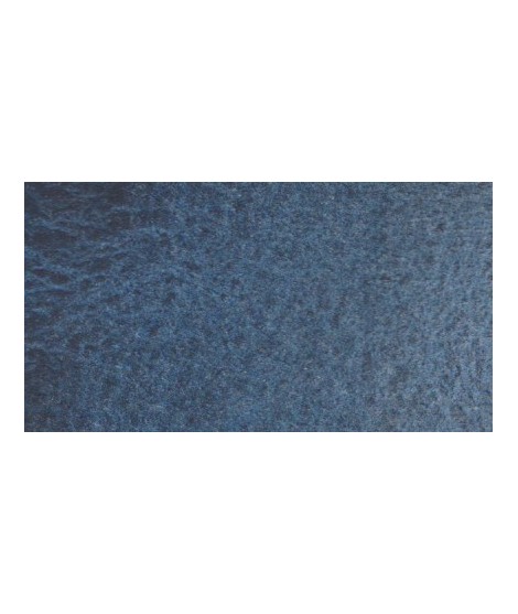
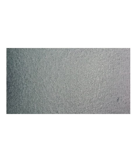
Very nice cold, deep gray, turning blue. Useful as a contrast color.
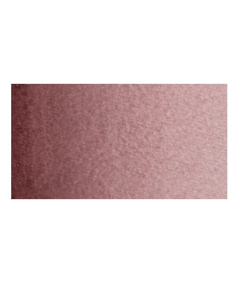
Your dark purple tending to brown. Pure it is of an interesting tone. It also comes in composite colors like sepia brown or Van Dijck brown.
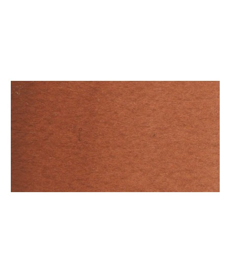
Earthy orange but nevertheless bright.
Green useful for landscapes in particular. Maybe nuanced with phthalo green or yellows.
Singular and grainy green color.
A very soft, slightly pastel yellow.
Magnificent red which turns brown. More transparent than burnt Sienna and less grainy, it can perfectly replace it for watercolorists who prefer a more transparent and reddish tone.
Very beautiful brown, slightly red. For watercolorists looking for uniform washes, March Brown may be preferred over natural soils.
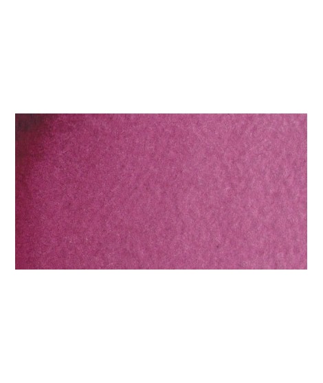
This color can be used as the primary color. It is a bright pink, which forms with the yellows beautiful oranges and with the blue magnificent mauves.
This black can be useful for certain mixtures. For example, by combining it with ultramarine blue to obtain Payne gray or mauve iron oxide or Venice red to obtain Van Dijck brown, if we add a little ocher we obtain the sepia color.
Pale yellow with a slightly darker shade than lemon cadmium yellow. Luminous and bright yellow. Useful as primary yellow. It is one of the essential colors on the palette of a watercolorist.
You can add light Isaro yellow to a range of Indian yellow.
Very beautiful red, lively and bright with an underlying note colder than Scarlett red.
Dark mauve which can be lightened with Isaro pink and nuanced with overseas blue for example.
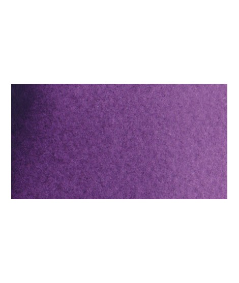
Magnificent bright color. Indispensable in many mixtures and in particular to compose, with the blues, a large number of mauves.
With the reds it makes it possible to obtain "cherry red" or "raspberry red" tones.
In my opinion, it is one of the very useful colors on a palette.
Very beautiful light mauve mono pigmentary and therefore a beautiful purity of tone. It can be lightened with Isaro pink and darkens with ultramarine blue or phthalo blue for example.
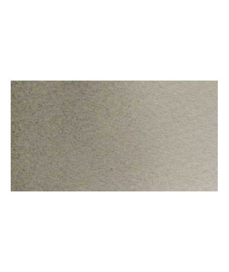
Beautiful subtle very light gray for light shadows and drapes.
Bright and vivid green that can also be created on the palette by mixing using phthalo green PG7 or phthalo green yellow shade PG36; To the latter, lemon cadmium yellow or light cadmium yellow is added or, if it is desired to retain more transparency, light Isaro yellow PY154.
Close shade of natural indigo.
Warm and bright yellow, very beautiful in wash for example.
It is a dark blue, which corresponds to a dark reddish blue. It is ideal for nuancing cool colors like violets and blues by giving them more depth. Also useful for forming greens, especially with chartreuse yellow.
It is a metallic color. This tone is singular, with a mauve shade dotted with copper highlights.
The flagship color in metallic colors. Very appreciated by watercolorists looking for fantasy.
Golden color, to be used for certain highlights.
The base of this color is a very soft blue. Diluted well, this color gives a bluish white ideal for painting snow for example.
Very beautiful brick red, with an underlying shade of orange-yellow.
Plastic bucket to fill with your watercolors in tubes.
Size: 3x 1.8x 1cm
Sold by 10, 25, 50
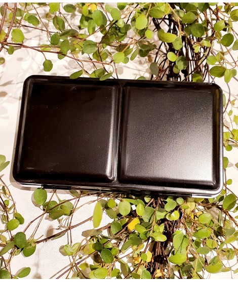
Empty metal Watecolour box : includes 12 half pans
Simply fill the pans with your favorite tube watercolors, let them dry, and then rewet them when you're ready to paint. PORTABLE AND REUSABLE
Use colors straight from the tube or mix up your own custom shades. Watercolor tins are offered in a variety of sizes and configurations.Â
Includes 12 empty half pans which are detachable .Each pan can hold upto 2ml of watercolour paint.Â
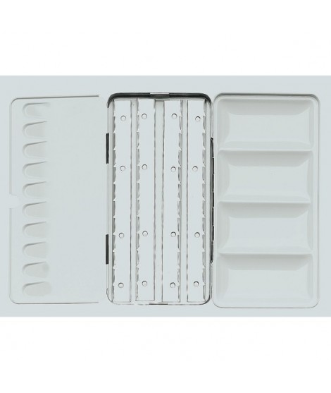
Empty metal Watecolour box : 48 half pans included:
Simply fill the pans with your favorite tube watercolors, let them dry, and then rewet them when you're ready to paint. PORTABLE AND REUSABLE
Use colors straight from the tube or mix up your own custom shades. Watercolor tins are offered in a variety of sizes and configurations.Â
Includes 48 empty half pans which are detachable .Each pan can hold upto 2ml of watercolour paint.Â